Lecture

Let's look at the results of a recent study that was aimed at studying the influence of the design of page 404 on user behavior.
If you think that the 404 page with a picture and other design is the best option so that the user wants to view the site further, then you are right. Let's look at the example of our ward.
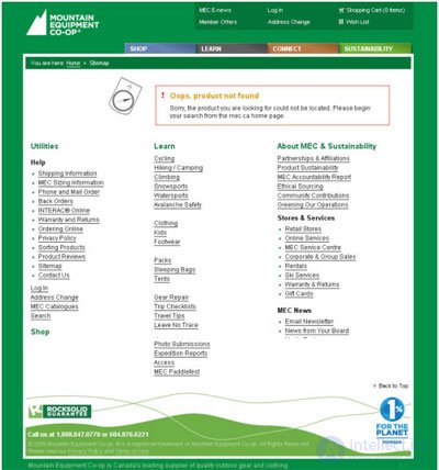
v 1.0 - text only.
Text - a plain text informing the user about possible reasons why he could get on page 404
conversion - 37%
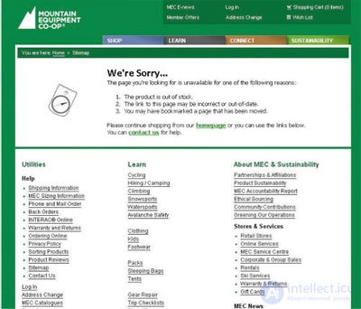
v 1.01 - Text, image and link.
The text is a plain text informing the user about the possible reasons why he could get on page 404.
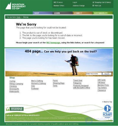
v 1.02 - Image, text and links.
The text is a plain text informing the user about the possible reasons why he could get on page 404.
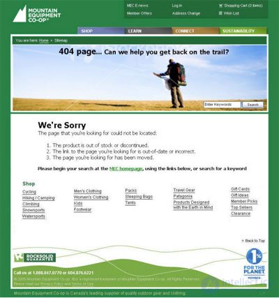
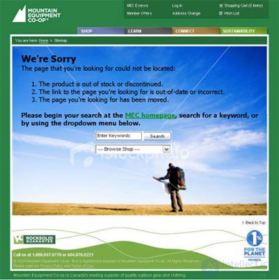
v 1.03 - Big picture, text and drop-down menu.
The text is a plain text informing the user about the possible reasons why he could get on page 404.
Summing up
As you can see from the examples, the version 1.03 won, having a conversion rate of 38.32% and an overall increase in views of 73.2% .
As it turned out, a large number of links on page 404 scares most users.
On version 404, which won the text was used with an apology about the error, the drop-down list and search and the corresponding color scheme, which improves functionality and looks more attractive to the user.
Comments
To leave a comment
seo, smo, monetization, basics of internet marketing
Terms: seo, smo, monetization, basics of internet marketing