
We all know that the top left of the site is the most active, but how does the location of objects affect the conversion of visitors? Let's look at a specific example, the example of an online store.
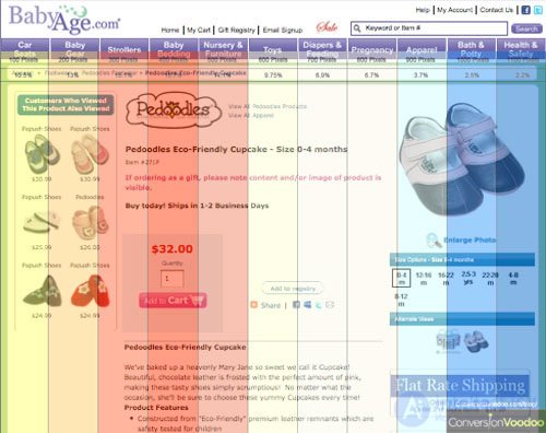
Our partners at http://www.widerfunnel.com/ and http://www.whichtestwon.com/ were surprised to find that the unconventional placement of the button to add goods to the cart on the left side of the BabyAge.com website surpassed the conversion of everyone in the conversion right-side accommodation at 16.7% .
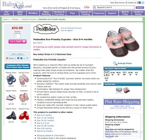
This discovery surprised many, because 99.9% of all online stores place this button on the right side and most buyers are looking for this button there.
But if you take into account the recent study of Jacob Nielsen, during which it turned out that more attention is paid to the left side, the test results of the BabyAge.com site do not seem so shocking.
According to Nielsen, Internet users spend 69% of the time looking at the left side of the site, and only 30% spend the right . Is the site’s left-sided positioning greater than the right-sided conversion just because the human eye is inclined to look left?
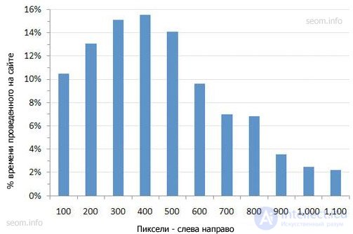
Based on the studies of Nielsen, a layer was compiled, with the overlay of which the zones of the site’s "heat" are shown (the most popular places). Layers can be downloaded in the following formats: .png or .jpg.
Compare the BabyAge site with left-sided positioning to the Amazon site after the layers are overlaid:
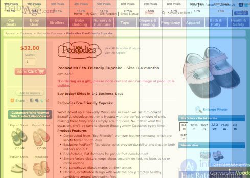
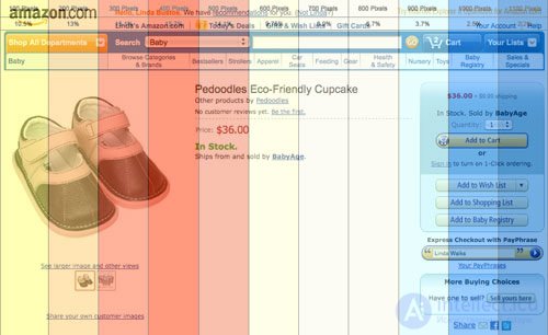
So that if BabyAge would place the basket in the hottest area?
Or another option, what would happen if you tested it on your online store?
Nevertheless, this study makes you think and even reconsider the positioning of your site. Try all the positioning options and find the most suitable for your site with maximum conversions.


Comments
To leave a comment
seo, smo, monetization, basics of internet marketing
Terms: seo, smo, monetization, basics of internet marketing