
Lecture
Touch controls work great for most mobile games, but they have one important limitation: the size of a human finger. When small objects appear on the screen or high precision is required, users start making input errors. Hitting a small button, selecting a tiny item in the inventory, aiming precisely, pointing at a spot on a map, or coloring a tiny area becomes much harder than with a mouse or stylus.
This problem occurs in games of all kinds: coloring games, shooters, strategies, puzzles, level editors and simulators. At the same time, it often cannot be solved by simply enlarging the objects, since this frequently conflicts with the gameplay, the design or the interface constraints.
That is why modern mobile games use various UX techniques that compensate for the imprecision of touch input. In this article we will look at the nine most effective approaches that make interacting with small elements more convenient and natural for the user.
This is one of the most common UX problems in mobile coloring games. It is usually solved not by making the user more precise, but by having the interface "help" them. Here are the main approaches, from the most effective to the less popular.
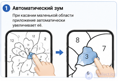
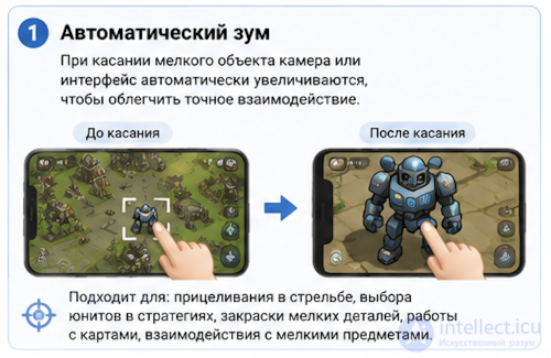
When the user touches a small area, the app automatically magnifies it 2–5 times.
Pros:
Cons:
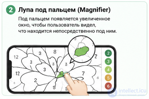
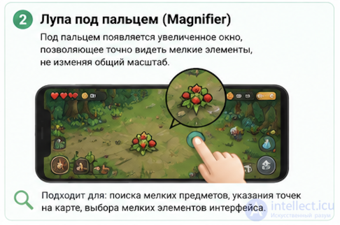
A magnified window appears near the finger so that the user can see what is directly beneath it.
     finger
       ↓
   ________
  |   🔍   |   ← magnified area
  |________|
This is how many image editors and drawing apps work.
Pros:
The most useful technique.
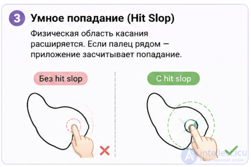
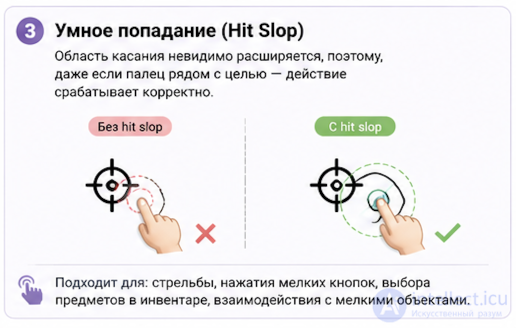
The physical touch area is expanded.
For example:
If the finger lands near the target area, the game counts it as a tap on that area.
This is almost unnoticeable to the user.
When the finger is near an outline:
It is similar to magnetic snapping.
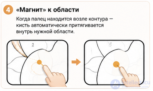
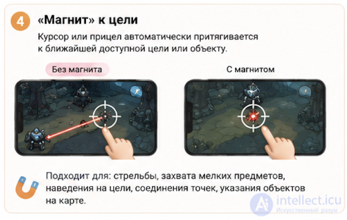
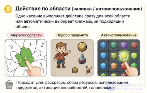
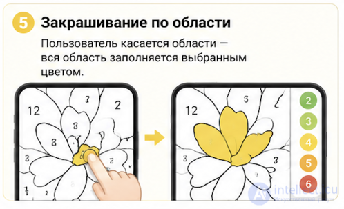
Instead of painting with a brush:
Many "color by number" games work this way. It is the simplest option for mobile devices.
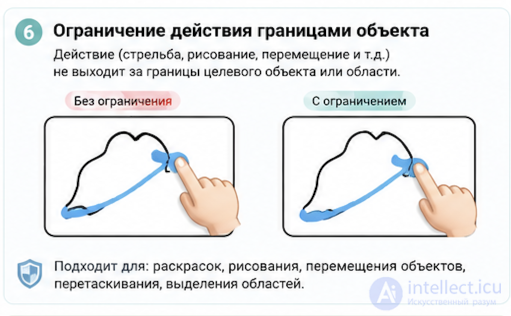
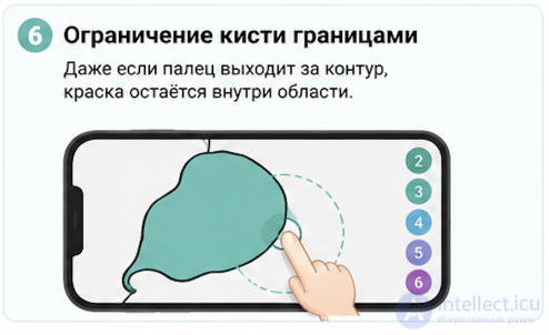
Even if the finger goes slightly beyond the outline, the paint stays inside the area.
██████████
██      ██
██ **** ██ ← the brush hits the outline
██ **** ██
██████████
To the user, it feels like they are drawing very neatly.
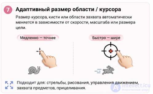
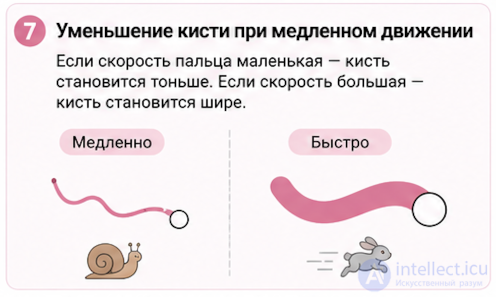
If the finger speed is low:
If the speed is high:
Some apps use this kind of stroke-size adaptation for finger drawing.
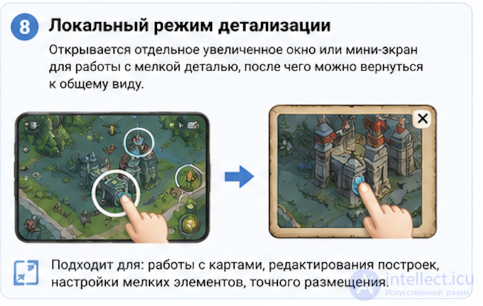
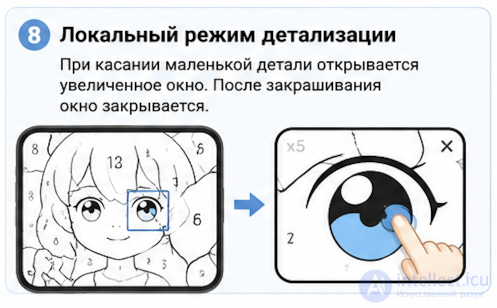
When a small detail is touched, a separate window opens:
Whole picture
      ↓
+------------------+
|       eye        |
|                  |
|       x5         |
+------------------+
After the area is filled, the window closes.
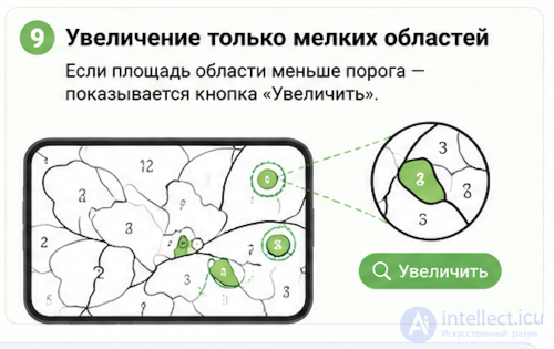
You can determine in advance:
if the area size < 100 px²
    show a "zoom in" button
Large details do not need magnification.
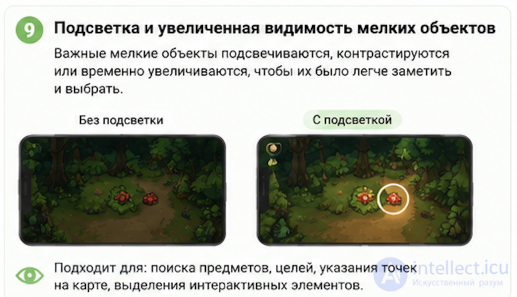
Sometimes the problem is solved not in the UX but at the content preparation stage:
This approach significantly reduces the number of hard-to-hit spots.
The most successful combination looks like this:
Such a set makes finger coloring comfortable even on smartphone screens, while the user hardly notices that the interface is actively helping them.
The problem of precise interaction with small objects is one of the fundamental characteristics of mobile devices. The user does not become less attentive or less careful, but the physical size of the finger and the absence of tactile feedback inevitably reduce input precision compared to a mouse.
That is why good UX in mobile games is built not on demanding maximum precision from the user, but on help from the interface. Expanded touch zones, automatic magnification, magnetic cursor attraction, restricting movement inside objects and other techniques keep the gameplay comfortable without changing its mechanics.
In many cases the best result is achieved by combining several approaches. The less the player notices the limitations of touch controls, and the less often they make mistakes when interacting with small objects, the more natural and enjoyable the game becomes, regardless of its genre.

Comments