
Lecture
This article will give you a general understanding of how to create stylish 2D graphics for games. This is not a step-by-step tutorial — it's something far more useful and inspiring!
The material is aimed at those who already have a basic understanding of 2D graphics in game development. First and foremost — at programmers who want to level up the visual side of their games, as well as anyone striving to create quality graphic assets.
By 2D assets, we mean here any two-dimensional in-game images — from sprites and interfaces to large backdrops and backgrounds. This article will introduce you to proven principles of visual design that can significantly improve the look of your game and save you time — and nerves. It will also help you avoid common mistakes of taste and composition.
There will be no discussions of image formats here, no debates between raster and vector, no reviews of specific programs — just the essentials, just practice and good ideas.
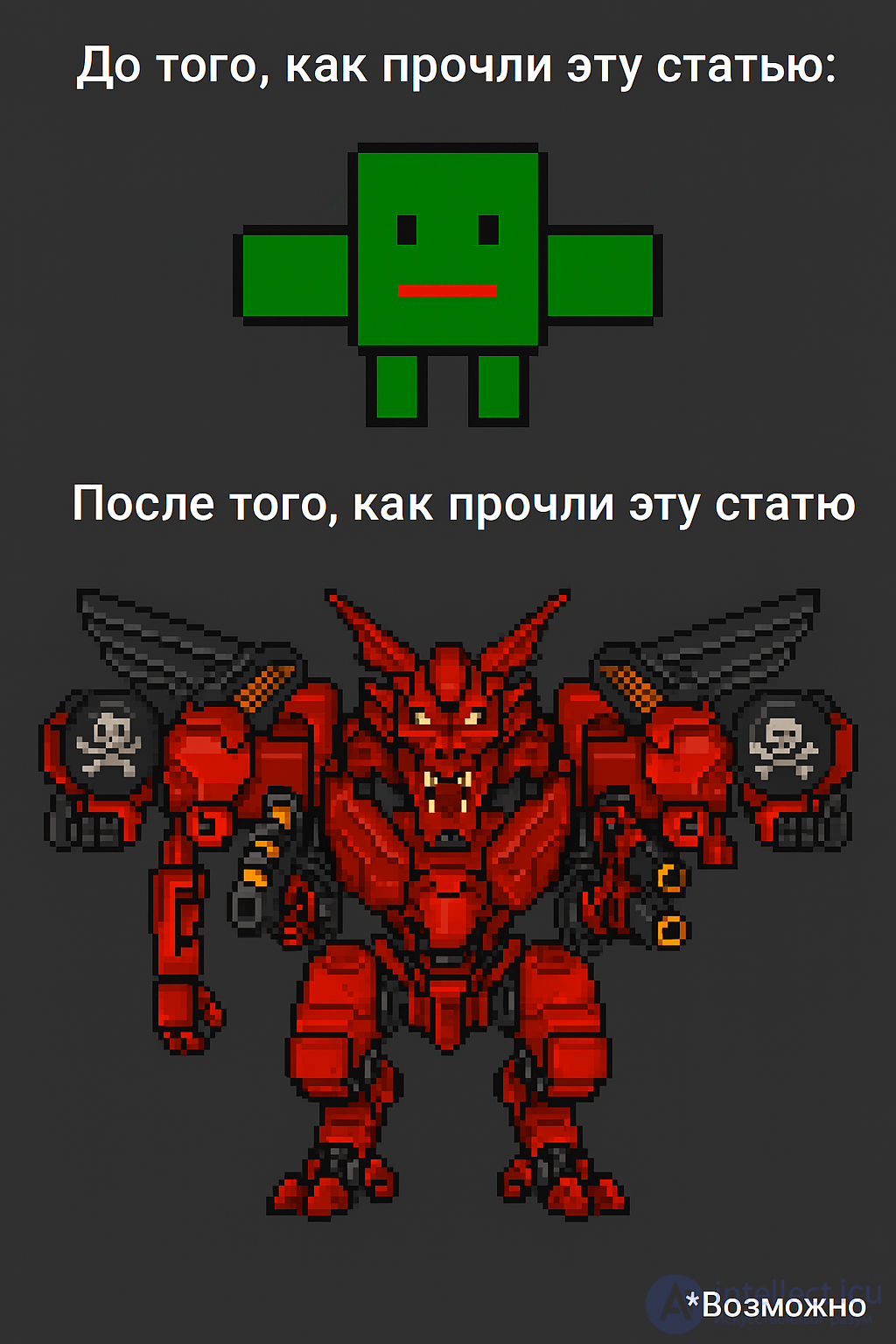
If you don't quite feel yet what we're talking about — take a look at a clear "before" and "after" example.
These aren't abstract pictures from the internet, but a real case: the top image was created by a programmer for his game, and the bottom one — the result of a light touch-up by his designer friend. The difference speaks for itself.
We constantly encounter 2D graphics in everyday life. We know how to tell "beautiful" from "ugly," but we don't always understand exactly why. And yet any image can be broken down into simple visual elements. Creating 2D graphics is, in a sense, assembling these elements into something that:
Resembles what you wanted to depict;
Doesn't make your eyes bleed.
Yes, we all know what a square or a sphere looks like. But how does that turn into a character you want to see in a game, rather than burn?
To figure this out — let's move on to the first part:
By understanding how shapes work, you'll be able to create visual images that literally speak to the player.
Shapes can make a game environment welcoming — or, on the contrary, unsettling. They can emphasize a character's personality — or make them look out of place in their surroundings. This is a powerful visual language, and it works even when you yourself aren't thinking about it.
Start simple. Circles, squares, triangles — these aren't just geometry from a school notebook. Try drawing a character made only of squares. Then — another one, made only of triangles. Compare them: which of them looks like a hero, and which — more like a villain? Such quick sketches from simple shapes — a great way to come up with designs without getting buried in details. (More on this — in the "Honing Your Skills" section.)
Traditionally it's believed that:
Sharp, jagged shapes = something dangerous, aggressive, frightening;
Soft, rounded shapes = something kind, organic, friendly.
On this scale, the triangle and the circle sit at opposite ends, while the square — somewhere in the middle.
Recall, for example, landscapes: the sharp cliffs of Mordor versus the soft hills of the Shire. And now imagine: the very same character, drawn rounded and cute. In which environment will he seem to be in greater danger — among spiky, sharpened shapes or among soft roundness? The environment amplifies the impression. This can and should be used in design.
And here's another great example: Godzilla versus Barney the dinosaur.
Both — large reptilians. But one of them is the embodiment of destruction, and the other — the hero of a children's show. What's the deal? It's all about shapes. Sharp spikes, an angular silhouette, tense lines — and before us is a monster. A round little face, a soft belly, smooth shapes — and we've already got a cutie singing about friendship.
Shapes — are not just a contour. They are mood, message, context. And the sooner you start working with them consciously, the stronger your graphics will become.
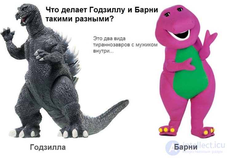
And Godzilla also has four toes on his feet
Think about it: Godzilla and Barney — are essentially the same thing.
Both — monsters inspired by the image of a tyrannosaurus. Both are designed so that a person in a costume can fit inside. But visually they — are opposites. One instills fear, the other — brings a smile. Why is that?
It's all about shapes.
Barney has — soft, rounded lines. Godzilla has — an angular, uneven, at times even sharp-cornered silhouette. And although this isn't the only reason (we'll talk about others later), it's precisely the contours that set the first impression.
On a basic level of perception, rounded shapes seem safer and more "alive" to us. And sharp corners and spikes — a signal of alarm. It's not for nothing that villains in pop culture are literally pricked with evil: recall Bowser from Super Mario, studded with spikes like an antagonist cactus. Whereas Mario himself — is a spherical, friendly image in overalls and a cap.
When Sonic appeared — he was conceived as a "rebellious" alternative to Mario. And the designers immediately intensified his form: spiky hair, dynamic lines, sharp corners. It was a signal: this character is sharper, faster, cooler.
But let's return to Barney and Godzilla.
To truly understand the difference, let's take a look at their silhouettes...
How personality affects a character's shape in a game
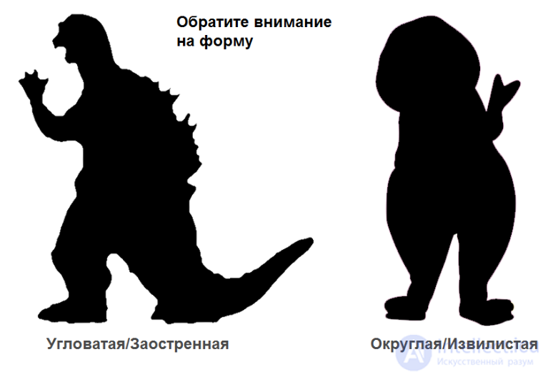
The more painful it would be to step on him — the meaner he looks.
It sounds funny, but in character design this is a surprisingly accurate rule. A prickly, sharp-cornered silhouette signals: "danger," "aggression," "stay away." And conversely — a soft, rounded contour says: "I'm one of you, I'm kind."
The silhouette — is the foundation of a shape.
You can work on the details as much as you like, but if a character reads poorly by silhouette — its design doesn't work. It gets lost, blends in with others, leaves no imprint in memory. That's why many artists start with the simplest thing — a black shadow. If at this stage everything is clear and recognizable — then the path chosen is the right one.
Simplifying an object down to a silhouette — is a great way to check how well it holds its shape. In short: if you want your graphics to "speak" for you — be sure to take into account outlines and the meaning they carry.
Shape — is not just "appearance."
It's a tool. Players perceive objects primarily by their outlines. Therefore — try to make all the elements on the screen have a distinguishable shape. This improves readability and speeds up recognition. And yes — a prickly sea urchin in the role of a kind hero can work, but it will most likely be perceived as strange. Not because it's "not allowed," but because the shape doesn't support the idea.
The takeaway is simple: everything you draw has a shape — and shapes influence how it's perceived. If you want your graphics to convey meaning — start by making the shape and that meaning match.
The human figure — is one of the most difficult objects to draw.
This is because in the body, muscles, bones, tendons, and skin are all intertwined — everything interacts and moves in a complex way. But don't worry — we won't be delving into a doctor's anatomy.
The main thing to understand: the human body has certain proportions.
The length of the arms and legs, the position of the pelvis, the size of the head — all of this is interconnected and follows a logic. That's precisely why anatomical mistakes are so noticeable: a person intuitively senses when proportions are off.
Of course, stylized characters (like Mickey Mouse) can ignore many rules — and that's fine. But to consciously break anatomy, you first have to understand it well. So it's better to learn from realistic forms first, and only then move toward simplification, stylization, or the grotesque.
A convenient reference point is the head.
Usually a person's height is measured in "heads." In reality — about 7.5, but artists often round up to 8 so the figure looks more proportional and elegant.
Example:
1 head — from the crown to the chin
2 heads — to the chest
4 — to the groin
6 — to the knees
8 — to the heels
These aren't rigid laws, but a great foundation. By comparing parts of the body to one another, you'll better understand structure, develop your eye for proportion, and get closer to the visual "golden ratio" of the figure.
The rule of 8 heads
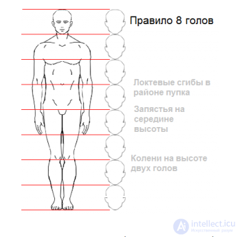
There are many proportion diagrams, and not without reason.
The size of the head relative to the body — is not just numbers, it's a way to control how a character is perceived.
A large head = friendliness and "childlikeness."
A small head = maturity, strength, threat.
When a character has a disproportionately large head, they seem cute, naive, and safe — like a child. That's why such proportions are often used for heroes the viewer is supposed to feel sympathy toward. Barney — is a prime example: a giant body, but a large round head makes him almost plush.
Godzilla, on the contrary, has a comparatively small head and a massive body. This lends the image seriousness and weight, emphasizes his monstrousness. Even if you didn't know a single detail about the personalities of these two creatures — their proportions would already tell you a lot.
The takeaway is simple:
Proportions — are a powerful tool of visual storytelling.
They directly affect the first impression of a character and set the emotional tone.
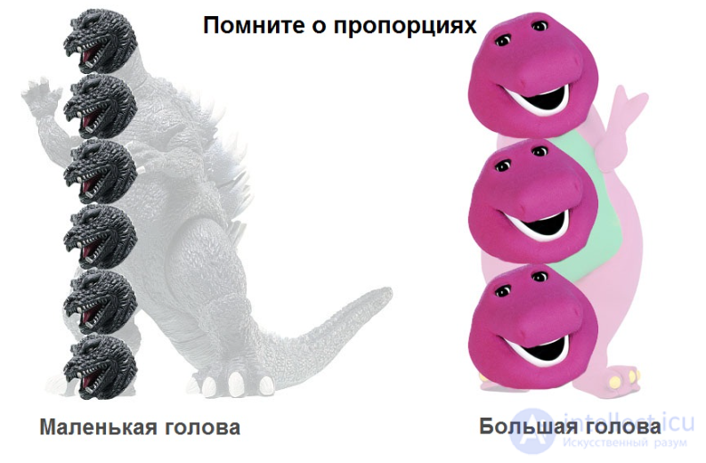
Godzilla looks grown-up and menacing, while Barney — well… frankly sycophantic.
And all of this — is the result of proportions. The sizes of body parts relative to one another directly affect how a character is perceived emotionally.
In short:
For characters to look convincing, the proportions have to be right. Violating these ratios can ruin the entire image — even if the shape, color, and details are chosen correctly. Fuzzy proportions throw off perception and leave the viewer confused: is this a hero or a joke?
So yes — drawing correctly — is not only about lines and shadows, but also about ratios. Proportions — are the foundation.
Perspective — is a way to create the illusion of depth on a flat surface.
With its help, a two-dimensional image begins to look three-dimensional. Perspective is achieved by distorting the shapes and contours of objects — and this is quite a large topic, so we'll break it down piece by piece.
In theory — it's all simple: want a realistic scene — use geometric perspective. In practice, though, it's all more complicated. In most 2D games, developers deliberately don't use precise perspective, because it requires a great deal of time and effort. Drawing every detail while accounting for vanishing points and angles — is too labor-intensive, especially if the team is small.
That's why developers often take the simpler route:
A flat side view, like in classic platformers such as Super Mario — where everything is visible equally well, as if the world had been unfolded toward the player.
Or an isometric projection, where objects seem tilted at an angle of 30–45°, and a sense of depth is created, but without true perspective. It's still not realistic, but it looks convincing and is much simpler to implement.
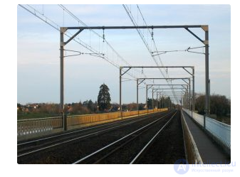
We'll break down geometric perspective in detail — it's the most difficult, but at the same time one of the most important topics to understand if you want to seriously improve the quality of your graphics. Even a basic grasp of it will already produce a noticeable effect.
At the center of the formal theory of perspective stands the idea of the vanishing point — the place on the horizon where parallel lines seem to converge. Imagine railroad tracks: although they run parallel, at a great distance they seem to merge into a single point.
(Here you can picture the corresponding diagram or drawing with rails converging to a point on the horizon.)
To understand the power of the effect, imagine an even more impressive scene — a train racing toward you, which visually becomes larger and larger as it approaches.
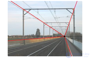
Notice how the parallel lines converge — both the real and the imaginary ones?
We could add even more red lines to the drawing, but even so everything becomes clear: they all converge at a single point — the vanishing point. And the familiar line that separates sky and earth — is the horizon line. It arises where the infinite planes of the earth and sky intersect from the observer's point of view.
The idea of the vanishing point and the horizon line is very simple:
objects that are far away seem smaller than those that are closer,
and the side of an object facing us looks larger than its far part.
The example above shows perspective with one vanishing point — the simplest kind. In fact, the number of such points depends on the number of sets of parallel lines on the object — each set has its own vanishing point.
Sounds complicated? It is, which is why artists often simplify the task and use:
one-point perspective,
two-point,
or three-point.
In one- and two-point perspective, it's assumed that one or several sets of parallel lines remain parallel and don't converge at all.
Here's an example of a cube and a rectangular box depicted in one-point perspective:
One-point perspective
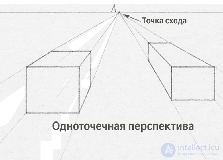
Pencil and paper... what else did you expect?
Note: in one-point perspective, the horizontal and vertical edges remain strictly parallel — there are no distortions in these directions.
This is one of the reasons why this drawing method is often chosen for simple and clear scenes.
Now let's look at two-point perspective:
Two-point perspective
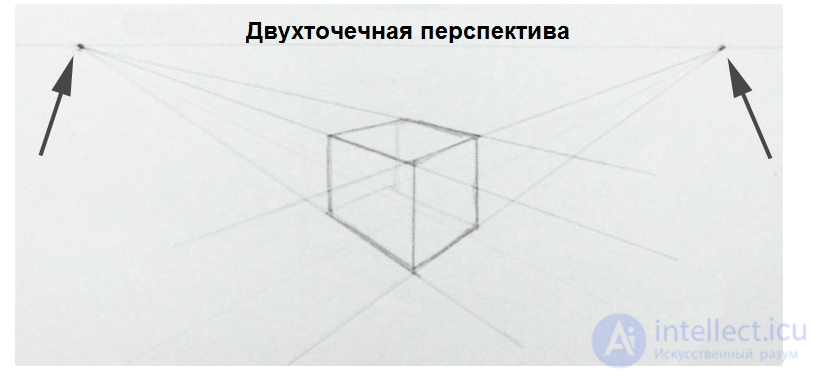
When depicting objects in perspective, their back side is often drawn as well — this makes it easier to convey the sense of three-dimensionality.
In this example, the horizontal lines that used to be parallel now converge at the vanishing point. And the vertical edges still remain parallel.
Finally, three-point perspective:
Three-point perspective
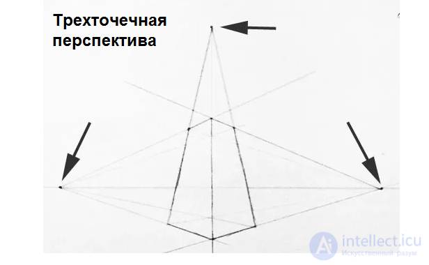
In three-point perspective, objects look truly epic — especially when it comes to height!
Now each edge gets its own vanishing point — and we can congratulate them on that.
It's worth noting that vanishing points are easiest to draw for parallel lines. But if you draw guides or even entire rectangular boxes for complex objects, this significantly helps you feel the depth and volume.
One-, two-, and three-point perspective — are the most popular methods, but there are also experimenting artists: one of them even used six-point perspective to create truly crazy spherical scenes!
And now about the trick with circles and tubes:
in perspective, circles don't stay round — they turn into ellipses, especially when you look at them at an angle. The greater the tilt — the stronger the compression and stretching of the ellipse.
Perspective for a circular cross-section
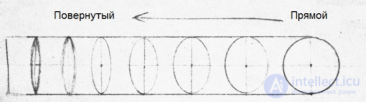
The circle turns into an ellipse
Here's a simple rule for drawing cylinders and similar objects in perspective:
If you're looking at the edge of a cylinder from below upward — the curve will bow upward.
If, on the other hand, you're looking from above downward, for example at the base of a tree trunk — the curve bends downward.
At the same time, the horizon line always passes through the middle of the image — your reference for the correct direction of the curve.
Cylinder projection
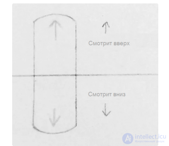
To emphasize the volume of figures, they're usually shaded, but for clarity we'll leave the images without shadows.
It's important to remember: in most 2D games, they strive to simplify the task and avoid the complexities of geometric perspective. Usually a side or top view is chosen, where perspective is almost unnecessary, and objects look readable and simple.
When a character is drawn with perspective taken into account, it's said that they're depicted in a certain foreshortening.
For example, a fist aimed straight at the viewer not only seems significantly larger than a fist seen from the side, but also covers part of the arm — creating an effect of depth and volume.
Example:
A character in foreshortening
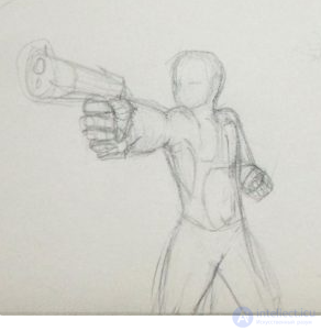
Approximate, but effective.
In real work, many artists don't bother with precisely calculating all the vanishing points and build foreshortenings by eye — this saves time and lets them move on quickly. Nevertheless, to understand how everything should look from a technical standpoint, it's useful to know the basics of construction using vanishing points.
Below you'll see an example of foreshortening where each limb is worked out with simple cylinders and marked vanishing points. This approach helps accurately convey the volume, direction, and perspective of body parts, which is especially important with complex poses.
This method is often applied at the sketching stage — it not only speeds up the process, but also helps avoid mistakes that are hard to fix at later stages.
Auxiliary foreshortening with vanishing points and cylinders
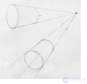
Cylinders are easier to draw than people
Remember: characters, especially human ones, are often depicted as a set of simple shapes that are easier to combine. This is normal practice — first make a sketch from cylinders connected by "joints," and only then draw a more detailed figure inside them.
With overlap, everything is fairly simple: objects located closer to the player will overlay more distant ones and partially or fully hide them. This is a very important technique for 2D games, since it helps quickly understand where the player is relative to surrounding objects and characters.
Let's look at a simple example that will clearly show how overlap works and why it's needed.
Overlap of 2D shapes
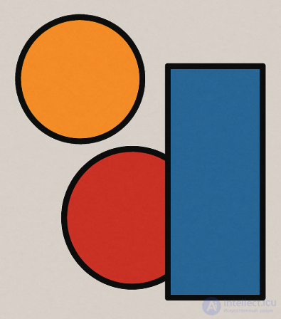
This picture went down in history as the strange hills in the background of every game in the Super Mario series
This set of lines creates a sense of depth: the small round object on the right (for example, a bush) seems to be positioned closest of all, while the largest one — on the contrary, is behind. This visual technique is often called the "T-rule," because the intersection of the lines of objects standing closer and farther resembles the letter "T."
Although the rule seems simple, it's very effective and helps quickly understand who's in front of whom. In the example given, all the "T"s are as if inverted — but the essence doesn't change because of that.
The T-rule
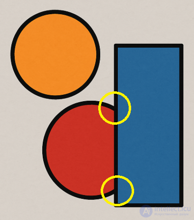
The T-rule (or T-junction rule) in the context of 2D drawings and visual perception describes how overlapping objects create the illusion of depth, especially when one object partially covers another.
The T-rule of overlap — is a visual principle in which a line (or the edge of an object) that crosses another line at a right angle and "stops" at it is perceived as the front object, while the line that continues behind it — as the back one.
When objects overlap in a 2D image, a "T-shaped" corner forms at the point of contact.
The "cap" of the T — is the line of the front object (which overlaps).
The "stem" of the T — is the line of the back object (which is overlapped).
Imagine that in your drawing you have:
A rectangle partially covering a circle.
At the point of intersection, we see that the lines of the circle "break off" at the point where the rectangle overlaps them.
The eye reads the T-shaped configuration, and the brain draws the conclusion: "the rectangle is closer, the circle is farther."
Creating depth without perspective: even without linear perspective, you can show which object is "in front" and which is "behind."
Reading the scene by the player: helps the viewer correctly interpret scenes, especially in platformers and puzzles.
Avoiding visual mistakes: if lines accidentally form incorrect T-junctions, this can distort the perception of the scene.
Use T-shaped overlaps to manage layering and depth.
Avoid "Y-shaped" intersections or lines where it's unclear who's overlapping whom — this creates visual confusion.
Contrast and color also help determine depth, but the T-rule works even in line drawings without color.
In combination with shading and a blurred background, the T-rule becomes a powerful tool of depth.
Parallax — is an important technique connected with the sense of depth and perspective.
The essence of the effect is that as the observer moves, more distant objects shift across the screen more slowly than nearer ones. This creates the impression of three-dimensional space even on a flat screen.
Parallax is ideal for 2D games — it's relatively simple to implement, and you've surely already encountered this effect in popular projects.
If you want to dig deeper, I recommend starting with this article on Wikipedia — it lays out the basic ideas and principles.
In 2D games, the classic rules of perspective are often deliberately ignored — simply because it's much easier and faster to draw that way. In such cases, you have to use other techniques to create a sense of depth and distance.
One of the simple and effective ways — is to make objects that are farther from the viewer more blurry and less detailed. This helps visually separate near objects from distant ones and adds realism to the scene.
Here's an example from real life — a photograph of an urban landscape of industrial China, where the distant buildings look less sharp and bright compared to those located closer.
Aerial perspective
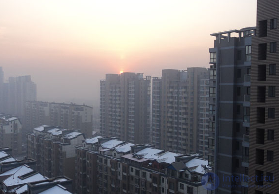
Urban smog in all its glory
You'll probably also notice the effect of geometric perspective — although in this case the main vanishing point is on the left outside the frame.
Practically every classic 2D platformer uses aerial perspective to add depth and atmosphere. A great example — is Super Mario World, where the backgrounds gradually lose sharpness and saturation, creating a sense of distance.
Aerial perspective in a 2D game
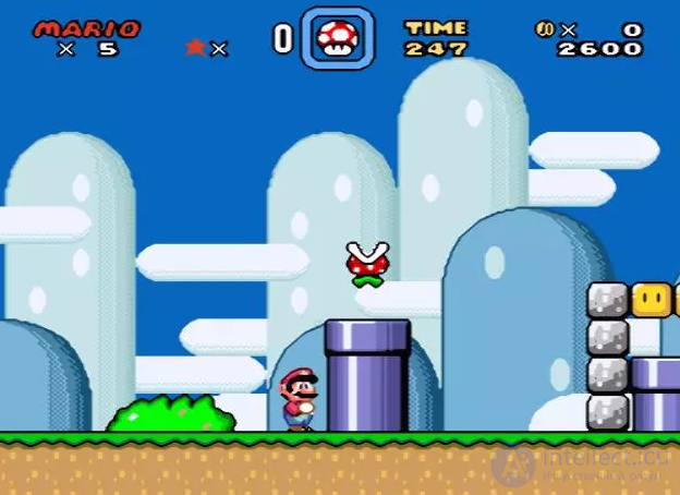
As well as overlap and parallax
Notice how the visual clarity of objects in the background changes with distance: the farther an object is from the foreground, the more strongly it blurs. This visual fading — is not just a decorative technique, but an important tool of communication. Even by the degree of saturation and sharpness of contours, you can understand how close an object is to the player. All of this comes down to one fundamental idea — contrast.
Contrast — is what directs the player's gaze and tells them what to focus on. It literally whispers: "This is what's important, and the rest — is just background."
Look again at the screenshot from Super Mario World. The softly darkened blue hills in the background? They create atmosphere, but don't demand attention. But the pipe with a bright white highlight and a bold black contour immediately catches the eye — it's important. And, of course, the only richly red object on the screen stands out instantly — it's critically important for interaction.
Remember: if an object in a game is interactive, it must stand out among the background and other decorative elements. Exceptions are possible only in those cases where you deliberately need to hide something — for example, to create a mystery or a puzzle.
Color – is a tricky topic, and one of the most subjective in art in general. There's no accounting for taste in color, and color combinations and their meanings differ across cultures. White may be the color of purity in the West, but in Japan it often means death. Nevertheless, there are a few basic ideas about color that will help you understand what's happening with your graphics. Let's start by thinking about what a particular color is made of.
Hue, saturation, brightness
There are many ways to break colors down, but the one discussed here is the simplest and most convenient for beginning digital artists.
Let's start by comparing two colors:
Two colors
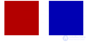
Red and blue
Red and blue. It's clear these are different colors, right? But in fact there's a more precise term Hue. The left square has a red hue, and the right one has a blue hue. Other hues include green, orange, purple, etc. Although hue may seem like a redundant term for defining color, it isn't, because the amount of any hue in a color can change:
Two hues of one color
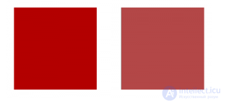
Red and pale red
So, before you are two red colors, but how do they differ? The one on the right has sort of slightly… faded. It has a lower Saturation.
Saturation denotes how much color there is in the color, or what its hue is like. You can think of saturation as the amount of gray in a given color. No gray – a saturated color. A lot of gray – unsaturated. So in this case the square on the left is fully saturated, and the one on the right – less saturated. Pure gray – is simply a color without saturation. Saturation is the trickiest of the color properties, on which a beginner might slip up. Just keep in mind that saturation has a big influence on the atmosphere of your graphics. Highly saturated colors, when used in large amounts, tend to look more friendly, while unsaturated colors are associated with a serious style.
The last property – is Brightness. Sometimes Value is used instead. Brightness is much easier to understand: it shows how bright a color is. Here's the same red as above, and its less bright (i.e. darker) version:
Another two hues of one color
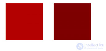
Red and dark red (less bright)
The relationship between brightness and saturation needs a bit of sorting out:
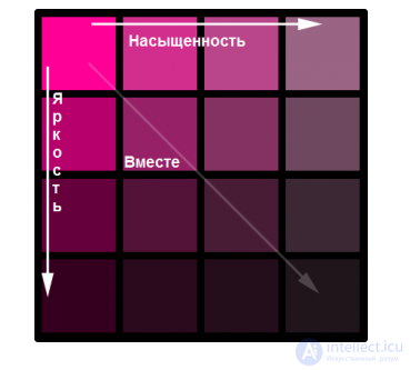
These properties can be changed simultaneously
Here's an example of how color can influence a game's atmosphere. New Super Mario (if you're already tired of examples from the old one) and Castlevania: Lords of Shadow are compared.
The video game artist chose bright colors for a reason
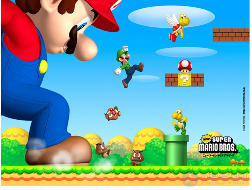
Also note that no bloody chunks flew off Mario when he stepped on a mushroom
Game graphics in gloomy tones
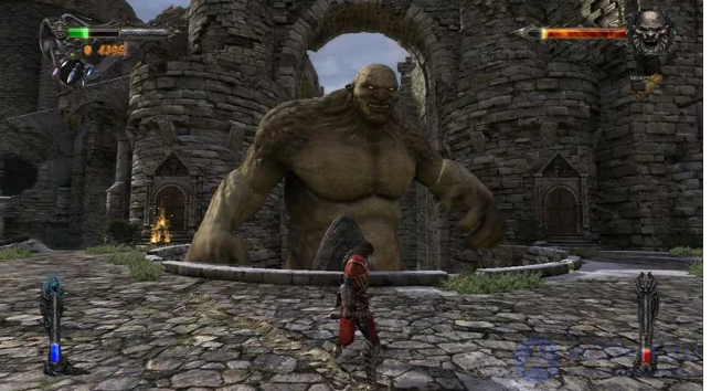
Nothing special, just wanted to show how nicely the bright status bars stand out against the overall background
Speaking of color, we can once again recall… Barney and Godzilla! Think about how color makes them so different in terms of hue, brightness, and saturation, and what would happen if one or several of these properties were changed. What would happen if you took just one property and gave it to both characters? Do you still want to hug a gray Barney?
Briefly about RGB
Congratulations! Now you understand the HSB color model (Hue Saturation Brightness) or HSV (Value = Brightness). Practically any image-editing program uses this term alongside RGB (the Red Green Blue color model) and CMYK (Cyan Magenta Yellow Black). But HSB, apparently, most simply explains what's happening with colors. Especially with respect to how bright or saturated the color you need is when you're working on shading. However, in various applications you'll have to deal with the RGB color model, so let's briefly consider it too. RGB simply describes all colors in terms of red, green, and blue, since all colors can be described as a combination of these three. The human eye processes color information in a similar way. Take a little time to play with color values and see how the HSB and RGB values change, and how they're related to each other. Here's a standard RGB diagram (note what happens when the colors overlap):
RGB diagram
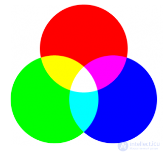
Also known as the additive color model, since colors are created by adding light rather than absorbing it (as in the subtractive model)
Look how the combination of all three colors yields white. You can imagine as if the colors are playing tug-of-war, because when they have equal brightness, the hues cancel each other out and white or gray remains. But if you mix colors in different proportions, you may get confused in the logic of arriving at the result, which is why, when working on graphics, we advise HSB.
The color wheel
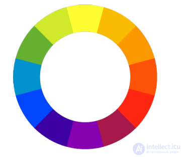
Now that we've figured out what color is, let's start looking at color combinations. Color theory is complex and rather subjective, so the following should be regarded not as an ironclad rule, but as a direction for further development.
The foundation of color theory itself is the color wheel (color circle). To simplify the explanation, the wheel – is a subjective arrangement of color hues relative to red, yellow, and blue, which divide the wheel into three parts (the so-called primary colors), and green, orange, purple (secondary colors) between them.
The color wheel
A typical color wheel
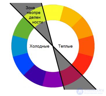
Hues are also usually subdivided into warm and cool, in terms of color temperature. Moreover, red-yellow colors are considered warm, and blue colors cool, as shown below:
Dividing the wheel by color temperature
Fun fact. To convey the heat in the shot, in the film "Do the Right Thing" (1989) the director added more orange tone
Here a zone of uncertainty is added, since the colors included in it are a kind of borderline. But yellow-green is often classified as cool, and magenta as warm. It's important to remember that cool colors are associated with dark shades, so a shadow of a cool color will be perceived as darker than one done in a warm color of the same brightness.
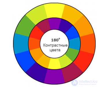
Other relationships between colors can also be explained using the color wheel. Analogous colors – are simply hues next to each other, such as green, yellow, and the colors between them. Contrasting colors – are colors (hues) 180 degrees apart from each other, which seem brighter when used together. You've probably seen them in action, even if you didn't know why. Blue and orange have even become a trope (a standard stylistic device).
How pairs of contrasting colors are obtained
If you use Firefox, look at the icon. Blue and orange again!
When working on game graphics, try to associate colors with certain races or enemies, environments or levels. Color-coding isn't mandatory, but you can use it as a way to influence players' perception. Think about a set of colors for the bad guys, but use, for example, unique shades of these colors for specific enemies. Don't be afraid to experiment and try to use rarer colors. In any sufficiently advanced image-editing program (for example, GIMP), color is easier to change than any other property. This is one of the few things that can be easily changed in a finished drawing.
In short: Colors can be separated and compared to one another in various ways, and in different combinations pairs of colors can look better or worse.
In this part you'll see many examples of pixel art, but they talk about basic concepts that apply to any type of 2D graphics.
Light sources
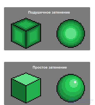
Beginning artists often don't understand why they actually draw light and shadow. Shading a drawing usually means applying different shades to create the illusion of light in the drawing, exactly the way perspective – is the illusion of depth. And just as with perspective, you need to create some kind of 2D analogs of the effects visible in reality. There's only one rule here: light has to come from somewhere. It can't be everywhere, so if you just color in a drawing, it will look wrong. When beginners try to draw shadow but don't understand how, it leads to objects that look like this:
Pillow shading in pixel art
Seriously, don't do this
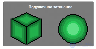
Compare with the version without shadows:
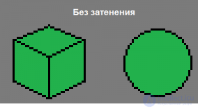
Pixel art without shading
Better to leave it like this than how it was above
This is called pillow shading, and it's very easy to draw without thinking. It seems natural to shade objects along their outer contours… but it looks absolutely unnatural. For lighting to look right, it must have a direction, and the lighting/shading of a surface needs to be built depending on which side the light source is aimed at the object from. The light source can be the sun, a lamp, a lake of boiling lava, etc., or it can be left abstract.
For example, you can simply assume that almost all light falls from an infinitely distant source at a 45-degree angle. This is enough to nicely shade objects in most cases. For animated sprites that will be used on various backgrounds, a bit of ambiguity helps keep them looking appropriate everywhere.
Here's an example with a light source in the upper left corner:
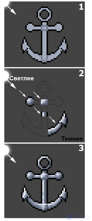
Correct shading
You also need to think about whether one of the object's parts might cast a shadow on the others
The parts facing the light source will be lighter, and those opposite them – darker. What could be simpler? But it's not always exactly like that…
Flat and curved surfaces
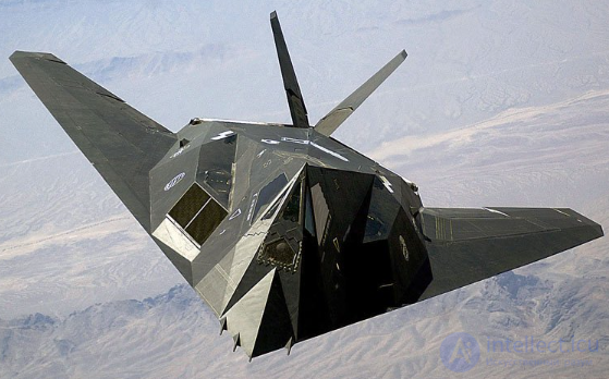
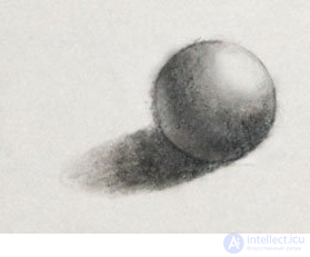
Flat surfaces usually have almost the same shade everywhere, while on curved ones we'll see a gradient. Elegant examples from the real world:
The F-117 bomber
The American F-117 bomber. Flat surfaces
The F-15 bomber

The more familiar-looking F-15. Curved surfaces
Let's return again to the paragraph about shapes. Which of these bad boys will seem good to you, and which will put you on guard by their appearance alone?
You can see a real gradient between light and shadow. Note the left wing; the gradient on it is simply perfect. Now let's return to the previously mentioned monstrosity with pillow shading:
Pillow shading again
Correct shading in pixel art
The light source for the cube and the sphere isn't quite the same. What's the difference?
And here each face of the cube needs only one shade, while the sphere needs far more – to imitate the gradient nature of shadows on curved surfaces.
Reflected light
Above we looked at simplified shading, since light can further reflect off surfaces and illuminate shaded areas. This often means that the part of the shadow that is farthest from the main light source is actually lighter than in other places. The effect is most noticeable when an object is large or is very close to a reflecting surface. Below is shown a classic example:
You can also draw 2D games in this style
Such shading lets you better feel the volume
A couple more digital examples on the same theme.
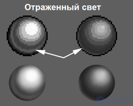
If the spheres were on a blue surface, the reflected light would have a blue tint
In the left example you see the reflection of light located beyond the edge of the drawing, which is what happens with strongly reflecting surfaces. The stronger the incident light, the more distinctly the reflected light is seen too.
Change of color tone
The change of tone is connected with the reflection of light and can be shown very well using the example of pixel art. The basic essence of this phenomenon is that the tone of a shadow or reflected light isn't always merely a darker or lighter version of the object's base color.
Most often, a change of tone can be encountered in objects illuminated by the sun. Direct sunlight has a yellow tone, but the blue sky reflects its color onto the shadows, so we get yellow highlights and shadows of a blue tone.
Change of color tone
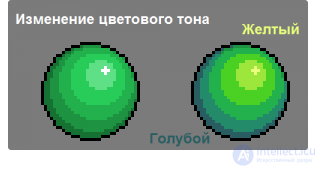
Let's recall warm and cool colors. Highlights have a warm tint, and shadows – a cool one
This concept takes on importance when you have additional light sources and they differ in color from the main ones (for example, molten lava). Remember that colored light will change the color of the illuminated object. However, a change of tone can also just be a stylistic choice. By exaggerating the effect or substituting additional colors, you can achieve a very interesting picture:
The sepia effect
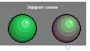
If you use tints too much, the game will resemble Instagram
It's also worth knowing that shadows are less saturated, and that less saturated colors can seem darker than they actually are.
Among artists there's no consensus regarding the change of tone. Find your own solution, but remember that the more strongly you change the tone, the more surreal your drawing will become.
Shading can hint not only at an object's shape, but also at its texture. An object's texture affects how light reflects off it. Therefore, by changing the shading you can sometimes change the impression of the texture. To distinguish some types of textures, there are their own terms:
The main types of textures
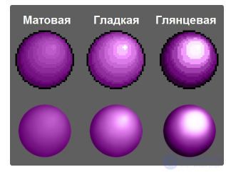
This will come in handy someday when you buy paint for renovations
From a surface with a glossy texture, light reflects well and with very little scattering. This means the illuminated part of the object will be very bright (due to good reflection), and the unlit part – very dark (because the additional illumination comes from scattered light, and there isn't any). A good example of a glossy texture is a just-polished car body.
A matte texture doesn't reflect very well and scatters light on reflection. This means it seems more evenly lit. A good example of a surface with a matte texture is an old car tire.
A smooth texture sits somewhere in the middle. It reflects well, but strongly scatters light on reflection. A smooth texture is often found on plastic, for example most computer keyboards.
So, don't forget about the properties of the materials you depict. Is it glossy metal or matte fabric? The clothing of medieval characters shouldn't reflect light like plastic, and space armor shouldn't seem soft to the touch.
In short: For 2D graphics to look believable, light must have a direction.
We recommend studying (in English): The drawing course by Niklas Jansson
Honing your skills
What to do now that all the basics have been laid out? Go for it! Start trying! It's true: anyone can draw. Of course, some people have more skill, but the biggest difference between a bad artist and a good one – is how much they've practiced. The more practice, the better you master the skill. But practice wisely. Game projects provide a great opportunity for this. If you've dreamed about your own game, start making sketches for it while reading this article.
If you don't have your own, join other people's game projects! Even in the smallest game there's enough graphics for you to get great practice and draw noticeably better next time. And one more thing: to be a game artist, you don't necessarily have to draw like Renaissance-era artists.
Pencil and paper
The only way to draw better – is to practice, and the cheapest and simplest way – is to do it with a pencil and paper. It's tempting to use only digital tools, since you'd get a finished result right away. But don't give in to temptation! When you draw by hand, you participate in the process more actively. In addition, you'll be able to avoid some bad habits that arise when you rely entirely on the computer. Of course, the tools in a program can look very powerful. But if you try to draw sprites using auto-shapes first, believe me, you'll end up with funny and ugly things that would have been impossible to make with a pencil sketch.
After you've developed good basic habits, there will be plenty more time to ruthlessly explore all the tools and techniques. Does it seem strange to you to draw with a pencil on paper if you're already used to working in a program? But it's not for nothing that this became the starting point for artists all over the world.
Get yourself a sketch pad (it says sketchbook on the cover), pencils, and a good eraser. You'll have to use the eraser very often. The sketch pad, though, is optional. The key idea is that you need practice, so you can draw even in the margins of your school notebook. But in a pad all the works will be in one place, so you won't later regret that your most successful drawing of a villain ended up on a sheet with homework.
Sketches (a.k.a. sketches)
In pencil sketches it's better to consider that all the lines – are only temporary assumptions, not the final version. Don't become dependent on your lines. Draw over them, erase, and draw again without regard for what's already there. Of course, for this you need to make the lines light enough. Start with the basic shape of your object and gradually add details. Most objects can be approximated with basic shapes, that is, a sphere, a cylinder, and a "box," which is especially useful for drawing in perspective.
For example, don't draw a more or less finished head, but switch to the rib cage, then the arms, legs, etc. By going into details prematurely, you might lose sight of how they all correspond to one another. Draw everything together on a large rough sketch and add details on top. Don't be afraid to continue sketching over the first lines until you achieve the ideal of the overall shape, and don't be afraid to start over.
This video shows excellently how an artist builds the basic structure of a character, layers rough shapes on top, while adding more and more new details, and also erases and redraws details that look bad. And here's a picture from a beginning artist's pad:
How to draw a character for a 2d game
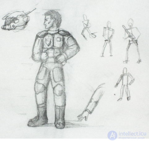
A typical sketch
Draft, draft, draft again
At first it may seem crazy, but you should pencil-sketch at least three versions of any character/object/menu element on paper. Only after that can you transfer them to the computer for refinement. Large studios often create literally dozens of concepts of a single character before they even think about making a choice. Sketching three versions even for non-interactive background assets, such as trees or bushes, – is a common thing. You take a big risk if you rely on the first version as the only and final one. Having come up with three different versions, you can take the best from each and combine them in the final. Here's a simple example, where each of the cool space helmets differs from the final version below (that one is based on even rougher early sketches):
How to draw 2d graphics
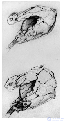
Review the section on anatomy and proportions. Without knowing the structure of the skull, it's hard to come up with a decent helmet
A space helmet
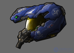
The top little thing should actually cast a shadow on the visor
If it seems that following such advice is very hard, keep remembering: you're drawing rough, very rough, roughest sketches. Don't spend time on them. In fact, in most cases the less, the better. The longer you work on a version, the harder it is for you to agree to redo it or to create another version. Leave the details aside, just convey the general idea and move on. You can always go back and work up a sketch if you liked it.
Be prepared for the fact that you'll have to draw, and draw a lot, and that at times you'll have to get frustrated. If your drawings seem incomprehensible to you, it only means that nothing human is alien to you. Next time it'll turn out better, and then even better. Remember that it's normal to be dissatisfied. If drawing were a simple pursuit, this article wouldn't have appeared. In essence, if you're 100% satisfied with your drawing, you're not trying, you start losing friends and convince yourself that this blurry mess is what you originally wanted to draw.
In short: Always make several pencil versions of your game art first, and don't try to achieve perfection right away.
Now you know the basics and are fully ready to create decent graphics for 2D games. If you're interested in learning more on the topic, throughout the article you can notice links to additional sources. The article itself is largely based on Chris Solarski's book "Drawing Basics and Video Game Art." You can read some of his writings here. Go for it!

Comments