
Lecture
Web components are a web development technology that lets you build reusable components (or widgets) using standard web technologies such as HTML, CSS and JavaScript. Web components provide a convenient way to organise code, improve its readability and keep things modular when building web applications.
Web components should not be confused with HTML Components (HTC) — that is an obsolete technology.
Here are the core concepts of web components:
Custom Elements:
Custom elements come in two parts: autonomous custom elements and customised built-in elements. Autonomous custom elements are HTML elements that are entirely separate from the native HTML elements; essentially they are built from the ground up using the Custom Elements API. Customised built-in elements are elements built on top of native HTML elements in order to reuse their functionality.
Shadow DOM:
The Shadow DOM is a feature that lets a web browser render DOM elements without placing them in the main document's DOM tree. This creates a barrier between what the developer and the browser can reach; the developer cannot access the Shadow DOM in the same way as nested elements, while the browser can render and modify that code just as it does nested elements. The effect of CSS being scoped to a particular element's Shadow DOM is that HTML elements can be encapsulated without the risk of CSS styles leaking out and affecting elements they were never meant to affect. Although these elements are encapsulated as far as HTML and CSS are concerned, they can still fire events that other elements in the document can receive.
The scoped subtree inside an element is called a shadow tree. The element the shadow tree is attached to is called the shadow host.
A shadow DOM must always be attached to an existing element, either by attaching it as a literal element or via script. In JavaScript, shadow DOMs are attached to an element using Element.attachShadow().
HTML Templates:
An HTML template is a way of inserting fragments of HTML cloned from a template at will. The syntax of HTML templates looks like this:
< html >
    < template >
        < h1 >< slot  name = "title" >/ slot >/ h1 >
        < p >< slot  name = "description" >/ slot >/ p >
    </ template >
</ html >
Scripts will not run and resources inside the template will not be fetched until the template is instantiated.
HTML Imports:
JavaScript API:
The benefits of web components include code reuse, better modularity, hiding implementation details, and the ability to create your own custom elements. However, as things stand, support for web components can vary between browsers, and polyfills are sometimes required for compatibility.
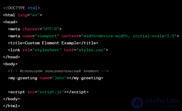
An example of creating a custom element with the Custom Elements API might look like this. Say you want to create a simple custom element <my-greeting> to display a greeting with a name. Let's implement it using HTML, CSS and JavaScript:
/* Styles for the custom element */
 my-greeting {
      font-family: Arial, sans-serif;
      color: green;
 }
JavaScript (script.js):
// Defining the class for the custom element
class MyGreeting extends HTMLElement {
  constructor() {
    super();

    // Getting the value of the "name" attribute
    const name = this.getAttribute('name') || 'Guest';

    // Creating the Shadow DOM
    const shadow = this.attachShadow({ mode: 'open' });

    // Creating an element to display the greeting
    const greetingElement = document.createElement('span');
    greetingElement.textContent = `Hello, ${name}!`;

    // Attaching the element to the Shadow DOM
    shadow.appendChild(greetingElement);
  }
}

// Registering the custom element
customElements.define('my-greeting', MyGreeting);
In this example:
Now, if you open the HTML file in a browser, you will see "Hello, John!" with the styles from the CSS applied. You can also use this custom element elsewhere in your project.
Web components are supported by the current versions of all the major browsers.
Backwards compatibility with older browsers is achieved through JavaScript-based polyfills.
There are many libraries built on top of web components with the aim of raising the level of abstraction when creating custom elements. Some of these libraries are: X-Tag, Slim.js, Polymer, Bosonic, Riot.js, Salesforce Lightning Web Components, DataFormsJS and Telepathy.
Of the list above, Bosonic, Polymer, Telepathy and DataFormsJS provide ready-made components that can be used free of charge. These components can be used interchangeably, since they are all built on open web technologies. Bosonic, Polymer and DataFormsJS have far more ready-made components. Telepathy is "close to the metal" in the sense that its only goal is to help the developer quickly build easily maintainable web components.
The community makes numerous efforts to grow the web components ecosystem. WebComponents.org provides an interface for searching any existing web components; Custom Elements Everywhere checks whether popular front-end frameworks are compatible with and ready to use the web components standard, with a list of outstanding bugs and available workarounds. Moreover, the Vaadin Tutorials have a dedicated section showing how to use these workarounds effectively, with example demo applications and similar topics.
In 2011 web components were first presented by Alex Russell at the Fronteers conference.
In 2013 Google released Polymer, a library based on web components. Polymer is the canonical implementation of Material Design for web application user interfaces.
In 2016 RequireJS was introduced as a JavaScript library and AMD loader plugin for custom elements.
In 2017 the Ionic team (a mobile app framework) created StencilJS, a JavaScript compiler that generates web components.
In 2018 Angular 6 introduced Angular Elements, which let you package your Angular components as custom web elements that are part of the web components set of web platform APIs.
In 2018 Firefox 63 enabled web components support by default and updated the developer tools to support them.
In 2018 LitElement was developed by the Google Chrome team as part of the larger Polymer project. LitElement was designed as a lightweight, easy-to-use platform for building web components.

Comments