
Lecture
Это окончание невероятной информации про оптимизация изображений.
...
an image. Changing the gamma can also change the ratio of red to green. Images without gamma correction often look washed out or dark.
In video and computer graphics, gamma is used for compression, similar to data compression. It makes it possible to squeeze the useful brightness levels into fewer bits (8 rather than 12 or 16). Human perception of brightness is not linearly proportional to the physical amount of light. Representing colours in their true physical form would be wasteful when encoding for the human eye. Gamma compression is used to encode brightness on a scale closer to human perception.
With gamma compression the useful brightness scale fits into 8 bits of precision (0−255 in most RGB colours), because the brightness units are encoded non-linearly. Imagine you are in a dark room with a single candle. Light a second one — and you will notice a significant increase in brightness. Add a third candle and the room becomes brighter still. Now imagine you are in a room with a hundred candles. Light the 101st, the 102nd — and you will notice no change at all.
In both cases physically the same amount of light was added. But since the eye is less sensitive to bright light, gamma compression "squeezes" the bright values, so less precision is encoded there in physical units, but the scale itself is adjusted for humans — and from a human point of view all the values are equally precise.
Note: Gamma correction or compression here is different from the gamma curves in Photoshop; proper gamma compression is not like anything else.
A colour profile is information describing a device's colour space. It is used to convert between different colour spaces. The point of profiles is for images to look as similar as possible across all types of screens and media.
Images can carry an embedded colour profile following the International Colour Consortium (ICC) standard, in order to define colours precisely. Profiles are supported in various formats, including JPEG, PNG, SVG and WebP, and most major browsers support embedded ICC profiles too. If a picture is opened in a program and the monitor profile is known, the colours are adjusted accordingly.
Note: The colour profiles of some monitors are similar to sRGB, so they will not be able to display colours from a wider gamut. Embedding digital profiles in images may therefore be of limited use. Bear in mind the characteristics of your target audience.
Embedded colour profiles also significantly increase image size (sometimes by 100 KB or more), so be careful. Tools like ImageOptim automatically strip out any colour profiles they find. If the ICC profile is removed, the browser will start displaying the picture in your monitor's colour space, which may change saturation and contrast. So it is worth looking for a compromise in each particular case.
The site Nine Degrees Below has an excellent collection of resources on managing ICC colour profiles if you need more information.
Earlier versions of Chrome had little colour management support, but this was fixed in 2017 with the introduction of the Color Correct Rendering feature. If the display profile differs from sRGB (recent MacBook Pros), it converts colours from sRGB into the display profile. This means colours become more consistent across different systems and browsers. Safari, Edge and Firefox also take ICC profiles into account, so images with different profiles now display correctly whether or not you have a wide-gamut display.
Note: An excellent guide to the many ways of using colour on the web is "A Nerd's Guide to Color on the Web" by Sarah Drasner.
Image sprites (or CSS sprites) have a long history, are supported by every browser, and used to be a popular way of reducing the number of images loaded by combining them into one larger image that is then sliced up.

Image sprites are still widely used in production on major sites, including the Google home page
Under the HTTP/1.x standard some people used sprites to cut down the number of HTTP requests. This had a number of advantages, but required care because of the cache invalidation problem — changing any small part of the sprite invalidates the whole image in the cache.
Nowadays splitting things into sprites goes against the HTTP/2 recommendations. Since it has become possible to send many requests over a single connection, it is better to load images individually. Weigh up the options for your own situation.
Lazy (deferred) loading is a performance practice where loading images into the browser is postponed until the user actually needs them. For example, images are loaded asynchronously as the page is scrolled. This can save bandwidth on top of image compression.
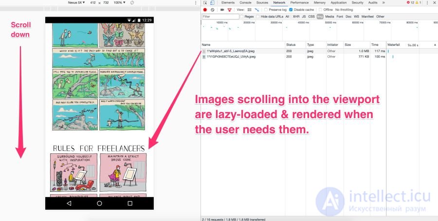
Images that fall within the screen are loaded immediately. But the rest are not visible at that point. They should be loaded not right away but later — and that is lazy loading. It happens only if and when the user scrolls down the page.
Lazy loading is not yet supported by browsers themselves (although in the past it has been discussed). JavaScript is used instead.
It has many advantages:
As with other tools, though, with great power comes great responsibility.
Avoid lazy-loading images that are within the viewport. Use it for long lists (of products or user avatars, for example). Don't use it for the main image on the page. Lazy-loading within the viewport can slow loading down both technically and in terms of human perception. It kills preloading and progressive loading, and JavaScript creates extra work for the browser.
Be very careful with lazy-loading images on scroll. If you wait for the scroll event itself, the user may see placeholders instead of pictures, or receive the pictures before scrolling to them. One recommendation is to start lazy-loading the next images as soon as the previous one has appeared on screen, regardless of user interaction.
Lazy loading is used by most large sites with lots of images. For example, Medium and Pinterest.

An example of Gaussian-blurred previews of illustrations on Medium
On some sites (Medium, for example) a small blurred picture (around 100 bytes) is shown as a preview, which after deferred loading turns into a normal-quality illustration.
José M. Pérez has described how to implement the Medium effect using CSS filters. He has experimented with different graphics formats. Facebook has also described its famous approach using 200-byte placeholders for cover photos. If you use Webpack, the LQIP loader will help automate some of these steps.
To see lazy loading in action, just open your favourite catalogue of high-quality photographs and scroll down the page. Almost always you will see that the site loads only a few full-resolution images and the rest are placeholders. As you scroll, the placeholders are replaced by full-resolution images. That is lazy loading.
Recently a new technique has caught on, using vector rather than raster placeholders. It was proposed by Tobias Baldauf in his tool SQIP. There the Primitive utility generates an SVG preview from a handful of simple shapes that roughly match the main features of the image. The SVG is then optimised with SVGO — and a Gaussian blur filter is applied. The result is an SVG placeholder of only 800−1000 bytes that looks sharp on any screen and gives a meaningful impression of what is in the real picture. Obviously, you can combine lazy loading with low-quality image previews.
There are a number of methods and plugins for deferred loading. I recommend lazysizes by Alexander Farkas, for its decent performance, its feature set, its optional integration with Intersection Observer and its plugin support.
Lazysizes is a JavaScript library that requires no configuration. Just download the minified js file and include it in the web page.
Below is a code example from the README file:
Add the 'lazyload' class to images/frames together with the data-src and/or data-srcset attribute.
You can additionally add a src attribute with a low-quality image:
For the web version of this book I wired Lazysizes up to Cloudinary (though you could use any alternative). This makes it easy to experiment freely and with minimal effort with different scales, quality levels, formats and with whether progressive loading is needed:
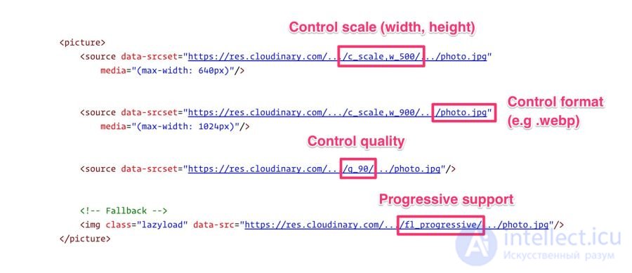
Lazysizes is not the only option. There are other libraries too:
Deferred loading is a common way of saving bandwidth, cutting costs and improving the user experience. Judge how useful it is in your case. For more information see the articles "Lazy Loading Images" and "Implementing Progressive Loading on Medium".
Older responsive image solutions handled image requests incorrectly when the CSS display property was set. This could lead to a significant increase in the number of requests, which is another reason why using and is preferable.
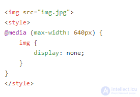
Have you ever written a media query that under certain conditions hides an image with display:none?
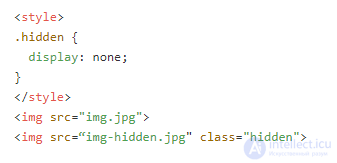
Or hides images using the class display:none?
A quick check in the Chrome DevTools network panel shows that such "hidden" images are still loaded. This is in fact correct browser behaviour according to the embedded resources specification.
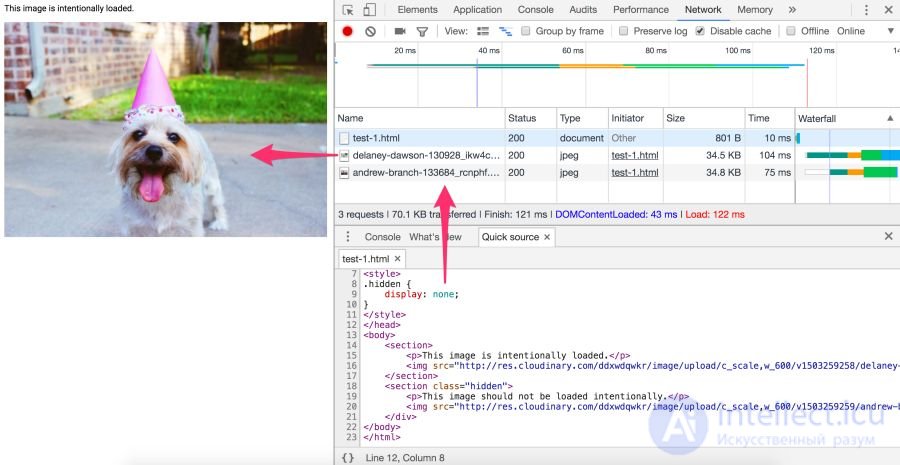
No. The specified image will still be requested. A library cannot rely on display:none here, because the request is sent before JavaScript changes the src.
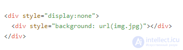
The answer is yes. A CSS background is not fetched when the element is parsed. Calculating CSS styles for child elements with display:none is less useful, since they do not affect document rendering. Background images of child elements are neither calculated nor loaded.
Jake Archibald has an excellent quiz on the pitfalls of display:none. If you are unsure how a particular browser handles image requests, open DevTools and check for yourself.
Again, wherever possible use and rather than relying on .
The time spent reading articles in order to set up your own image processing pipeline and then refine it is often far more costly than paying for such a service. Cloudinary offers a free tier, Imgix has a free trial, and there is the free alternative Thumbor, so there are plenty of options.
For the fastest possible page load you need to optimise image loading, including serving responsive images with server-side compression, automatic selection of the optimal format and resizing. It is important to serve the right-sized image to the right device at the right resolution — and as fast as possible. Doing that is not as simple as it sounds.
Image manipulation is a specialised subject. Everything in it changes constantly, so let's start with a quote from an experienced practitioner and then carry on.
"If your product isn't itself about image processing, don't do it yourself. Services like Cloudinary [or Imgix — author's note] will handle it far better and more efficiently. And if you are worried about the price, think about what development and maintenance will cost, plus hosting, storage and delivery" — Chris Gmyr
At this point we are inclined to agree that it is better to use a CDN for image processing. Let's look at two such services — and how they measure up against the list of tasks mentioned.
Cloudinary and Imgix are well-known image processing CDNs. They are used by hundreds of thousands of developers and companies worldwide, including Netflix and Red Bull.
The first huge advantage of a CDN over a home-grown solution is that they use a distributed global network to keep your images closer to your users. And with a CDN it is far easier to guarantee that the service stays current as technology changes, since not everyone is able to track trends and make changes on their own — that requires maintenance, keeping an eye on browser support for new formats and immersing yourself in the life of the image compression community.
Second: each service has a tiered pricing plan. Cloudinary has a free tier, and Imgix has an inexpensive starter plan. Imgix offers a free trial, which is almost the same thing as a free tier.
Third: both services have an API. Developers can connect to the CDN programmatically and automate the process. Client libraries, framework plugins and API documentation are available, though some options are only available on the more expensive plans.
Let's limit the discussion to static images. Cloudinary and Imgix offer a wide range of image processing methods. On their standard and free plans both support the basic features: compression, resizing, cropping, generating thumbnails.
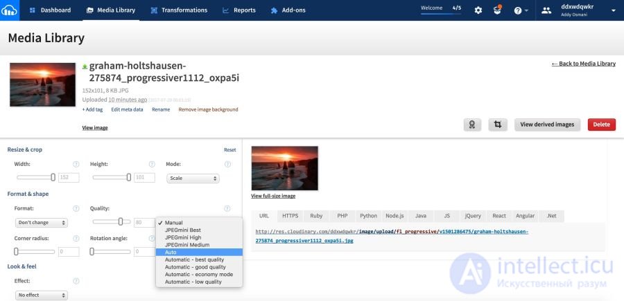
The Cloudinary Media Library: by default Cloudinary serves ordinary rather than progressive JPEGs. To enable this option, tick the relevant box under "Advanced options" or use the fl_progressive flag
Cloudinary lists seven broad transformation categories, with 48 subcategories in total. Imgix has more than 100 image processing operations.
By default Cloudinary performs the following optimisations:
By default Imgix does not run the same optimisations as Cloudinary, but it lets you set a default quality. In Imgix the automatic parameters help automate a baseline level of optimisation across your image catalogue.
At present four methods:
Imgix supports the following image formats: JPEG, JPEG2000, PNG, GIF, animated GIF, TIFF, BMP, ICNS, ICO, PDF, PCT, PSD, AI.
Cloudinary supports these formats: JPEG, JPEG 2000, JPEG XR, PNG, GIF, animated GIF, WebP, animated WebP, BMP, TIFF, ICO, PDF, EPS, PSD, SVG, AI, DjVu, FLIF, TARGA.
CDN performance depends mainly on latency and speed.
Latency is always a little higher for completely uncached images. But as soon as a picture lands in the cache and spreads across the servers on the network, the global CDN finds the closest route to the user. Together with the savings in file size, this almost always eliminates latency problems compared with unoptimised images or single servers trying to serve the whole planet.
Both CDNs have wide coverage and fast servers, which reduces latency and increases loading speed. Speed affects page load time, and that is one of the most important metrics for users and for conversion.
Cloudinary has around 160,000 customers, including Netflix, eBay and Dropbox. Imgix does not disclose its user numbers, but they are lower than Cloudinary's. Even so, Imgix's customer base includes heavyweights such as Kickstarter, Exposure, unsplash and Eventbrite.
In image processing so many parameters resist objective assessment that comparing the performance of the two services is difficult. Much depends on how you want to process the image (which will take different amounts of time) and what size and resolution you need in the end. Ultimately, cost may turn out to be the most important factor for you.
CDNs cost money. A heavy site with a lot of traffic can pay hundreds of dollars a month for a CDN. A certain level of knowledge and programming skill is needed to get the most out of these services. But if you aren't doing anything unusual, you shouldn't run into any particular difficulties.
If you currently serve images from your own server, or plan to, it may be worth considering a CDN.
Resources can specify caching rules via HTTP cache headers. In particular, Cache-Control determines who should cache responses and for how long.
Most images are static resources that will not change in future. The best strategy for them is aggressive caching.
When setting HTTP caching headers, set Cache-Control with a max-age of one year (for example, Cache-Control:public; max-age=31536000). Such aggressive caching works well for most images, especially long-lived ones such as avatars and pictures in page headers.
Note: if you serve images via PHP, caching will be disabled because of the default session_cache_limiter setting. You can work around the problem withsession_cache_limiter('public'), specifyingpublicandmax-age=. Alternatively, turn the option off and set custom cache-control headers.
Critical resources can be preloaded using
.
 — this is declarative loading that makes the browser send a request for the resource without blocking the document's
 onload event. It raises the priority of requests for resources that would otherwise only be discovered later during parsing.
To preload images, the as value is set to image:
This is how resource loading is optimised for , , srcset and SVG.
Note:
Sites such as Philips, Flipkart and Xerox use
to preload their logos (often used at the start of the document). Kayak also uses preloading so that the main header image loads as fast as possible.
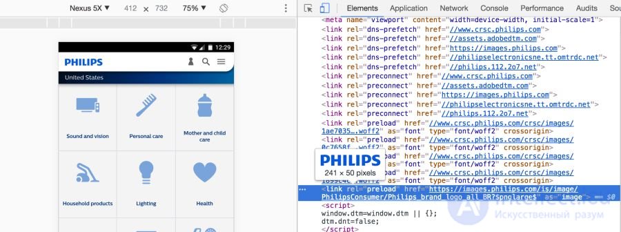
Link preloading is specified either with an HTML tag or in the HTTP Link Header. Either way, the link tells the browser to start loading the resource into the memory cache, because the page is highly likely to need that resource and there is no time to wait for the preload scanner or the parser to discover it.
The header for images will look like this:
When the Financial Times introduced such a header on its site, users started seeing content 1 second faster:
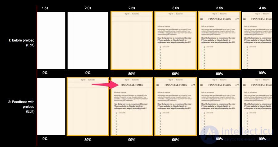
Bottom: with  , top: without. A comparison for the Moto G4 on a 3G connection in a WebPageTest run before and after optimisation
Wikipedia likewise sped up its "time to logo", as described in their study.
You have to be sure that preloading this particular resource is absolutely necessary, because it pushes the rest of the content to the back of the queue. Perhaps you should focus your efforts on other content?
It is important to avoid rel=preload for preloading images without broad browser support (WebP, for example), and to avoid using it with responsive images defined in srcset, where the image source depends on the type of device.
For more information see the articles "Preload and Priorities in Chrome" and "Preload: What Is It Good For?"
A performance budget is a maximum limit that developers try not to exceed. For example, "no more than 200 KB of images on a single page" or "the user interface must load in under 3 seconds". When the budget is missed, look into why it happened and how to fix the situation.
Budgets help you discuss the results of your work. When a design or business decision affects performance, check it against the budget. If a change doesn't fit within the budget, that is grounds for postponing or reconsidering it.
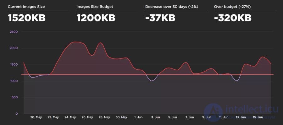
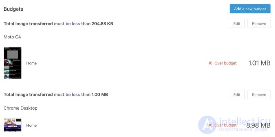
I have found that a performance budget works best when monitoring is automated. Instead of studying network graphs by hand, you run a service that automatically flags when the budget is exceeded. Two useful services of this kind are Calibre and SpeedCurve.
Once an image size budget has been defined, SpeedCurve starts monitoring and warns when it is exceeded:
Calibre lets you set a budget for each class of device. This is useful, since the image size budget for a desktop PC on WiFi may be very different from the budget for phones.
Ultimately the choice of image optimisation strategy comes down to the types of images you serve your users and a sensible set of evaluation criteria to choose from. That might be SSIM or Butteraugli, and on a small set of illustrations you can trust your own eye: what looks better and what looks worse.
If you cannot serve images in different formats depending on browser support:
q=90 is too wasteful. For ordinary pictures it is enough to use q=80, and for a DPR of 2× even q=50. Since Guetzli does not go down to such a low level, you can use MozJPEG for the web.
If you can serve images in different formats depending on browser support, using , the Accept header or Picturefill:
-m 4 -q 75 are good for most cases as an optimal balance of speed and compression ratio.-m 6 -q 100) that shrinks files by examining every combination of parameters. It is an order of magnitude slower, but worth it for static assets.
Happy compressing!
Note: for more practical image optimisation advice I strongly recommend Jeremy Wagner's book Web Performance in Action. The book High Performance Images is also full of excellent advice and detail.
Часть 1 Optimising graphics for the web
Часть 2 Who uses WebP in production? - Optimising graphics for the
Часть 3 Colour profiles - Optimising graphics for the web





Comments