
Lecture
Это продолжение увлекательной статьи про оптимизация изображений.
...
font-family:-apple-system,blinkmacsystemfont,segoe ui,arial,sans-serif; font-size:16px">WebP delivers better compression at the cost of higher CPU load. Back in 2013 WebP compression was roughly 10 times slower than JPEG, but now the difference is not so significant (some images may compress twice as slowly). For static images processed during the build, this shouldn't be much of a problem. Dynamically generated images will probably cause noticeable CPU usage that you will have to reckon with.
Note: WebP's lossy quality settings do not correspond to JPEG's settings. For example, a JPEG at 70% quality will look very different from a WebP image at 70% quality, because WebP achieves smaller file sizes by discarding more data.
Many large companies use WebP in production to cut costs and speed up page loading.
Google has reported savings of 30−35% with WebP compared with other lossy compression schemes. Google serves 43 billion images a day, 26% of which are losslessly compressed. That is a lot of requests and considerable savings. They will undoubtedly grow further as browsers improve their WebP support. Google uses the format on Google Play, YouTube and other sites.
Netflix, Amazon, Quora, Yahoo, Walmart, Ebay, The Guardian, Fortune and USA Today compress and serve WebP images to browsers that support it. The publisher VoxMedia cut page load times by 1−3 seconds The Verge by switching to WebP for Chrome users. The site 500px recorded an average 25% reduction in file sizes with similar or better quality.
Besides those listed above, other companies use WebP as well.
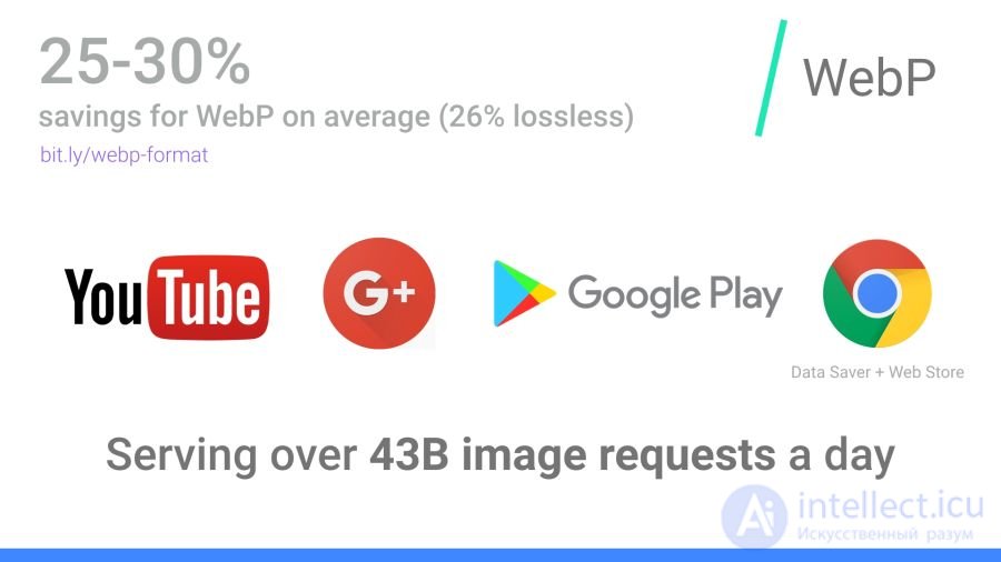
WebP usage at Google: 43 billion WebP images are served daily on YouTube, Google Play, Chrome Data Saver and G+
For static images, WebP is an alternative to JPEG. Lossy encoding has three key stages:
Macro-blocking — splitting the image into (macro) blocks of 16×16 luma pixels and blocks of 8×8 chroma pixels. This is similar to the way JPEG transforms the colour space, breaking it into blocks and reducing the number of pixels in the chroma channels.
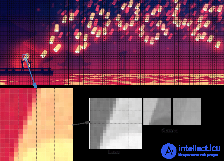
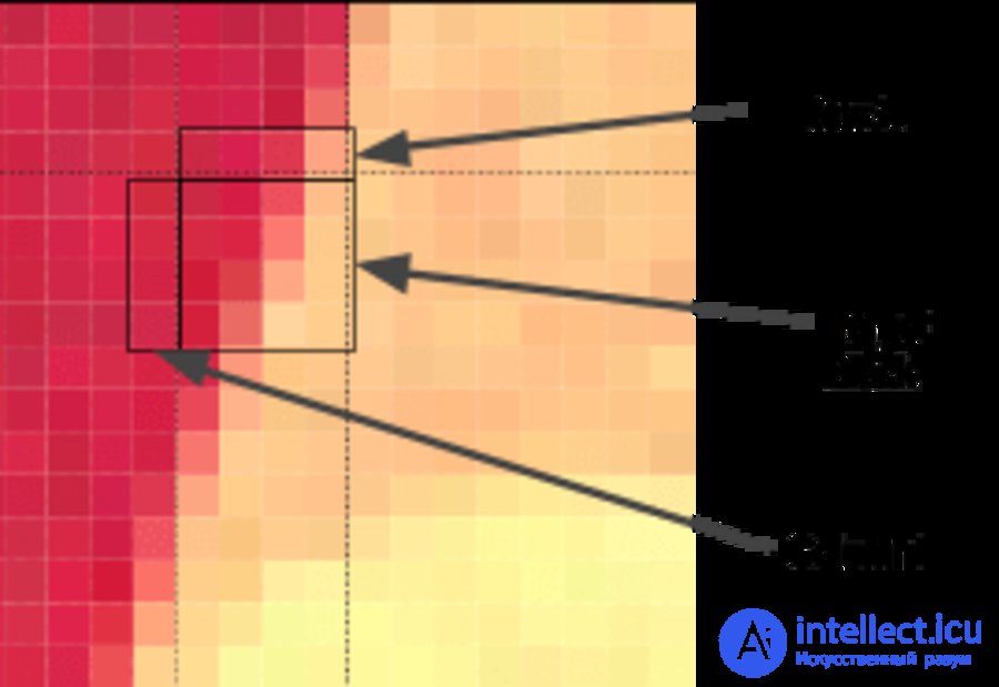
Prediction — for each 4×4 subblock a prediction model is built that effectively performs filtering. It is defined by two sets of pixels around the block: A (the row immediately above) and L (the column to the left). Using these two sets, the encoder fills a test 4×4 block with pixels and determines which values are closest to the original block. Colt McAnlis explains this in more detail in an article on how WebP works in lossy compression mode.
The discrete cosine transform (DCT) is applied in several stages, as in JPEG. The key difference is the use of arithmetic compression rather than the Huffman algorithm used in JPEG.
For more information I recommend the article "WebP Compression Techniques" on the Google Developer site.
Not all browsers support WebP, but according to data from CanIUse.com, global support is around 74%. Chrome and Opera support the format. Safari, Edge and Firefox are experimenting but have not yet shipped support in official releases. Because of this, serving WebP often falls to the web developer. More on that later.
Here are the main browsers and their support status:
WebP is not without its shortcomings. It lacks full-resolution colour space options and does not support progressive decoding. Even so, decent tooling has been built for WebP, and browser support is more than enough to consider serving WebP as one of your options.
Several commercial and free editors support WebP. One of the most useful applications is XnConvert: a free cross-platform batch converter.
Note: it is important not to convert low- or medium-quality JPEG images to WebP. This is a common mistake that produces WebP images carrying JPEG compression artefacts. It reduces WebP's effectiveness, since it has to preserve both the image and the JPEG distortions, which results in a double loss of quality. Feed the converter the highest-quality file you have, preferably the original.
XnConvert batch-processes images in more than 500 formats. You can combine more than 80 individual operations in various ways to convert or edit images.
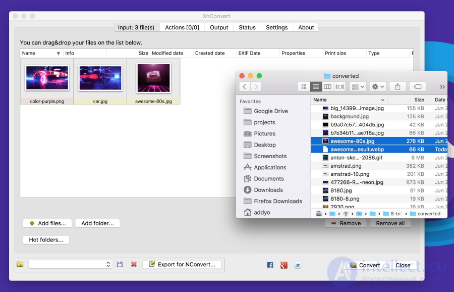
XnConvert supports batch image optimisation, converting directly from source files to WebP and other formats. Besides compression, XnConvert can strip metadata, crop images, adjust colour depth and perform other transformations
Some of the options listed on the xnview website:
The results of these operations can be exported to roughly 70 different file formats, including WebP. XnConvert is free software for Linux, Mac and Windows. It is an excellent option, especially for small businesses.
Imagemin is a popular image compression module with an extension for converting to WebP (imagemin-webp). Both lossy and lossless compression are supported.
To install imagemin and imagemin-webp, run:
> npm install --save imagemin imagemin-webp
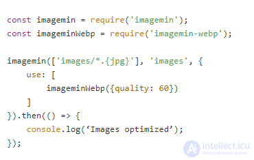
We can then require() both modules and run them on any images (JPEGs, for example) in the project directory. Below we use lossy encoding with a WebP encoder quality of 60:
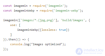
As with JPEG, you may notice compression artefacts in the resulting image. Judge for yourself what level of compression is appropriate for your files. Imagemin-webp can also be used to encode WebP images losslessly (with support for 24-bit colour and full transparency) by specifying the lossless: true:
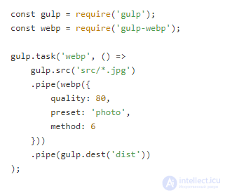
The WebP plugin for Gulp by Sindre Sorhus is built on imagemin-webp, and there is also a WebP loader for WebPack. The Gulp plugin understands all of the imagemin extension's options:
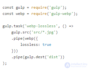
Or lossless compression:
XNConvert supports batch compression, but it can all be done from the command line.
Batch-converting images to WebP with cwebp:
find ./ -type f -name '*.jpg' -exec cwebp -q 70 {} -o {}.webp \;
Optimising with the MozJPEG encoder using jpeg-recompress:
find ./ -type f -name '*.jpg' -exec jpeg-recompress {} {} \;
and trimming SVGs with the svgo tool (which we will look at later):
find ./ -type f -name '*.svg' -exec svgo {} \;
Jeremy Wagner has written a fuller article on image optimisation in Bash and another on parallelising the task.
On Android you can convert existing BMP, JPG, PNG and static GIF images to WebP using Android Studio. For more details see the section "Create WebP Images Using Android Studio".
Although WebP images always open in Blink-based browsers (Chrome, Opera, Brave), you can view them directly from the OS using an add-on for Mac or Windows.
A few years ago Facebook experimented with WebP and noticed a problem: some users saved images to disk and then couldn't open them. There are three key issues here:
Your users may not run into these problems, but it is an interesting footnote. Fortunately, there are utilities for viewing WebP on various operating systems today.
On Mac, try the Quick Look plugin for WebP (qlImageSize). It works pretty well:
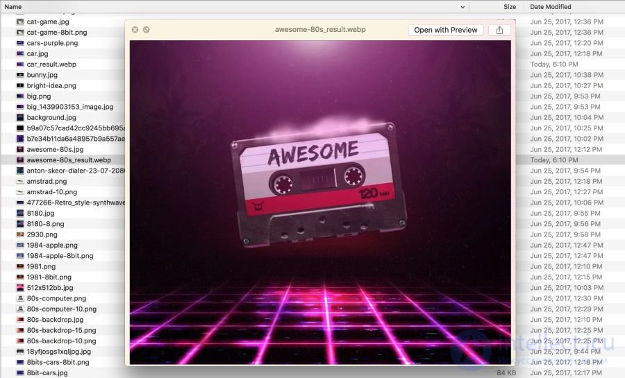
On Windows you can download the WebP codec pack, which adds a WebP viewing option to File Explorer and Windows Photo Viewer.
Browsers without WebP support will show no image at all. There are several strategies for avoiding this.
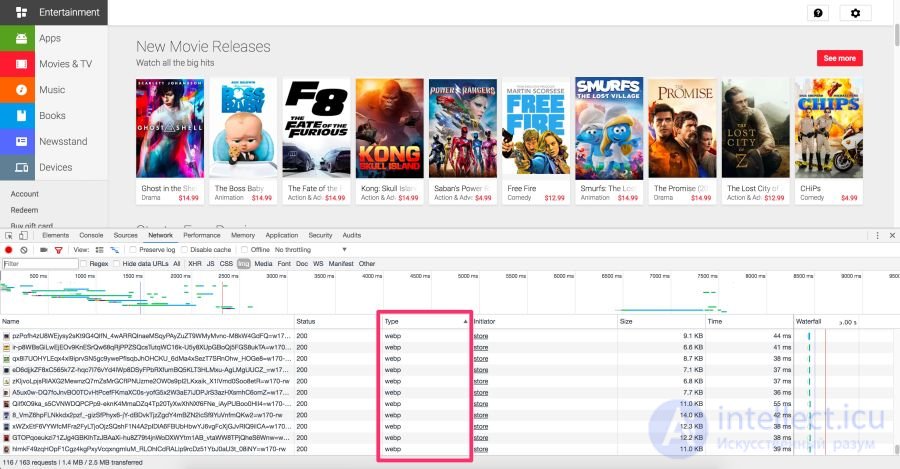
The Chrome DevTools Network panel highlighting files of type WebP that are served to Blink-based browsers
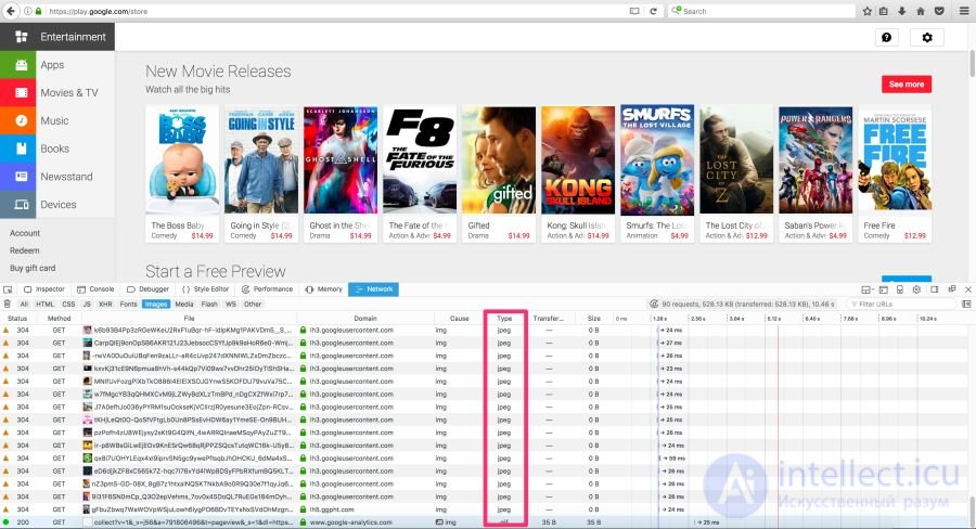
The Play Store serves WebP to Blink browsers and JPEG to the rest, such as Firefox
Here are some ways of delivering WebP images to users:
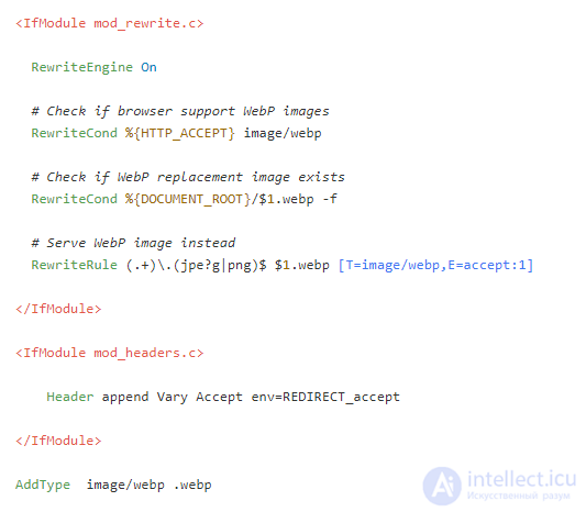
Here is how to use .htaccess to serve WebP files in supported browsers when the server has a webp version of the JPEG/PNG file.
Vincent Orback recommended this approach:
Browsers can explicitly signal WebP support via the Accept header. In that case you can serve the WebP version of the image from the server. But this is not always possible (for static hosts such as GitHub Pages or S3, for example), so be sure to check before considering this option.
Below is a sample .htaccess file for the Apache web server:
If you have problems displaying WebP graphics, make sure the image/webp MIME type is enabled on the server.
On Apache, add the following code to the .htaccess file:
AddType image/webp .webp
On Nginx, add the following code to the mime.types file:
image/webp webp;
Note: Vincent Orback provides a sample htaccess for serving WebP, and Ilya Grigorik maintains a collection of configuration scripts for serving WebP that may come in handy.
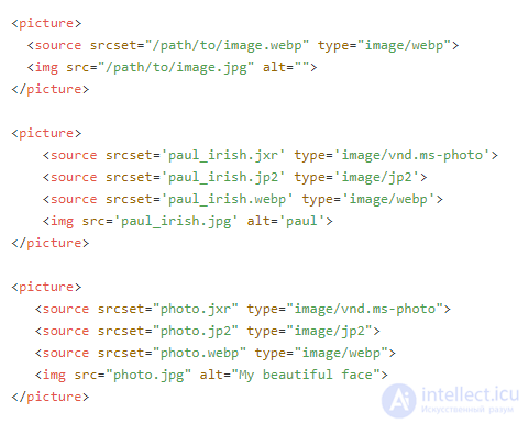
The browser is able to choose the image format itself using the tag. Inside it you specify a number of elements, each with a single tag that actually holds the image. The browser looks through them and requests the first suitable one. If the tag is not supported, rendering falls back
Note: be careful with the order of the elements
. Don't place image/webp sources after legacy formats — put them before. You can also arrange images in ascending order of file size if they have the same pixel dimensions (when the media attribute is not used). This usually produces the same order as listing the newer formats first.
Here are some HTML examples:
Some CDNs support automatic conversion and delivery of WebP at the client's request, where possible. Check whether your CDN supports it. The problem may have a very simple solution.
Jetpack: a popular WordPress plugin, includes an image CDN service called Photon with WebP support. It is included in the free version of Jetpack, which is very practical and useful. The downside is that Photon automatically resizes images, puts a query string in the URL, and each image incurs an extra DNS request.
Cache Enabler and Optimizer: if you use WordPress, there is at least one open-source option. The Cache Enabler plugin menu has a checkbox for caching and serving WebP images if the user's browser supports them. This makes working with WebP easier. There is a downside here too: Cache Enabler requires the companion Optimizer program, which charges an annual fee. That is not very typical of open-source solutions.
Short Pixel: another optimiser option for Cache Enabler, also paid. In terms of functionality Short Pixel is very similar to the Optimizer mentioned above. It lets you optimise up to 100 photos a month for free.
Compressing animated GIFs and why
is better
Animated GIFs are still widely used despite their narrow specialisation. Although everyone from social networks to popular media sites uses animated GIFs liberally, the format was never intended for video or animation. In fact, the GIF89a specification explicitly states that "GIF is not intended as a platform for animation". The number of colours, the number of frames and the aspect ratio all affect the size of an animated GIF. Switching to a video format gives the greatest savings.
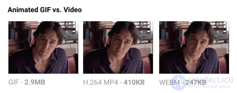
Comparison of the sizes of an animated GIF and a video of equivalent quality
Serving the same video as MP4 cuts the file size by 80% or more. Besides wasting bandwidth, GIF files take longer to load, contain fewer colours and generally don't look very pleasant. You may have noticed that animated GIFs uploaded to Twitter work better there than on other sites. That is because animated GIFs on Twitter aren't actually GIF files. To improve quality and reduce bandwidth, Twitter automatically converts them to video. Similarly, Imgur converts GIFs to MP4 on upload.
Why are GIF files many times larger? Because they store every frame as a lossless GIF image — yes, lossless. GIF's poor quality is caused not by compression but by the 256-colour palette. The format does not analyse neighbouring frames for compression, unlike video codecs such as H.264. MP4 video stores each key frame as a lossy JPEG, discarding some of the original data to achieve better compression.
ffmpeg -i animated.gif -movflags faststart -pix_fmt yuv420p -vf "scale=trunc(iw/2)2:trunc(ih/2)2" video.mp4
-lossy flag and compresses animations by 60−65%. The good tool Gifify is built on top of it. Convert non-animated GIFs to PNG or WebP.
For more information see "The GIF Book" from Rigor.
Minimising SVG files means removing everything unnecessary. As a rule, an SVG exported from an editor contains a lot of redundant information (metadata, comments, hidden layers and so on). Often it can safely be removed or reduced to a minimum without affecting the visual result.
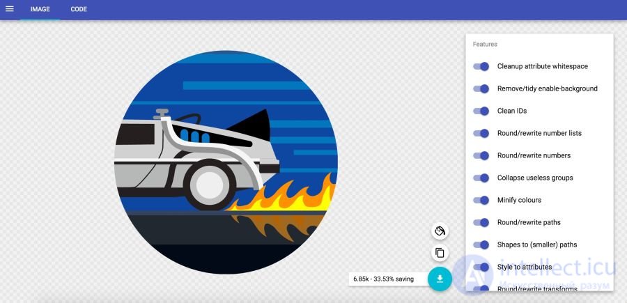
In Jake Archibald's SVGOMG service you can pick different optimisation options and see the result instantly
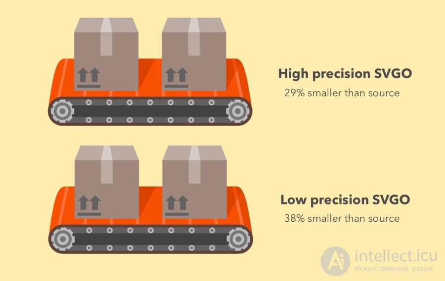
SVGO's effectiveness in high-precision mode (−29% of the original file size) and low-precision mode (−38%)
SVGO is a Node-based SVG optimisation tool. It reduces file size by lowering the precision of the numbers in definitions. Every digit after the decimal point is an extra byte, so changing the precision (the number of digits) has a big effect on file size. But be very careful, because reducing precision can visibly affect the shapes in the image.
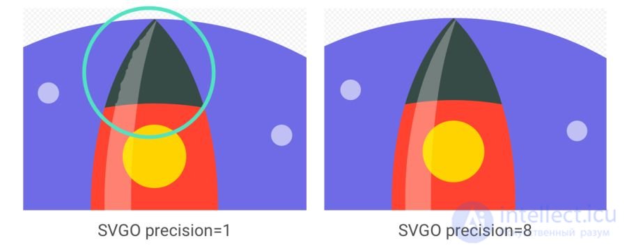
It is worth noting: although SVGO succeeded in the previous example without over-simplifying paths and shapes, that is often not the case. Look at how the highlight on the rocket becomes distorted as precision is lowered
SVGO can be installed as a CLI if you prefer the command line:
npm i -g svgo
Optimising an SVG file:
svgo input.svg -o output.svg
All the available options are supported, including setting the floating-point precision:
svgo input.svg --precision=1 -o output.svg
See the readme for the full list of supported options.

Also, don't forget to gzip your SVG files or serve them over Brotli. A text format compresses very well (~50% of the original).
When Google released its new logo, we announced that its minimal version takes up just 305 bytes.

There are many advanced tricks for squeezing the file down even further (all the way to 146 bytes)!
SVG is an excellent fit for icons, offering sprite-style rendering without the contrived workarounds that fonts require. It gives better control over CSS styling than fonts do (SVG stroke properties), better control over positioning (no need to mess about with pseudo-elements and display), and SVG has much better browser support.
Tools such as svg-sprite and IcoMoon automate combining SVGs into sprites that can be used as a CSS Sprite, Symbol Sprite or Stacked Sprite. It is worth reading the practical tips from Una Kravets on using gulp-svg-sprite in your workflow. Sara Soueidan describes on her blog the move from icon fonts to SVG.
Sara Soueidan's tips on optimising SVG delivery and "Practical SVG" by Chris Coyier are excellent. I found Andreas Larsen's articles on optimising SVG very useful (part 1, part 2). I can also recommend the article "Preparing and Exporting SVG Icons in Sketch".
It is always advisable to compress an image from the source. Recompressing carries unpleasant consequences. Suppose you take a JPEG that has already been compressed at quality 60. If you compress it lossily again, it will look worse. Every additional round of compression brings further quality loss — information is discarded and artefacts accumulate. Even if you recompress at high-quality settings.
To avoid this trap, set the minimum acceptable quality straight away, and get the maximum savings from the outset. Then you won't be tempted to recompress, because any lossy compression of the file will look bad, even though it will reduce the file size.
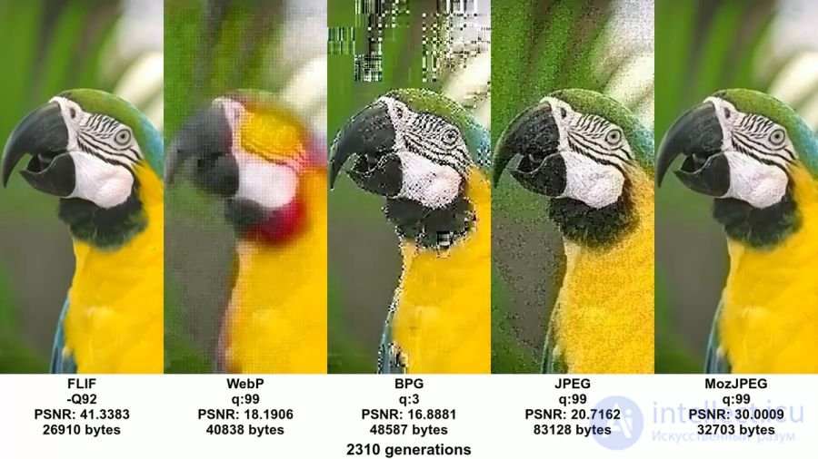
An example from John Snyers's excellent video and accompanying article shows the effect of recompression in different formats. You can run into this problem if you save (already compressed) pictures from social networks and re-upload them (recompressing them again). The quality loss builds up
MozJPEG is (possibly by accident) more resistant to this kind of degradation thanks to trellis quantisation. Instead of compressing all DCT values as they are, it looks for nearby values in the +1/-1 range so they can be packed into fewer bits. Lossy FLIF uses a hack similar to lossy PNG, where before (re)compressing the encoder analyses the data and decides what to throw away.
Keep your source files in a lossless format, such as PNG or TIFF, to preserve maximum quality. Then your build tools or compressors will prepare the compressed version that you serve to users with minimal quality loss.
We have all served users large images at excessively high resolution. There is a price to pay for it. Decoding and resizing are resource-hungry operations for the browser on an ordinary phone. If you serve large images and scale them with CSS or width/height attributes, you will see how this affects performance.
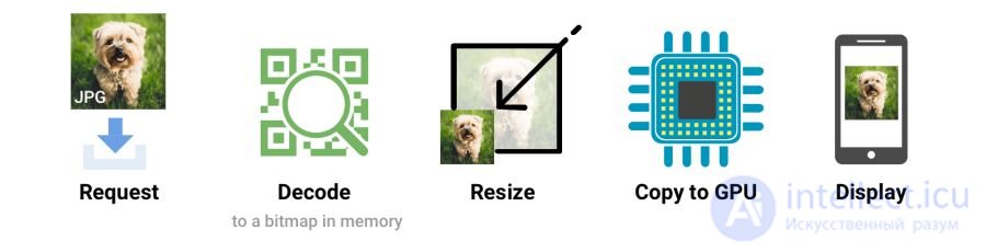
When the browser receives an image, it has to decode it from the original source format (JPEG, for example) into a bitmap in memory. Often the image also needs resizing (for example, when the width is set as a percentage). Decoding and resizing images are resource-hungry operations that slow down rendering
Ideally you should serve images that the browser can display without resizing. So serve images at the minimum size for the relevant screens and resolutions, using srcset/sizes — we will shortly take a look at srcset.
Omitting the attributes width or height attributes can also hurt performance. Without them the browser assigns the image the smallest possible placeholder area until it has received enough bytes to determine the correct dimensions. At that point the document layout has to be updated with a costly reflow operation.
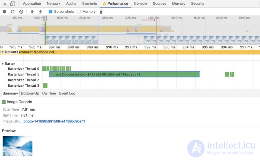
Browsers have to take several steps to paint an image on screen. Once the image arrives, it has to be decoded and often resized. These events can be traced on the Chrome DevTools timeline
Large images also consume memory: roughly 4 bytes per pixel once decoded. If you aren't careful enough you can literally hang the browser; on low-end devices it isn't that hard to push things into swap. So keep an eye on the cost of decoding, resizing and memory consumption.
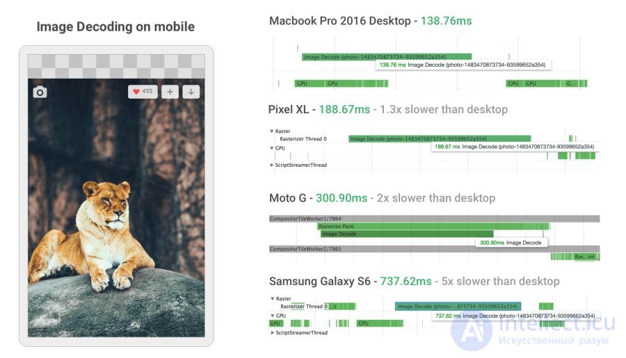
Image decoding can be incredibly resource-hungry on mid- and low-range mobile phones. In some cases it is 5 times slower or more than on the desktop
While developing the new mobile version, Twitter greatly improved image decoding speed by setting the correct dimensions. For many images decoding time dropped from ~400 ms to ~19 ms!
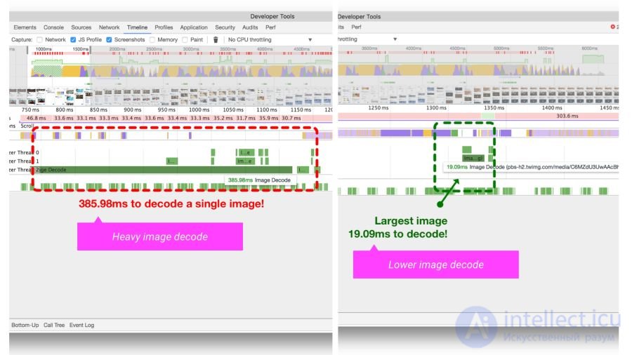
The Timeline/Performance panel in Chrome DevTools showing image decoding time in Twitter Lite before and after optimisation
srcset
Users may visit a site from a variety of mobile and desktop devices with high-resolution screens. The device pixel ratio (DPR) (also called the "CSS pixel ratio") determines how CSS should interpret screen resolution. The DPR standard was created by phone manufacturers to increase the resolution and sharpness of mobile screens without shrinking the elements.
For maximum quality you should serve images at the most appropriate resolution. Devices with high-resolution screens get high-definition images (at DPR 2×, 3×), while standard screens get ordinary images, since 2× and 3× DPR images are considerably heavier.
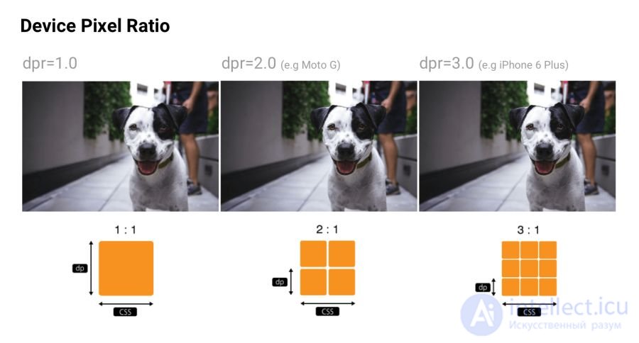
Device pixel ratio: many sites track the DPR of popular devices via material.io and mydevice.io
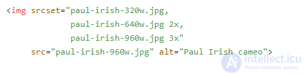
srcset lets the browser choose the optimal image for each device. For example, take the 2× image for a mobile display with DPR 2×. Browsers without srcset support can take the default src specified in the tag.
Image CDNs such as Cloudinary and Imgix support DPR for serving an image at the optimal resolution from a single source.
Note: you can learn more about device pixel ratio and responsive images in this free Udacity course and in the images guide on Web Fundamentals.
As a reminder, Client Hints are also a fitting alternative to listing every possible DPR and format in responsive markup. Instead, the relevant information is added to the HTTP request so that the web server can choose the most suitable variant for the particular screen.
While choosing the right resolution matters, some sites also think about aesthetics. If the user has a small screen, you can crop or zoom in — and present the subject differently, making the best use of the available space. Although art direction is beyond the scope of this article, some services such as Cloudinary provide APIs for automating such tasks.
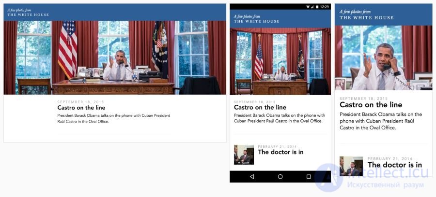
Eric Portis has shown an excellent example of creative use of responsive images. In this example the characteristics of the main subject of the illustration change to make the best use of the available space
Colour can be looked at from at least three perspectives: biology, physics and print. In biology, colour is a perceptual phenomenon. Objects reflect light in various combinations of wavelengths. Light receptors in the eye translate these waves into the sensation of colour. In physics, what matters is wave frequency and energy (brightness). Print is more about colour gamut, inks and artistic models.
Ideally, every screen and web browser in the world would display colour in exactly the same way. Unfortunately that is not the case. Colour management makes it possible to reach a compromise in colour rendering using colour models, spaces and profiles.
Colour models are a system for creating the full spectrum from a smaller set of primary colours. There are various types of colour spaces with different parameters for controlling colours. Some spaces have fewer control parameters than others — for example, a single brightness parameter between black and white is enough for all shades of grey.
Two common types of colour model are additive and subtractive. Additive colour models such as RGB render colour by emitting light, while subtractive ones such as CMYK do so by reflection (subtraction).
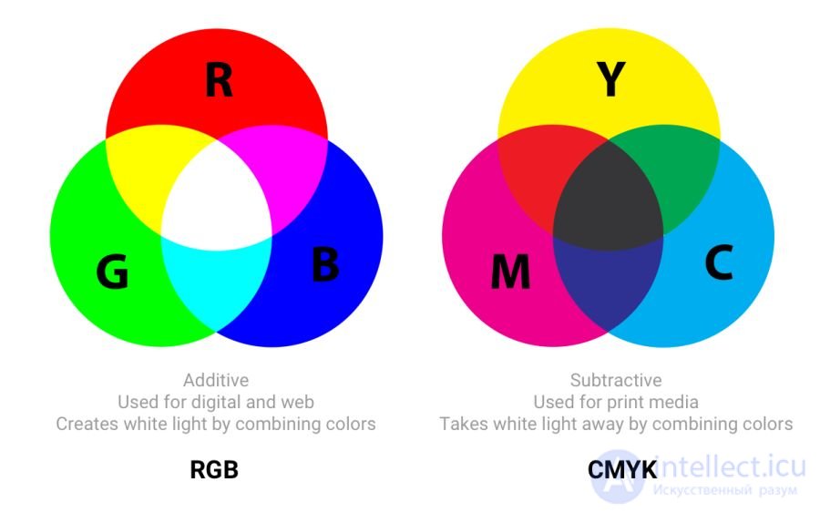
In RGB, red, green and blue light are added in various combinations to produce a wide spectrum of colours. CMYK (cyan, magenta, yellow and black) works with inks of different colours, subtracting part of the paper's white spectrum
The article "Understanding Colour Models and Colour Systems" gives a good description of other colour models and modes, such as HSL, HSV and LAB.
Colour spaces is a defined range of colours that can be displayed for a given image. For example, an image may hold up to 16.7 million colours, and different colour spaces let you narrow or widen that range. Some developers think that colour models and colour spaces are the same thing.
sRGB was developed on the basis of RGB as the standard for the internet. It is a small colour space that is usually considered the lowest common denominator and the safest option for colour management in browsers. Other colour spaces (for example Adobe RGB or ProPhoto RGB, used in Photoshop and Lightroom) contain a wider variety of colours, but since sRGB is ubiquitous in browsers, games and monitors, it is normally the one used.
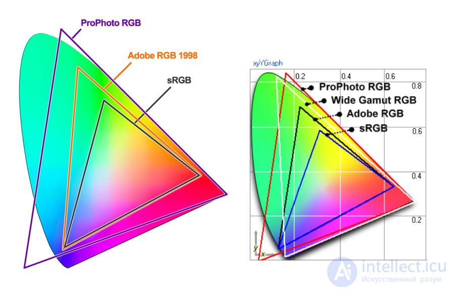
A visualisation of the gamut — the range of colours in a colour space
Colour spaces use three channels (red, green and blue), each with 255 colours in 8-bit mode, which gives 16.7 million colours. 16-bit images are capable of displaying trillions of colours.

A comparison of sRGB, Adobe RGB and ProPhoto RGB on an image from Yardstick. It is incredibly hard to illustrate this concept when your screen only shows sRGB colours. Comparing an ordinary photograph in sRGB and in a wide gamut, everything will look the same except for the most saturated, "juicy" colours
Colour spaces differ in their gamut (the range of colours they can reproduce with their shades), their spectrum and their gamma curve. sRGB is roughly 20% smaller than Adobe RGB, and ProPhoto RGB is roughly 50% wider than Adobe RGB. The photographs above are taken from Clipping Path.
Wide gamut is a term for colour spaces wider than sRGB. Displays of this type are becoming more and more common. Even so, many digital displays are still simply incapable of showing colour profiles significantly better than sRGB. When saving for the web in Photoshop, use the convert-to-sRGB option unless you are specifically targeting wide-gamut displays.
Note: When working with original photographs, do not use sRGB as your main colour space. It is smaller than the colour spaces of most cameras and can lead to loss of information. Instead work in a wide colour space (ProPhoto RGB, for example), and convert to sRGB only when exporting for the internet.
Yes. If the image contains a very saturated/juicy/vivid colour — and you want to show it on compatible screens. In real photographs, though, this happens rarely. Often you can easily tweak the settings so that a colour looks vivid without stepping outside the sRGB gamut.
The reason is that human colour perception is not absolute. Perception works relative to its surroundings — and is easily fooled. But if the picture has a stroke of fluorescent marker in it, then of course it is easier to show it in a wide gamut.
Gamma correction (or simply gamma) controls the overall brightness of
продолжение следует...
Часть 1 Optimising graphics for the web
Часть 2 Who uses WebP in production? - Optimising graphics for the
Часть 3 Colour profiles - Optimising graphics for the web

Comments