Lecture
In the UX-designer, the words wireframe, prototype, and mockup are often found. Experienced colleagues, of course, know what is different from one another and what is used for. And for newbies and unenlightened developers and managers, we translated that part of the articleWireframing, Prototyping, Mockuping - What's the Difference, where all this is explained.
Attempts to translate wireframe and mockup have already spawned, probably, a dozen terms of different adequacy and prevalence. We took this into account and in the article we confined ourselves to simple “wireframe” and “mocap”, so that everyone could substitute such russifications that they had in his company.
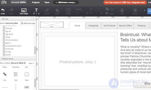
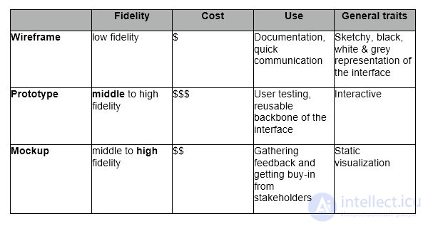
A wireframe is a low-detailed design representation. It should clearly show:
A wireframe is not just a meaningless set of gray blocks, although it looks that way. Think of it as the skeleton of your design and remember that all the important elements of the final product must be represented in a wireframe.
Presented is a keyword that helps you find the right balance between the level of detail and the speed of creation. You can not go into the details, but on the other hand, you need to create a solid representation of the final design and not miss a single important element. You describe the front of the project for all the people involved: developers, designers, copywriters, managers - they all need a well-designed wireless frame. Essentially, you are creating a city map. Each street should be on it, but in a very simplified form. Looking at the map, you can appreciate the planning of the city, but you cannot see its beauty.
Wireframes should be created quickly and most of this time should be followed by discussions with the team and reflections. Pulling gray blocks across the screen should take a minimum of time.
Appearance should be aesthetic, but very simple. Black and gray and white is a typical wireframe palette (you can add blue to denote links).
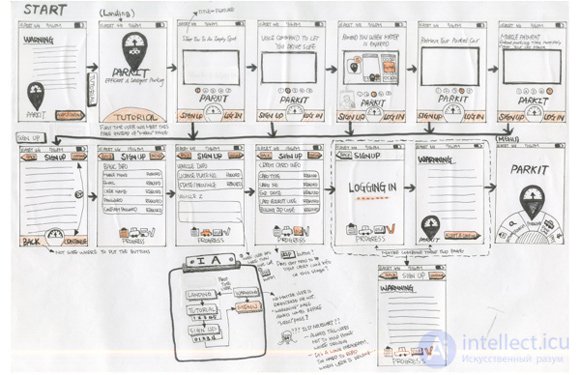
If, for example, choosing icons or loading images takes too much time, you can replace them with plugs - crosswise crossed out rectangles with the corresponding description. We tend to believe that a wireframe gives an incomplete picture of the end result.
Remember, a good frameframe forms the basis of a clean design and determines the direction of work for the whole team.
Usually wireframes are used as project documentation. Since they show the user interaction with the interface in certain static moments, they should be accompanied by text comments: both short explanations and complex technical documentation, if necessary.
However, they can be used in a less formal way. Since they are simple and quickly created, they, like sketches, are well suited for discussion within the team. If the developers ask how something should be done, the answer can be given in the form of a fast-built wireframe.
Wireframes are difficult to adapt for usability testing, although they can be useful for receiving feedback during the initial “partisan” research, when you urgently need insight and you are not bothered by methodological clarity.
In the overall design process, wireframes can be unexpectedly effective and, although in recent years they have been not very responsive, they remain an important starting point for complex projects.
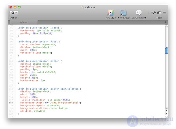
A prototype, often confused with a wireframe, is a medium or highly detailed representation of the final product that simulates user interaction with the interface. It should allow the user to:
The prototype is an imitation of user interaction with the interface of the final product. It may not look exactly like the final product, but it definitely should not be drafted in shades of gray. Interactions should be carefully modeled and be as close as possible to what will be in the final product. The connection between the interface (front end) and the backend is usually omitted to reduce costs and speed up the process.
The potential of prototypes is fully disclosed in user testing. With this simulation, you can get a lot of material to improve usability even before the actual start of development.
Prototypes are usually not very suitable for documentation, as you can understand how the interface works only in the process of interaction with the prototype. On the other hand, the prototype is the most attractive form of design documentation, since the interface is presented as it is.
Consider that prototyping is a rather expensive and lengthy form of developing and discussing design. I recommend creating prototypes, which can then be reused during development (yes, this means that you have to code HTML, CSS, and possibly JS). This is especially effective in relatively simple projects.
If done correctly, then in combination with usability testing, prototyping will pay for itself.
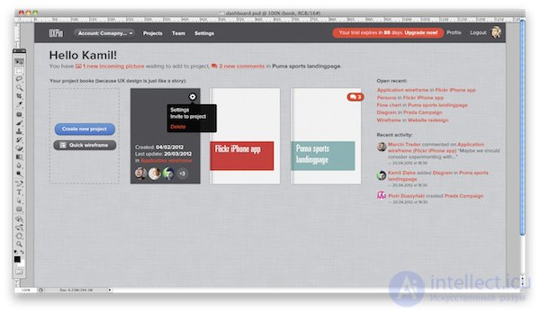
A mocap is a medium or highly detailed static representation of a design. Very often a mocap is a draft of a design or even an actual design layout. Good mocap:
Mockups are often confused with wireframes due to the names of such programs as Mockingbird, Mockup Builder, Balsamiq Mockups.
Mockups are very good for getting approval from interested people not involved in the development. Due to the visual nature of the mocap is perceived more easily than low-detailed artifacts, and thus creates a faster prototype. They are good for collecting feedback and can be used in the documentation.
Comments
To leave a comment
design software UI and Web design
Terms: design software UI and Web design