Lecture
Ergonomics - (from the Greek. Ergon work + nomos law) - a scientific discipline that studies work processes in order to create optimal working conditions, which increases its productivity, and also provides the necessary amenities and preserves the strength, health and efficiency of a person. |
One can argue about whether the definition and concept of "ergonomics" applies to web design, but the concept of "ergonomic website" is already firmly established among the visitors to the Internet.
Ergonomic site - a site created taking into account and on the basis of scientific knowledge about the structure and operation of the human eye, viewing, collecting (for subsequent analysis) information from a radiation source of a certain spectral intensity, limited in field of view.
The ergonomic site provides the necessary convenience to the visitor, saves his strength, health and performance. And this, ultimately, increases the efficiency of the site and brings income to the site owner.
Creating an ergonomic site is unthinkable without knowing the basic anthropological parameters of a person. From the point of view of web design, these are, first of all, the characteristics of the human eye.

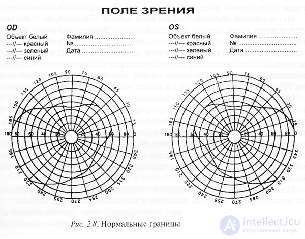
External normal boundaries of the visual field, where OS-oculus sinister is the visual acuity of the left eye, OD-oculus dexter is the visual acuity of the right eye.
Consideration of these characteristics is important when creating a professional website.
The distance of the best sight for a normal person is 25 cm.
The field of view of one eye horizontally in the direction of the nose is 60 ° (degrees), to the temple is 90 degrees. (only 150 degrees.), vertically up - 50 degrees, down - 70 degrees. The total field of view of both eyes is 180 degrees horizontally.
The field of view of the eye is the space within which it is possible to distinguish objects when the eye is stationary.
Visual acuity of the eye quickly falls from the center to the edge of the retina and after 16 degrees. from the axis it decreases three times (3 ').
The total duration of eye movement is 0.05-0.06 sec. The eye turns to 10 degrees. with a maximum speed of 300 degrees. in 1 second, and at 30 degrees. - with a speed of 500 degrees. in 1 sec.
The pupil of the eye can vary in diameter from 2 to 8 mm, and the inertia time increases from 0.05 to 0.2 sec.
At the greatest brightness, the angular resolution limit is 0.6 ', and at low - 50'. The minimal, still tangible eye angle difference of parallax with stereoscopic vision, is 10 ".
The eye is never stationary. Even with fixation, he performs three kinds of movements:
tremor - cola *** of the visual axes of the eyes with an amplitude of about 1 'with a frequency of 30 to 90 Hz with a chaotic change of direction and frequency;
Drift - slow, randomly varying in speed (from 0 to 30 minutes per 1 second) and direction; average speed 6 'per 1 sec; the duration of one drift is from 0.2 to 0.8 seconds; the image of the point moves within the central fossa and does not leave it;
small synchronous involuntary jumps that the observer does not feel with an amplitude from 2 'to 60' and a duration of 0.01-0.02 seconds; it seems to the observer that he fixes one point with a fixed gaze.
The zone of the clearest vision is limited to a yellow spot and is about 2 degrees. This zone is called central.
Next comes a zone of clear vision (30 degrees horizontally and 22 degrees vertically), within which, with the eye in a fixed position, it is possible to recognize objects without distinguishing fine details.
The third zone is a zone of peripheral vision , within which the identification of objects is impossible, but it is of great importance for orientation in the surrounding space. In this area, in particular, moving objects are clearly visible. The limitations of the sharply observed field are compensated by its mobility.
The appearance in the human mind of a light or visual image occurs with some delay relative to the moment of light exposure to the reticular membrane of the eye. This lag time, called sensation time , ranges from 0.1 to 0.25 seconds. depending on the brightness of the object. The greater the brightness of the subject, the less time sensations. The visual sensation also does not immediately disappear after the end of the action of the light. The visual sensation remaining after the end of the light exposure is called a sequential manner . The human eye has three types of receptors responsible for the perception of color and differing in their sensitivity to electromagnetic fields of different wavelengths. Some receptors respond to purple-blue, others - to green, and others - to orange-red color. If the light does not enter, the human eye perceives black. If all receptors are illuminated in the same way, the person sees gray or white. Thanks to the three-color vision, the human eye can distinguish any of the color shades. The human visual apparatus analyzes the light, determines the content of various radiations in it, and then they are synthesized into a single color in the brain. |
Experimental studies show some features of the human eye:
The three-component color vision is manifested only when observing relatively large objects.
The color of objects of medium size is a mixture of only two colors: orange and blue-green (blue).
Small details differ by eye only by brightness gradations, i.e. seem black and white, and the lack of color of small details slightly impairs the subjective perception of the color image.
For reference
The Golden Ratio is the division of a segment into unequal parts, in which the entire segment relates to the larger part as much as to the smaller part; or as a smaller segment refers to a larger one, as a larger segment to the whole segment:
a: b = b: c or c: b = b: a
The structure of the site can be divided into external and internal.
Let's first talk about the internal structure of the site. It depends on what information you will post, what materials you have. You have to decide what sections of your site you will have, subsections - you have to think over the site tree.
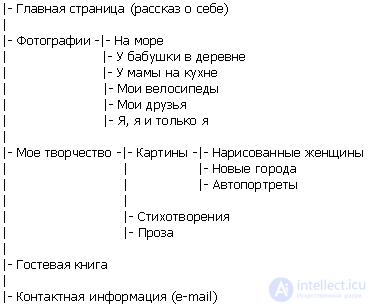
Consider the development of the internal structure on the example of the home page. What information can we put on it? A story about yourself (on the main page), your photos, contact information is at a minimum. So, the internal structure of our homepage is drawn as follows: 
You can stop at this, or you can create a more complex internal structure. Suppose you have a lot of photos, so it makes sense to split the Photos section into several subsections. You also want to receive feedback from visitors, so you expect the presence of a guest book. In addition, you are a creative person, so the My Creativity section will also appear on the site. 
When we have such an internal structure plan before our eyes, we can safely continue to work on the site without fear of forgetting or missing something.
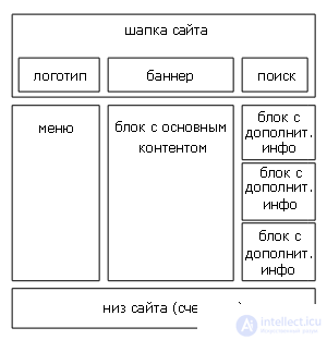
Now let's talk about the external structure, under it I mean the location of the main significant elements on each page. You need to decide where and how your banners will be located, if you embed them on the site, the counter, the menu, perhaps the search, the main content, some announcements about new sections of the site, updates, etc. For example, let's take the external structure of the site Build.ru, where you are now located: 
We had to draw about this layout of the main significant elements for ourselves when we were developing our site.
When developing the external and internal structure, your main task is to make it so that in the future the visitor can easily navigate your site, so that important and necessary information is easily located. Therefore, before undertaking the development of the structure of the site, you should probably examine the resources with similar topics and see how this problem is solved there.
Chain links (Bread crumbs) breadcrumb (navigation chains, bread crumbs)
Double bookmarks (Double tab)
Metanavigation
Separate navigation
Duplicate menu
Link up (Top)
Level division
Menu-zavlekalochki
Combined menus
Drop-down menus
Catalogs
Hierarchical menus
Scrolling menus
Quick Jump (Shortcuts)
Graphic menus
Guided Tour
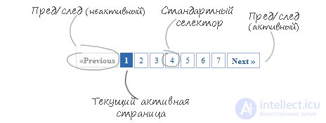
Pagination (from Lat. Pagina - page) - pagination of information (paper or electronic). Also under this concept sometimes imply the ordinal numbering of pages, denoted by colonizer numbers, located at the bottom, top or side of the page.
Automatic pagination of text with illustrations uses quite complex rules and algorithms to determine exactly where a page break can be located (in particular, control of hanging lines). Semantically, the common parts of the content should not be placed on different pages.
On the Internet, pagination refers to displaying a limited part of information on a single web page (for example, 10 search results or 20 forum trades). It is commonly used in web applications [1] for splitting large amounts of data into pages and includes a navigation block for switching to other pages.

Scrolling (scrolling) is a form of presenting information in which content (text, image) moves in a vertical or horizontal direction. Thus, scrolling does not change the content, but moves the “camera”.
There are three types of scrolling:
linear or “normal” (moving objects appear at one edge of the screen and disappear at the other).
cyclical (the object, disappearing from one edge, appears at the other).
bouncing (object, reaching the edge of the screen, changes the direction of motion to the opposite).
Site navigation is a key point when creating a web design. One of the ways to navigate the site is scrolling. Scrolling can turn a simple and boring website into a creative and original one. Using scrolling and vertical page space can greatly attract the attention of visitors. Back in 2007, research confirmed that the period when users were used to immediately receive information without using a mouse had long passed, and that 76% of visitors scroll down the page. and somewhere the same percentage of them reach the bottom. If you add beautiful illustrations, animations, and other visual effects to the scrolling implementation, this percentage may increase even more. When creating such you also need to note that it is desirable to leave navigation elements in view. They can be placed in the top or on the side of the page - the user should be able to easily move to the previous / next level, or return to the top of the page.
A web interface is a collection of means by which a user interacts with a website or any other application through a browser. Web interfaces are widely used due to the growing popularity of the world wide web [1] and, accordingly, the widespread distribution of web browsers.
One of the main requirements for web interfaces is their identical appearance and the same functionality when working in different browsers.
Content
1 Implementation options
1.1 Ajax
2 Application Benefits
3 See also
4 Literature
5 Notes
6 References
Implementation options
Web interface example: editing interface in MediaWiki
The classic and most popular method of creating web interfaces is to use HTML using CSS and JavaScript. However, different implementations of HTML, CSS, DOM, and other specifications in browsers cause problems when developing web applications and their subsequent support. In addition, the ability of the user to customize many browser settings (for example, font size, colors, disabling script support) may interfere with the correct operation of the interface.
Another (less universal) approach is to use Adobe Flash, Silverlight, or Java applets to fully or partially implement the user interface. Since most browsers support these technologies (usually using plug-ins), Flash or Java applications can be run with ease. Since they give the programmer more control over the interface, they can bypass many incompatibilities in browser configurations, although incompatibility between Java or Flash client-side implementations can lead to various complications.
Ajax
A new approach to the development of the front-end part of web applications, called Ajax, is currently gaining popularity. When using Ajax, the interfaces do not reload entirely, but only load the necessary data from the server, which makes it more interactive and productive.
Benefits of application
Web interfaces are convenient in that they allow employees who are not in the same office to work together (for example, web interfaces are often used to populate various databases or publish materials in online media) [1].
Comments
To leave a comment
design software UI and Web design
Terms: design software UI and Web design