
Lecture
A poster is a journalism genre that presents information about upcoming cultural events, such as concerts, exhibitions, theatrical productions, film screenings and other entertainment events. The main purpose of a poster is to give readers full and accurate information about the event, including the date, time, venue, a description of the programme and possible artistic features. A poster – is a message that should attract and interest the audience. When creating a poster, which is what we're used to calling the announcement of any event, one must remember three components: what to write, how to write it, and what to illustrate it with.
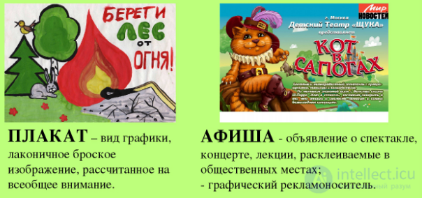
Characteristics of the poster genre:
Informativeness: A poster provides clear and accurate information about the event, so that readers can easily plan their visits.
Format: A poster is usually laid out as a table or a list, indicating the dates, times and venues of events.
Brevity: The text of a poster is usually limited in volume, so as to convey the main information in a concise form. It should be informative and easy to take in.
Reliability: A poster should contain reliable data about the event, in order to prevent possible misunderstandings or disappointment among readers.
Additional information: Some posters may also include brief descriptions of the artists, exhibitions or films, to help readers make a more informed choice.
Posters are published in specialised sections of newspapers, magazines, websites, or even in separate printed publications devoted to cultural events. They play an important role in informing society about various cultural opportunities and contribute to the development and spread of culture and art.
As a journalism genre, the poster has certain requirements to ensure its informativeness and convenience for readers. Here are some of the main requirements for a poster:
Completeness of information: A poster should contain all the necessary details about the event, including its name, date, time and venue. The ticket price and ways of purchasing tickets should also be indicated, if applicable.
Clarity and conciseness: The text of a poster should be clear and easy to read. It should be brief and contain only key information, avoiding unnecessary details or superfluous words.
Graphic design: A poster may contain design and graphic elements that help visually highlight information and make it more attractive. This can include the use of colours, fonts, images and logos.
Logical organisation: Information on a poster should be logically ordered and structured. Readers should be able to easily find the information they need, such as the dates and times of events, without unnecessary effort.
Accuracy of data: All information presented on a poster must be verified and accurate. This includes the correct spelling of names, correct dates and precise information about the venue.
Regular updates: A poster should be current and regularly updated. If there are changes to the schedule or details of the event, the poster should be updated or replaced with a more current version.
Requirements for a poster may vary slightly depending on the specific media format or publication in which it appears. However, in general, a poster should be informative, clear and convenient for readers, to help them decide whether to attend the event.
A banner is a format that can be used both in journalism and in marketing. Let's take a look at how a banner functions in each of these spheres.
Journalistic banner: In journalism, a banner is often used to draw readers' attention to certain news items or articles. A journalistic banner usually contains a headline and a brief introduction that provide the main information about the event or content of the article. It is placed on the homepage of a website or in a print publication to attract readers' attention and prompt them to read the full article. The purpose of a journalistic banner is to present the main information and arouse readers' interest.
Marketing banner: In marketing, a banner is an advertising material that presents goods, services or events. A marketing banner usually has an attractive design, including images, text and logos, in order to attract attention and create a desire in potential customers. It can be placed on websites, social media, billboards, banners in shopping centres and other places with large flows of people. The purpose of a marketing banner is to attract the target audience's attention, arouse interest and lead to an action, such as visiting a website, registering or purchasing a product or service.
The general purpose of a banner, both in journalism and in marketing, is to attract attention and interest the target audience. However, a journalistic banner usually informs about news or articles, while a marketing banner advertises products or services. The design, content and placement of a banner can vary depending on the specific goals and context of use.
It is now difficult to trace the history of the poster's creation from its very origin. But as early as the 16th century, the first examples already existed, used in Europe to announce the performances of artists, circus performers, and so on. A bright, colourful poster design appeared much later – in the 19th century. This type of advertising material is a variation on the flyer. The only difference is the method of distribution. Flyers and handbills are materials handed out, whereas posters and playbills are usually pasted onto walls, notice boards and other surfaces.
A poster usually depicts information that helps present the event and attract the attention of potential visitors. Here are some of the main elements that may be depicted on a poster:
Name of the event: The main name or title of the event should be clearly visible and attractively designed. It should be large enough and contrasting enough to attract readers' attention.
Image or illustration: A poster often features a graphic element, such as a photograph, illustration, artwork or logo, related to the event. It may be connected to the artistic aspect of the event or serve as a visual interpretation of its essence.
Date and time: A poster should contain information about the date and time of the event. This can be displayed as text or through graphic elements, such as a calendar or a clock.
Venue: It is important to indicate the place where the event will be held. This can be the name of a hall, theatre, gallery or other venue, as well as its address. Sometimes maps or directions are also included on the poster to help people find the venue.
Ticket price and ways of purchasing: If tickets need to be purchased, the poster can indicate their price and the ways to purchase them. This can be in text or through special symbols denoting the price.
Additional information: Depending on the event, a poster may present additional information, such as a list of artists or participants, a brief description of the programme, links to additional resources or contact details for obtaining more detailed information.
It is important to note that the design and layout of elements on a poster can vary depending on preferences and the style of design, as well as on the target audience of the event. The main task of a poster is to attract attention and provide enough information to interest people and prompt them to attend the event.
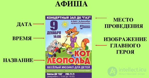
It would seem that everything here is simple and clear, but it is precisely in this simplicity that one of the main dangers lies. Often the desire to describe the event as fully and vividly as possible leads to the poster turning into a press release, that is, it loses its essence – being a compact and informative invitation. And yet it should make an instant impression.
That is why the main condition for success is to write briefly about the main thing. Suppose we want to invite guests to celebrate Maslenitsa (the Russian pancake festival), which we announce. When inviting everyone who wishes to come, the pronoun “you” is superfluous here, since it adds no specificity and does not designate a particular group of people. Also superfluous is the clarification, often found on posters, of “residents of the district” or “guests of the city”, because if someone not mentioned in the text shows up for the celebration, it will not disrupt the planned scenario.
Next, one should drop the phrase “we invite”, since this logically follows from the very nature of a poster. As a result, if the text is cut down to a minimum, it will not lose any of its original meaning at all.
It would have been enough to give the word “Maslenitsa” in large letters – and everyone would immediately understand where they were being invited to. Many posters suffer from an excess of information about the event (an overly bulky programme is fitted in, or too many participants are listed). This scatters the focus of attention, and it becomes difficult for a person to pick out the key facts from the abundance of information. If there is a desire to communicate something additional about the essence of the event, one should carefully choose the wording and place on the poster something that is truly worthwhile, interesting and does not duplicate the title.
What can a poster convey, and some posters can even convey a scent
Besides the name of the event itself, a poster must include the date and estimated time of its holding. Several
options are possible here. For example, indicating the year is most often unnecessary on a printed poster, which appears shortly before the event and is removed after its
conclusion. But for an electronic file posted online, the exact date will be especially important, since old announcements may confuse
potential visitors.
It is also important how the inviting party is indicated. Avoiding the use of the official name of the institution in the advertisement can only be welcomed. Another important element of a poster is the indication of the venue, and here too several particularities should be taken into account. If the library is holding an event on the square of another institution, a park, etc., then the address must be given to prevent confusion. If it concerns the only children's library in the city, or a rural one, or the main one in the region, which everyone already knows well, then either the address can be omitted entirely, or an abbreviated version can be given. The font size is most often chosen to be small, since this information is not key and, if needed, can easily be found in
open sources.
In addition, a poster must indicate the permissible age category of the event's participants, so as not to violate Federal Law No. 436 “On the Protection of Children from Information Harmful to Their Health and Development”. According to this document, “the size of the information-product marking must be no less than five percent of the area of the poster or other announcement of the relevant entertainment event, announcement of a film or video screening, as well as of the admission ticket, invitation or other document granting the right to attend such an event”.
Specialists often avoid using capital letters, since the text looks more effective from a composition standpoint that way. Recently a tendency has also taken hold of ignoring certain rules of the Russian language, in particular the rules of syllable hyphenation – a word is treated as a drawing, so the hyphenation is placed wherever it is most fitting (and the corresponding hyphen mark may be absent altogether). Vertical, upside-down writing of words and the like looks interesting too.
Sometimes text is the only “image” on a poster, but more often it is complemented by an illustration. Choosing the artwork is a complex and responsible
stage, even though it may seem otherwise to many. A suitable picture is not always the first thing that comes to mind. Interesting, non-trivial options
draw more attention than overused symbols. For example, the image of a book is encountered so often in the library
field (and of course there is an explanation for this) that visitors stop responding to it, stop delving into the essence of the news offer
illustrated in this way. Of course, it is good when an artist works on the poster, but if there is no such opportunity, one needs to be more
critical when choosing material and avoid formal solutions.
Rule 1. Do not overload the poster with text. Put only important information into the layout: the place, date and time, the title, the main performers, if known, the genre, the ticketing operator or information on how to buy tickets. Announcements and the names of all performers, if there are more than five, — are better saved for social media and the press.
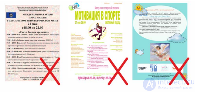
Fig. 1. Examples of posters
Rule 2. Write important information on the right. Most people remember better the part of the text that is placed on the right. Therefore, in the upper and lower right corners of the poster, place the information you consider most significant. For example, if you need to promote a brand or venue, place the logo and the name of the venue there. If you need attention drawn to the date — write the date. If the image shows performers of varying importance or recognisability — place the most popular one on the right or in the centre.
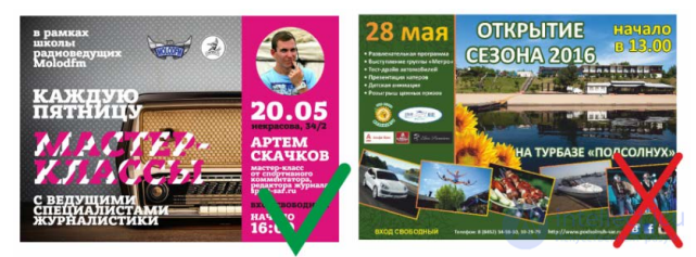
Figure 2. Examples of posters
Rule 3. Abandon symmetry. Psychologists have long proven that the human brain latches onto asymmetry. Therefore, place text at different levels of the poster's field (fig. 1). And even if, by concept, the poster should look perfectly symmetrical (for example, a circle in the centre of a square), allow yourself to misbehave a little and take at least one small element out of the circle. An exception may be the use of an asymmetric, dynamic picture. Then the text elements in your poster can be “centred” and placed symmetrically.
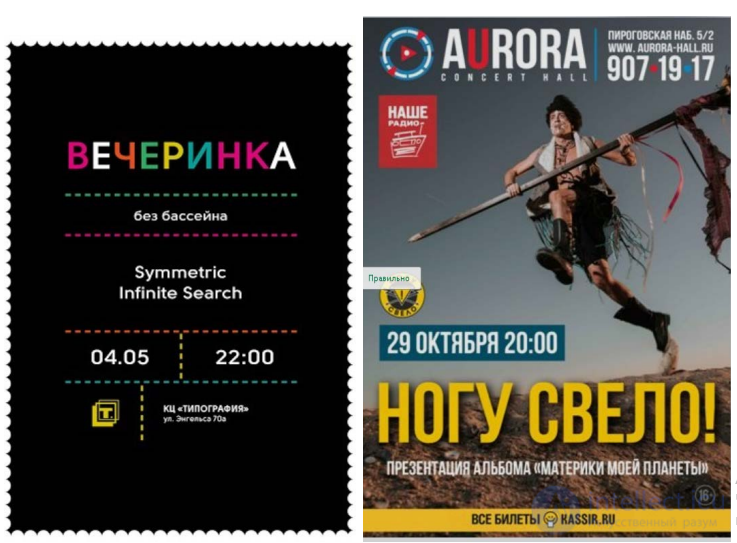
Figure 3. An incorrectly designed poster
Figure 4. A correctly designed poster
Rule 4. Choose an unusual shot. It doesn't matter whether you need to make a poster for a play, a band's concert, or a solo performer — try to choose an extraordinary, lively shot, especially if the person being advertised is not a media personality. Ask the photographers, if you are working together with them, not to take a “passport photo”, but to catch the artist in motion, with lively facial expressions, to get an emotional shot. If the photographs are sent by managers and you see that the photograph is boring, too static — ask them to send several to choose from. Do not hesitate to explain that the poster affects how full the hall will be and how recognisable the artist becomes.
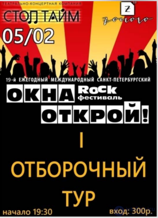
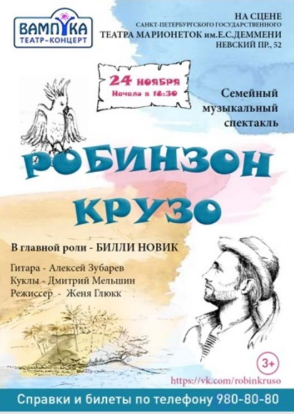
Figure 5. An incorrectly designed poster
Figure 6. A correctly designed poster
Rule 5. Do not overload the background with details. Try to choose a background that is not overloaded with details and busyness — the easier the picture and the text look against it, the more convenient the poster will be to take in.
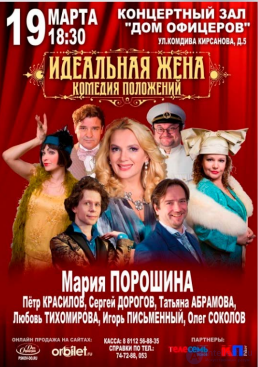
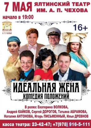
Figure 7. An incorrectly designed poster
Figure 8. A correctly designed poster
Rule 6. Work together with the artist. If the image for the poster is being prepared by an artist, try to interact with them and explain how the important elements should be placed in their picture. If the artist provides various elements that need to be combined into a single poster — try to maintain their style, while still observing all the rules of design
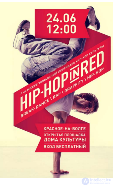
Figure 9. A correctly designed poster
Rule 7. Do not use many fonts. On a poster it is correct to use a maximum of two typefaces, and it is acceptable to add a third, but more than that is already bad taste. And most importantly, a jumble of fonts interferes with taking in the information. Logos of the venue and its name don't count, but if your concert features many performers, each of which has a signature typeface, — try not to put every single one's logo, choose the main one or three main performers, and write the rest of the groups in a single uniform font.
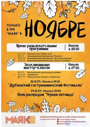
Fig. 10. A correctly designed poster
Rule 8. Do not use clip art (a set of graphic design elements). Try not to use in your poster the widely known clip art from free available collections, especially when it comes to clip art for discos and rock concerts. Show a bit of imagination and creativity.
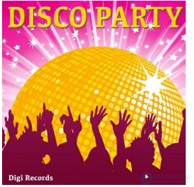
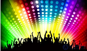
Fig. 11. Examples of clip art
Train your visual literacy, take video lessons and courses to improve your skills. Always remember — cultural institutions work and create a product for visitors and viewers. They must notice your poster, read the information on it and want to join your event. This is especially relevant for online content, which is offered both by cultural institutions and paid services. In such a stream, it is easy to get lost.
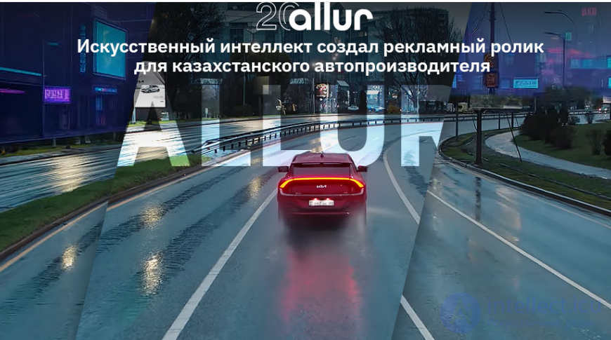
Fig. 12. An advertising banner, poster and video clip created by an artificial intelligence system
Below is a selection of interesting advertising banners that were created by neural network systems.
1. Do politicians drink too?

2. To eat or not to eat, that is the question?


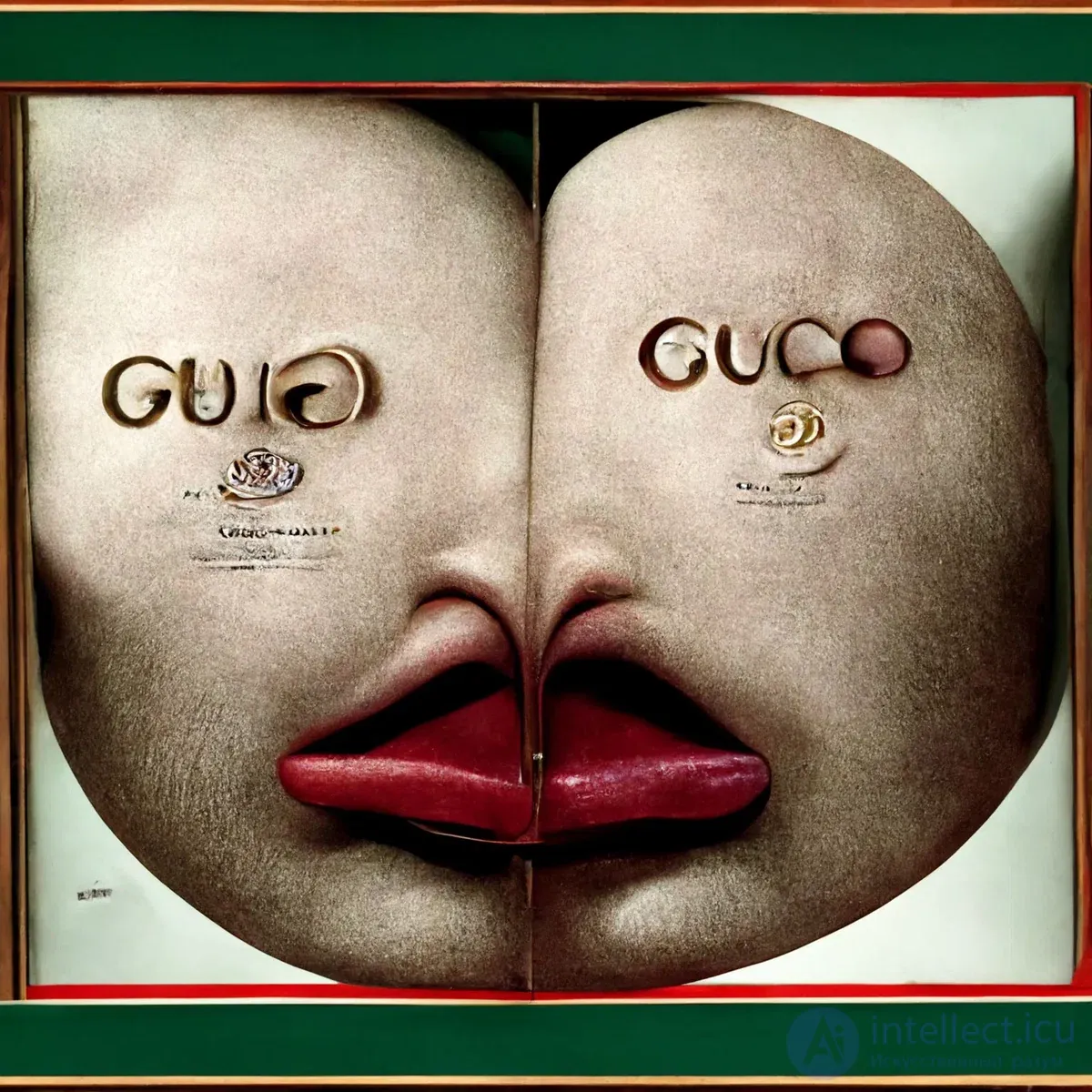
5. Uber will get you out of any mess!

What do you think of AI-created advertising? Does it sell services and goods? Do you feel like starting to use what's being advertised?

Comments