
Lecture
Hello everyone! We invite you to study the seventh topic of our open machine learning course!
 This session will be devoted to unsupervised learning methods, in particular principal component analysis (PCA) and clustering. You will learn why to reduce dimensionality in data, how to do it, and what ways there are to group similar observations in the data.
UPD: the course is now in English under the mlcourse.ai brand, with articles on Medium, and materials on Kaggle (Dataset) and on GitHub.
A video recording of the lecture based on this article, as part of the second run of the open course (September-November 2017).
List of articles in the series
The main difference between unsupervised learning methods and the usual machine learning classification and regression tasks is that there is no labeling for the data in this case. This gives rise to several features at once — first, it becomes possible to use incomparably larger volumes of data, since they won't need to be labeled by hand for training, and second, there is uncertainty in measuring the quality of the methods, due to the absence of the same straightforward and intuitively clear metrics as in supervised learning tasks.
One of the most obvious tasks that comes to mind in the absence of explicit labeling is the task of dimensionality reduction of data. On one hand it can be viewed as an aid to data visualization, and the t-SNE method, which we covered in the second article of the course, is often used for this. On the other hand, this kind of dimensionality reduction can remove redundant, strongly correlated features from the observations and prepare the data for further processing in a supervised-learning setting, for example making the input data more "digestible" for decision trees.
Principal component analysis (PCA) is one of the most intuitively simple and frequently used methods for reducing the dimensionality of data and projecting it onto an orthogonal subspace of features.
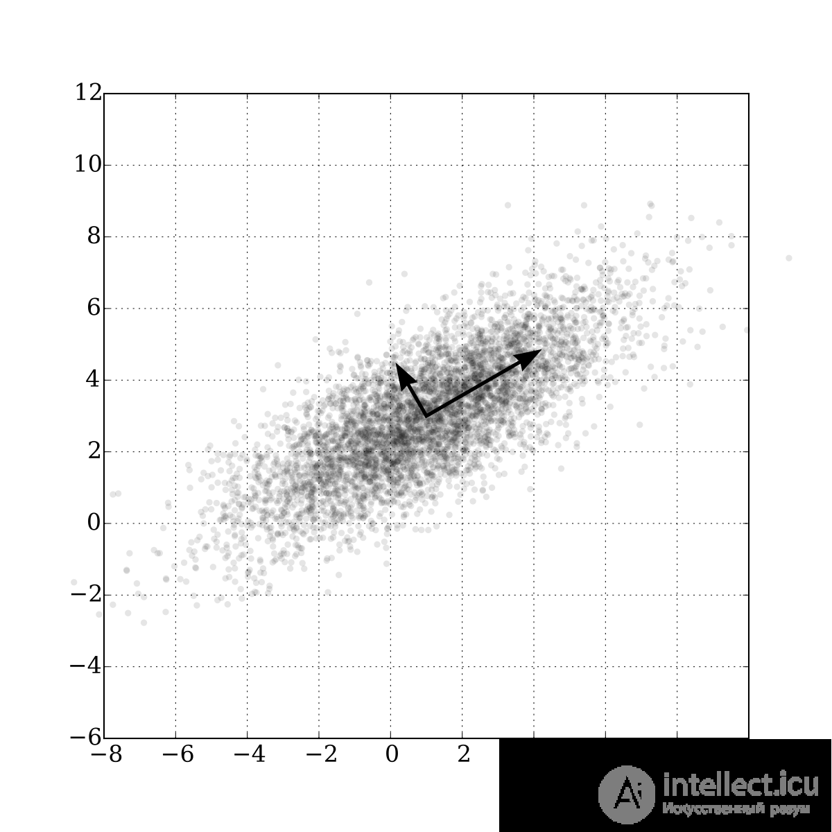 In the most general terms, this can be thought of as the assumption that all our observations most likely look like a certain ellipsoid in a subspace of our original space, and that our new basis in this space coincides with the axes of that ellipsoid. This assumption lets us simultaneously get rid of strongly correlated features, since the basis vectors of the space we're projecting onto will be orthogonal.
In the general case, the dimensionality of this ellipsoid will equal the dimensionality of the original space, but our assumption that the data lies in a lower-dimensional subspace lets us discard the "extra" subspace in the new projection, namely the subspace along whose axes the ellipsoid is least stretched. We will do this "greedily", choosing in turn, as the next basis element of our new subspace, the axis of the ellipsoid from those remaining along which the variance is greatest.
"To deal with hyper-planes in a 14 dimensional space, visualize a 3D space and say 'fourteen' very loudly. Everyone does it." — Geoffrey Hinton
Let's consider how this is done mathematically:
To reduce the dimensionality of our data from  to
to  , we need to choose the top
  axes of such an ellipsoid, sorted in decreasing order by variance along the axes.
Let's start by computing the variances and covariances of the original features. This is done simply using the covariance matrix. By the definition of covariance, for two features  and
and  their covariance will be

where  is the expected value of the
  -th feature.
Note here that covariance is symmetric, and the covariance of a vector with itself will equal its variance.
Thus the covariance matrix is a symmetric matrix, where the variances of the corresponding features lie on the diagonal, and off the diagonal are the covariances of the corresponding pairs of features. In matrix form, where  is the observation matrix, our covariance matrix will look like

To refresh our memory — matrices, as linear operators, have this interesting property called eigenvalues and eigenvectors. These things are remarkable in that when our matrix acts on the corresponding linear space, the eigenvectors stay in place and are only multiplied by their corresponding eigenvalues. That is, they define a subspace which, under the action of this matrix as a linear operator, stays in place, or "maps into itself". Formally, an eigenvector  with eigenvalue
  for a matrix
  is simply defined as
  .
.
The covariance matrix for our sample can be represented as the product  . From the Rayleigh quotient it follows that the maximum variation of our dataset is achieved along the eigenvector of this matrix corresponding to the maximum eigenvalue. Thus, the principal components onto which we would like to project our data are simply the eigenvectors corresponding to the top eigenvalues of this matrix.
The next steps are ridiculously simple — we just need to multiply our data matrix by these components and we will get a projection of our data onto the orthogonal basis of these components. Now, if we transpose our data matrix and the matrix of principal component vectors, we will recover the original sample in the space from which we made the projection onto the components. If the number of components was smaller than the dimensionality of the original space, we will lose some information in this transformation.
Let's start by loading all the necessary modules and playing around with the familiar iris dataset, following the example from the scikit-learn package documentation.
import numpy as np
import matplotlib.pyplot as plt
import seaborn as sns; sns.set(style='white')
%matplotlib inline
from sklearn import decomposition
from sklearn import datasets
from mpl_toolkits.mplot3d import Axes3D

# Load our irises
iris = datasets.load_iris()
X = iris.data
y = iris.target

# Set up a nice 3D picture
fig = plt.figure(1, figsize=(6, 5))
plt.clf()
ax = Axes3D(fig, rect=[0, 0, .95, 1], elev=48, azim=134)

plt.cla()

for name, label in [('Setosa', 0), ('Versicolour', 1), ('Virginica', 2)]:
    ax.text3D(X[y == label, 0].mean(),
              X[y == label, 1].mean() + 1.5,
              X[y == label, 2].mean(), name,
              horizontalalignment='center',
              bbox=dict(alpha=.5, edgecolor='w', facecolor='w'))
# Reorder the label colors so that they match correctly
y_clr = np.choose(y, [1, 2, 0]).astype(np.float)
ax.scatter(X[:, 0], X[:, 1], X[:, 2], c=y_clr, cmap=plt.cm.spectral)

ax.w_xaxis.set_ticklabels([])
ax.w_yaxis.set_ticklabels([])
ax.w_zaxis.set_ticklabels([])
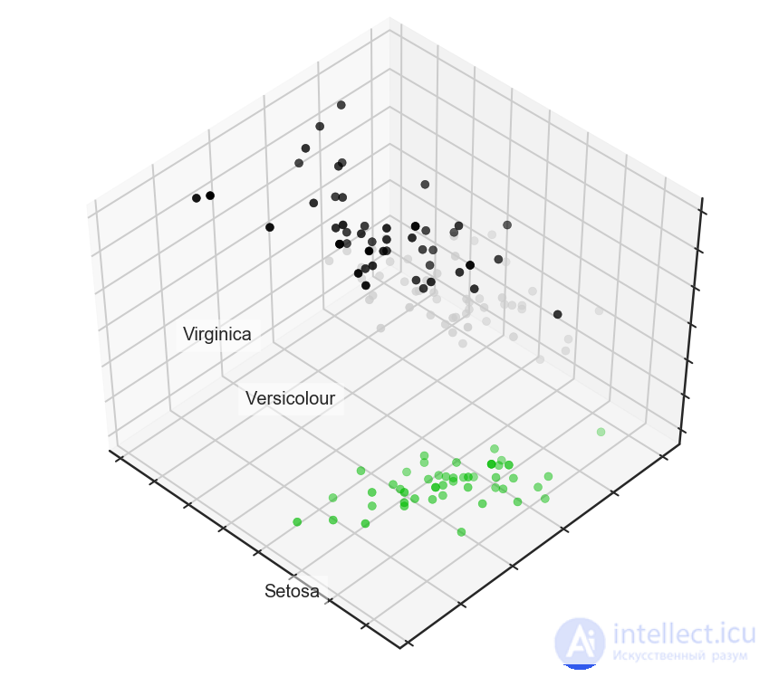
Now let's see how much PCA improves the results for a model that, in this case, will handle classification poorly because it lacks the complexity to describe the data:
from sklearn.tree import DecisionTreeClassifier
from sklearn.model_selection import train_test_split
from sklearn.metrics import accuracy_score, roc_auc_score

# Split off a validation set from our data
X_train, X_test, y_train, y_test = train_test_split(X, y, test_size=.3,
                                                    stratify=y,
                                                    random_state=42)

# As an example, let's take a shallow decision tree
clf = DecisionTreeClassifier(max_depth=2, random_state=42)
clf.fit(X_train, y_train)
preds = clf.predict_proba(X_test)
print('Accuracy: {:.5f}'.format(accuracy_score(y_test,
                                                preds.argmax(axis=1))))
Out: Accuracy: 0.88889
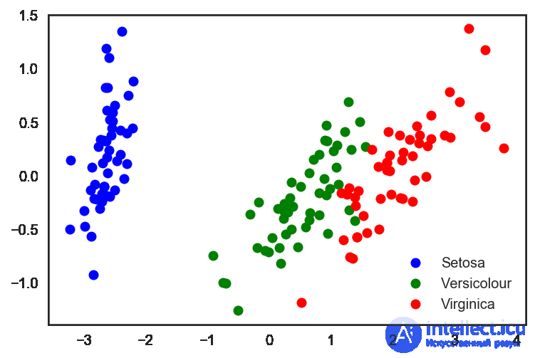
Now let's try to do the same thing, but with data for which we have reduced the dimensionality to 2D:
# Run the PCA built into sklearn
pca = decomposition.PCA(n_components=2)
X_centered = X - X.mean(axis=0)
pca.fit(X_centered)
X_pca = pca.transform(X_centered)

# And plot the resulting points in our new space
plt.plot(X_pca[y == 0, 0], X_pca[y == 0, 1], 'bo', label='Setosa')
plt.plot(X_pca[y == 1, 0], X_pca[y == 1, 1], 'go', label='Versicolour')
plt.plot(X_pca[y == 2, 0], X_pca[y == 2, 1], 'ro', label='Virginica')
plt.legend(loc=0);
# Repeat the same split into validation and training sets.
X_train, X_test, y_train, y_test = train_test_split(X_pca, y, test_size=.3,
                                                    stratify=y,
                                                    random_state=42)

clf = DecisionTreeClassifier(max_depth=2, random_state=42)
clf.fit(X_train, y_train)
preds = clf.predict_proba(X_test)
print('Accuracy: {:.5f}'.format(accuracy_score(y_test,
                                                preds.argmax(axis=1))))
Let's look at the increased classification accuracy:
Out: Accuracy: 0.91111
We can see that the quality increased only slightly, but for more complex, higher-dimensional data, where the data does not split trivially along a single feature, applying PCA can substantially improve the performance of decision trees and ensembles based on them.
Let's look at the 2 principal components in the last PCA representation of the data, and at the percentage of the original variance in the data that they "explain".
for i, component in enumerate(pca.components_):
    print("{} component: {}% of initial variance".format(i + 1,
          round(100 * pca.explained_variance_ratio_[i], 2)))
    print(" + ".join("%.3f x %s" % (value, name)
                     for value, name in zip(component,
                                            iris.feature_names)))
1 component: 92.46% of initial variance
0.362 x sepal length (cm) + -0.082 x sepal width (cm) + 0.857 x petal length (cm) + 0.359 x petal width (cm)
2 component: 5.3% of initial variance
0.657 x sepal length (cm) + 0.730 x sepal width (cm) + -0.176 x petal length (cm) + -0.075 x petal width (cm)
The handwritten digits dataset
Now let's take the handwritten digits dataset. We already worked with it in the 3rd article about decision trees and the nearest neighbors method.
digits = datasets.load_digits()
X = digits.data
y = digits.target
Let's recall what these digits look like — let's look at the first ten. Here, the images are represented by an 8 x 8 matrix (white-color intensity for each pixel). This matrix is then "unrolled" into a vector of length 64, giving the feature description of the object.
# f, axes = plt.subplots(5, 2, sharey=True, figsize=(16,6))
plt.figure(figsize=(16, 6))
for i in range(10):
    plt.subplot(2, 5, i + 1)
    plt.imshow(X[i,:].reshape([8,8]));
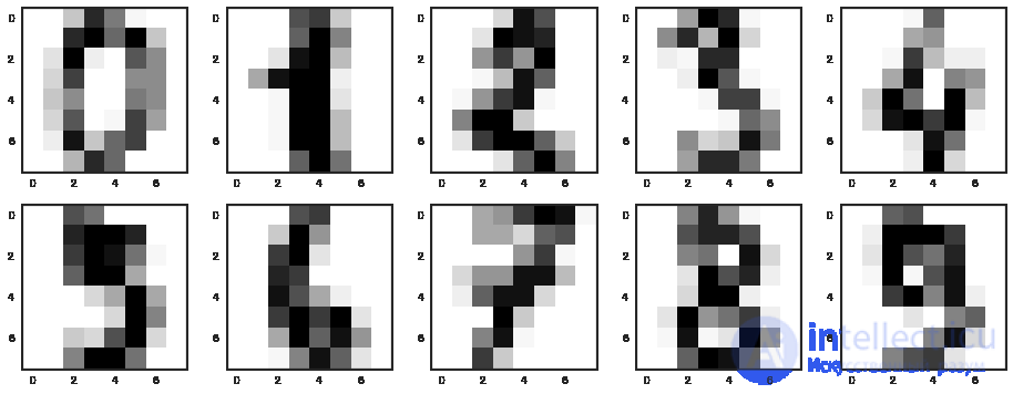
It turns out that the dimensionality of the feature space here is 64. But let's reduce the dimensionality all the way down to 2, and we'll see that even by eye, the handwritten digits split fairly well into clusters.
pca = decomposition.PCA(n_components=2)
X_reduced = pca.fit_transform(X)

print('Projecting %d-dimensional data to 2D' % X.shape[1])

plt.figure(figsize=(12,10))
plt.scatter(X_reduced[:, 0], X_reduced[:, 1], c=y,
            edgecolor='none', alpha=0.7, s=40,
            cmap=plt.cm.get_cmap('nipy_spectral', 10))
plt.colorbar()
plt.title('MNIST. PCA projection')
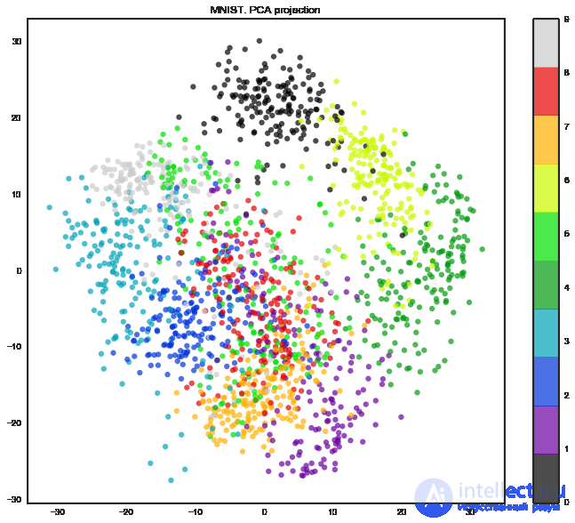
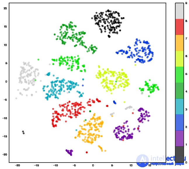
Well, to be fair, with t-SNE the picture comes out even better, since PCA has a limitation — it only finds linear combinations of the original features. On the other hand, even on this relatively small dataset you can notice how much longer t-SNE takes to run.
%%time

from sklearn.manifold import TSNE
tsne = TSNE(random_state=17)

X_tsne = tsne.fit_transform(X)

plt.figure(figsize=(12,10))
plt.scatter(X_tsne[:, 0], X_tsne[:, 1], c=y,
            edgecolor='none', alpha=0.7, s=40,
            cmap=plt.cm.get_cmap('nipy_spectral', 10))
plt.colorbar()
plt.title('MNIST. t-SNE projection')
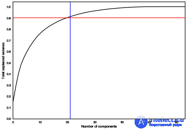
In practice, it's common to choose enough principal components to retain 90% of the variance of the original data. In this case, it's enough to select 21 principal components, i.e. to reduce the dimensionality from 64 features to 21.
pca = decomposition.PCA().fit(X)

plt.figure(figsize=(10,7))
plt.plot(np.cumsum(pca.explained_variance_ratio_), color='k', lw=2)
plt.xlabel('Number of components')
plt.ylabel('Total explained variance')
plt.xlim(0, 63)
plt.yticks(np.arange(0, 1.1, 0.1))
plt.axvline(21, c='b')
plt.axhline(0.9, c='r')
plt.show();
The intuitive formulation of the clustering problem is quite simple and amounts to us wanting to say: "Here I have a bunch of scattered points. I can see that they're falling into some clumps together. It would be great to be able to assign these points to clumps, and when a new point appears on the plane, to say which clump it falls into." From this formulation it's clear that there's a lot of room for imagination, and hence a corresponding variety of algorithms for solving this problem arises. The algorithms listed below by no means describe this variety in full, but are examples of the most popular methods for solving the clustering problem.
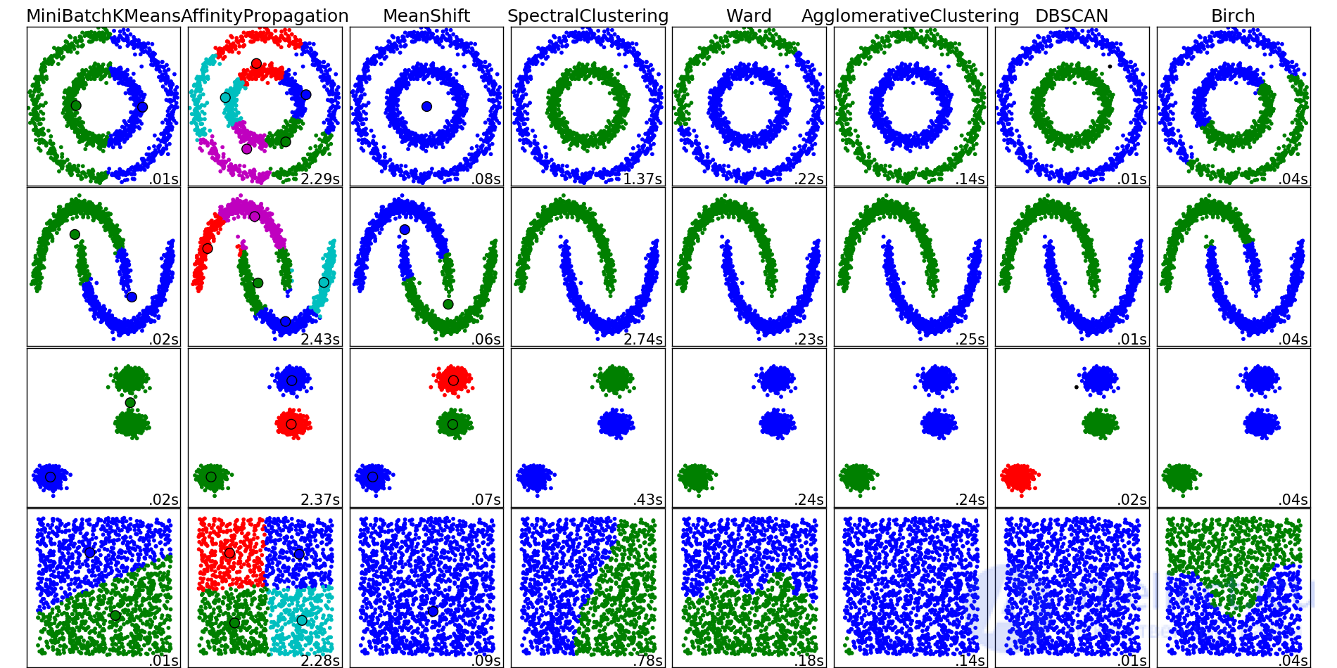
Examples of clustering algorithms at work, from the scikit-learn package documentation
The K-means algorithm is probably the most popular and simplest clustering algorithm, and it can be represented very easily as simple pseudocode:
that seems optimal to us for our data. points (centroids) randomly across the space of our data.
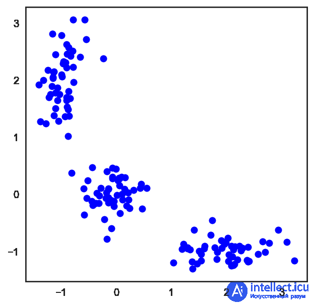
In the case of the ordinary Euclidean metric for points lying on a plane, this algorithm is very easy to work out analytically and to draw. Let's look at a corresponding example:
# Let's start by scattering three clusters of points on the plane
X = np.zeros((150, 2))

np.random.seed(seed=42)
X[:50, 0] = np.random.normal(loc=0.0, scale=.3, size=50)
X[:50, 1] = np.random.normal(loc=0.0, scale=.3, size=50)

X[50:100, 0] = np.random.normal(loc=2.0, scale=.5, size=50)
X[50:100, 1] = np.random.normal(loc=-1.0, scale=.2, size=50)

X[100:150, 0] = np.random.normal(loc=-1.0, scale=.2, size=50)
X[100:150, 1] = np.random.normal(loc=2.0, scale=.5, size=50)

plt.figure(figsize=(5, 5))
plt.plot(X[:, 0], X[:, 1], 'bo');
# scipy has a nice function that computes distances
# between pairs of points from two arrays passed to it as input
from scipy.spatial.distance import cdist

# Fix the randomness and scatter three random centroids to start
np.random.seed(seed=42)
centroids = np.random.normal(loc=0.0, scale=1., size=6)
centroids = centroids.reshape((3, 2))

cent_history = []
cent_history.append(centroids)

for i in range(3):
    # Compute the distances from the observations to the centroids
    distances = cdist(X, centroids)
    # See which centroid each point is closest to
    labels = distances.argmin(axis=1)

    # Set each new centroid to the geometric center of its points
    centroids = centroids.copy()
    centroids[0, :] = np.mean(X[labels == 0, :], axis=0)
    centroids[1, :] = np.mean(X[labels == 1, :], axis=0)
    centroids[2, :] = np.mean(X[labels == 2, :], axis=0)

    cent_history.append(centroids)
# And now let's draw all this beauty
plt.figure(figsize=(8, 8))
for i in range(4):
    distances = cdist(X, cent_history[i])
    labels = distances.argmin(axis=1)

    plt.subplot(2, 2, i + 1)
    plt.plot(X[labels == 0, 0], X[labels == 0, 1], 'bo', label='cluster #1')
    plt.plot(X[labels == 1, 0], X[labels == 1, 1], 'co', label='cluster #2')
    plt.plot(X[labels == 2, 0], X[labels == 2, 1], 'mo', label='cluster #3')
    plt.plot(cent_history[i][:, 0], cent_history[i][:, 1], 'rX')
    plt.legend(loc=0)
    plt.title('Step {:}'.format(i + 1));
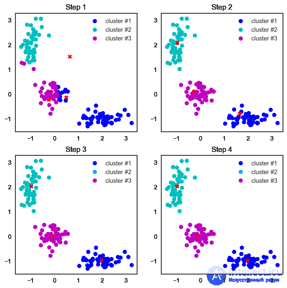
It's also worth noting that although we considered the Euclidean distance, the algorithm will converge for any other metric as well, so for various clustering tasks, depending on the data, you can experiment not only with the number of steps or the convergence criterion, but also with the metric by which we compute the distances between points and cluster centroids.
Another feature of this algorithm is that it is sensitive to the initial position of the cluster centroids in space. In this situation, several consecutive runs of the algorithm followed by averaging of the resulting clusters comes to the rescue.
Choosing the number of clusters for kMeans
Unlike the classification or regression problem, in the case of clustering it is harder to choose a criterion that would make it easy to represent the clustering problem as an optimization problem.
For kMeans, the following criterion is common — the sum of squared distances from the points to the centroids of the clusters they belong to.

here  is the set of clusters of cardinality
  , and
, and  is the centroid of cluster
  .
.
It's clear that there's common sense in this: we want the points to be located close together near the centers of their clusters. But here's the catch: the minimum of such a functional is achieved when there are as many clusters as there are points (that is, each point is a cluster of one element).
To resolve this issue (choosing the number of clusters), the following heuristic is often used: choose the number of clusters starting from which the functional described,  , falls off "no longer so fast". Or, more formally:

Let's look at an example.
from sklearn.cluster import KMeans

inertia = []
for k in range(1, 8):
    kmeans = KMeans(n_clusters=k, random_state=1).fit(X)
inertia.append(np.sqrt(kmeans.inertia_))

plt.plot(range(1, 8), inertia, marker='s');
plt.xlabel('$k$')
plt.ylabel('$J(C_k)$');
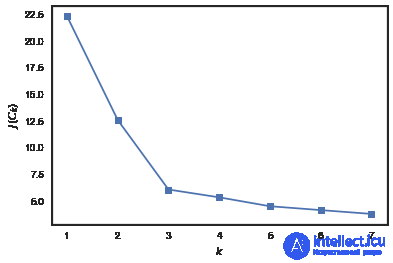
We can see that  drops sharply as the number of clusters increases from 1 to 2 and from 2 to 3, and no longer as sharply – when changes from 3 to 4. So for this problem it is optimal to choose 3 clusters.
Complications
Solving the K-means problem itself is NP-hard, and for dimensionality  , number of clusters and number of points , it is solved in
  . To deal with this pain, heuristics are often used, for example MiniBatch K-means, which for training does not use the whole dataset but only small portions of it (batches), and updates the centroids using the average over the entire update history of the centroid from all points assigned to it. A comparison of ordinary K-means and its MiniBatch implementation can be found in the scikit-learn documentation.
The scikit-learn implementation of the algorithm has plenty of handy perks, such as the ability to set the number of runs via the n_init parameter, which gives more stable cluster centroids in the case of skewed data. Moreover, these runs can be done in parallel, without sacrificing computation time.
Another example of a clustering algorithm. Unlike the K-means algorithm, this approach does not require specifying in advance the number of clusters we want to split our data into. The main idea of the algorithm is that we want our observations to be clustered into groups based on how they "communicate", or how similar they are to each other.
For this, let us introduce some "similarity" metric, defined such that  if observation
  is more similar to observation
  than to
  . A simple example of such similarity is the negative squared distance
  .
.
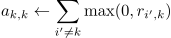
Now let us describe the "communication" process itself. To do this, we set up two matrices initialized with zeros, one of which  will describe how well the -th observation fits to be a "role model" for the -th observation relative to all other potential "examples", while the second —
  will describe how correct it would be for the -th observation to choose the -th as such an "example". It sounds a bit confusing, but a little further on we will see an example "in plain terms".
After that these matrices are updated in turn according to the rules:


Spectral clustering combines several of the approaches described above to get the maximum profit from complex manifolds of dimensionality lower than the original space.
For this algorithm to work, we will need to define a matrix of observation similarity (adjacency matrix). This can be done the same way as for Affinity Propagation above:  . This matrix also describes a complete graph with vertices at our observations and edges between every pair of observations with a weight corresponding to the degree of similarity of these vertices. For our metric chosen above and points lying on a plane, this thing is intuitive and simple — two points are more similar if the edge between them is shorter. Now we would like to split our resulting graph into two parts so that the resulting points in the two graphs are, on the whole, more similar to other points inside their resulting "own" half of the graph than to points in the "other" half. The formal name for such a problem is called the Normalized cuts problem, and you can read more about this here.
Probably the simplest and most understandable clustering algorithm without a fixed number of clusters — agglomerative clustering. The intuition of the algorithm is very simple:
The process of finding the closest clusters itself can happen using different methods of merging points:




The profit of the first three approaches compared to the fourth is that for them there is no need to recompute distances every time after merging, which greatly reduces the computational complexity of the algorithm.
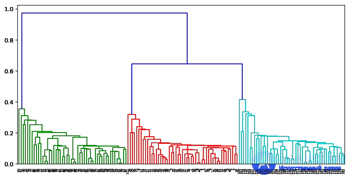
Based on the results of running such an algorithm, one can also build a nice tree of cluster merges and, looking at it, determine at which stage it would be most optimal for us to stop the algorithm. Or use the same elbow rule as in k-means.
Fortunately for us, Python already has great tools for building such dendrograms for agglomerative clustering. Let's look at an example using our clusters from K-means:
from scipy.cluster import hierarchy
from scipy.spatial.distance import pdist

X = np.zeros((150, 2))

np.random.seed(seed=42)
X[:50, 0] = np.random.normal(loc=0.0, scale=.3, size=50)
X[:50, 1] = np.random.normal(loc=0.0, scale=.3, size=50)

X[50:100, 0] = np.random.normal(loc=2.0, scale=.5, size=50)
X[50:100, 1] = np.random.normal(loc=-1.0, scale=.2, size=50)

X[100:150, 0] = np.random.normal(loc=-1.0, scale=.2, size=50)
X[100:150, 1] = np.random.normal(loc=2.0, scale=.5, size=50)

distance_mat = pdist(X) # pdist will compute for us the upper triangle of the pairwise distance matrix

Z = hierarchy.linkage(distance_mat, 'single') # linkage — implementation of the agglomerative algorithm
plt.figure(figsize=(10, 5))
dn = hierarchy.dendrogram(Z, color_threshold=0.5)
The task of assessing clustering quality is more complex compared to assessing classification quality. First, such assessments should not depend on the label values themselves, but only on the partitioning of the sample itself. Second, the true labels of the objects are not always known, so we also need estimates that allow us to assess the quality of clustering using only an unlabeled sample.
There are external and internal quality metrics. External ones use information about the true division into clusters, while internal metrics do not use any external information and assess the quality of clustering based only on the dataset. The optimal number of clusters is usually determined using internal metrics.
All the metrics listed below are implemented in sklearn.metrics.
Adjusted Rand Index (ARI)
It is assumed that the true labels of the objects are known. This measure does not depend on the label values themselves, but only on the partitioning of the sample into clusters. Let — be the number of objects in the sample. Denote by  — the number of pairs of objects that have the same labels and are in the same cluster, and by
  — the number of pairs of objects that have different labels and are in different clusters. Then the Rand Index is
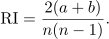
That is, this is the fraction of objects for which these partitions (the original one and the one obtained as a result of clustering) "agree". The Rand Index (RI) expresses the similarity of two different clusterings of the same sample. For this index to give values close to zero for random clusterings for any and number of clusters, it needs to be normalized. This is how the Adjusted Rand Index is defined:
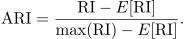
This measure is symmetric and does not depend on the values and permutations of the labels. Thus, this index is a measure of distance between different partitions of the sample.  takes values in the range
  . Negative values correspond to "independent" partitions into clusters, values close to zero — to random partitions, and positive values indicate that the two partitions are similar (they coincide when
  ).
).
Adjusted Mutual Information (AMI)
This measure is very similar to . It is also symmetric and does not depend on the values and permutations of the labels. It is defined using the entropy function, interpreting the sample partitions as discrete distributions (the probability of assignment to a cluster equals the fraction of objects in it). The  index is defined as the mutual information for the two distributions corresponding to the partitions of the sample into clusters. Intuitively, mutual information measures the fraction of information common to both partitions: how much information about one of them reduces the uncertainty about the other.
Similarly to , the index  is defined, which allows getting rid of the growth of the index with an increasing number of classes. It takes values in the range
  . Values close to zero indicate independence of the partitions, and values close to one – their similarity (coinciding when
  ).
).
Homogeneity, completeness, V-measure
Formally, these measures are also defined using the entropy and conditional entropy functions, treating the sample partitions as discrete distributions:

here — is the clustering result, — is the true division of the sample into classes. Thus,  measures how much each cluster consists of objects of one class, and
  — how much objects of one class belong to one cluster. These measures are not symmetric. Both quantities take values in the range , and larger values correspond to more accurate clustering. These measures are not normalized, like or , and therefore depend on the number of clusters. Random clustering will not give zero scores with a large number of classes and a small number of objects. In these cases it is preferable to use . However, with more than 1000 objects and fewer than 10 clusters, this problem is not so pronounced and can be ignored.
To account for both quantities and at the same time, the  -measure is introduced, as their harmonic mean:

It is symmetric and shows how similar two clusterings are to each other.
Silhouette
Unlike the metrics described above, this coefficient does not assume knowledge of the true labels of the objects, and allows assessing the quality of clustering using only the (unlabeled) sample itself and the clustering result. First, the silhouette is defined separately for each object. Denote by — the average distance from the given object to objects from the same cluster, and by — the average distance from the given object to objects from the nearest cluster (other than the one the object itself belongs to). Then the silhouette of the given object is defined as the quantity:
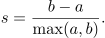
The silhouette of the sample is defined as the average value of the silhouette of the objects in the given sample. Thus, the silhouette shows how much the average distance to objects of its own cluster differs from the average distance to objects of other clusters. This quantity lies in the range . Values close to -1 correspond to poor (scattered) clusterings, values close to zero indicate that the clusters overlap and intersect with each other, values close to 1 correspond to "dense", clearly separated clusters. Thus, the larger the silhouette, the more clearly the clusters are separated, and they represent compact, densely grouped clouds of points.
With the help of the silhouette one can choose the optimal number of clusters (if it is not known in advance) — the number of clusters that maximizes the silhouette value is chosen. Unlike the previous metrics, the silhouette depends on the shape of the clusters, and reaches larger values on more convex clusters, obtained using algorithms based on reconstructing the density of the distribution.
And finally, let us look at these metrics for our algorithms, run on the MNIST handwritten digit data:
from sklearn import metrics
from sklearn import datasets
import pandas as pd
from sklearn.cluster import KMeans, AgglomerativeClustering, AffinityPropagation, SpectralClustering

data = datasets.load_digits()
X, y = data.data, data.target

algorithms = []
algorithms.append(KMeans(n_clusters=10, random_state=1))
algorithms.append(AffinityPropagation())
algorithms.append(SpectralClustering(n_clusters=10, random_state=1,
                                     affinity='nearest_neighbors'))
algorithms.append(AgglomerativeClustering(n_clusters=10))

data = []
for algo in algorithms:
    algo.fit(X)
    data.append(({
        'ARI': metrics.adjusted_rand_score(y, algo.labels_),
        'AMI': metrics.adjusted_mutual_info_score(y, algo.labels_),
        'Homogenity': metrics.homogeneity_score(y, algo.labels_),
        'Completeness': metrics.completeness_score(y, algo.labels_),
        'V-measure': metrics.v_measure_score(y, algo.labels_),
        'Silhouette': metrics.silhouette_score(X, algo.labels_)}))

results = pd.DataFrame(data=data, columns=['ARI', 'AMI', 'Homogenity',
                                           'Completeness', 'V-measure',
                                           'Silhouette'],
                       index=['K-means', 'Affinity',
                              'Spectral', 'Agglomerative'])

results
| ARI | AMI | Homogenity | Completeness | V-measure | Silhouette | |
|---|---|---|---|---|---|---|
| K-means | 0.662295 | 0.732799 | 0.735448 | 0.742972 | 0.739191 | 0.182097 |
| Affinity | 0.175174 | 0.451249 | 0.958907 | 0.486901 | 0.645857 | 0.115197 |
| Spectral | 0.752639 | 0.827818 | 0.829544 | 0.876367 | 0.852313 | 0.182195 |
| Agglomerative | 0.794003 | 0.856085 | 0.857513 | 0.879096 | 0.868170 | 0.178497 |
Current homework assignments are announced during the next session of the course; you can follow them in the VK group and in the course repository.
In the demo version of the homework, you are invited to work with Samsung data on recognizing types of human activity. The task is interesting; we will look at it both as a clustering task (forgetting that the sample is labeled) and as a classification task. A Jupyter starter notebook and a web form for answers are provided; the solution can also be found there.

Comments