
Lecture
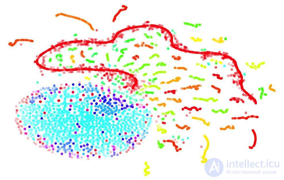
The second lesson is devoted to data visualization in Python. First, we'll look at the main methods of the Seaborn and Plotly libraries, then we'll analyze the telecom operator customer churn dataset that's already familiar from the first article, and we'll peek into n-dimensional space with the t-SNE algorithm. There's also a video recording of the lecture based on this article, from the second run of the open course (September-November 2017).
UPD: the course is now in English under the mlcourse.ai brand, with articles on Medium, and materials on Kaggle (Dataset) and on GitHub.
The article is now going to be noticeably longer. Ready? Let's go!
List of articles in the series
As always, let's start by setting up the environment: we import all the necessary libraries and tweak the default plot display a bit.
# turn off Anaconda warnings
import warnings
warnings.simplefilter('ignore')

# display plots right in jupyter
%matplotlib inline
import seaborn as sns
import matplotlib.pyplot as plt
#svg plots look crisper
%config InlineBackend.figure_format = 'svg'

#increase the default plot size
from pylab import rcParams
rcParams['figure.figsize'] = 8, 5
import pandas as pd
Next, let's load into a DataFrame the data we'll be working with. For the examples, I chose data on video game sales and ratings from Kaggle Datasets.
df = pd.read_csv('../../data/video_games_sales.csv')
df.info()
RangeIndex: 16719 entries, 0 to 16718
Data columns (total 16 columns):
Name               16717 non-null object
Platform           16719 non-null object
Year_of_Release    16450 non-null float64
Genre              16717 non-null object
Publisher          16665 non-null object
NA_Sales           16719 non-null float64
EU_Sales           16719 non-null float64
JP_Sales           16719 non-null float64
Other_Sales        16719 non-null float64
Global_Sales       16719 non-null float64
Critic_Score       8137 non-null float64
Critic_Count       8137 non-null float64
User_Score         10015 non-null object
User_Count         7590 non-null float64
Developer          10096 non-null object
Rating             9950 non-null object
dtypes: float64(9), object(7)
memory usage: 2.0+ MB
Some features that pandas read as object we'll explicitly convert to float or int types.
df['User_Score'] = df.User_Score.astype('float64')
df['Year_of_Release'] = df.Year_of_Release.astype('int64')
df['User_Count'] = df.User_Count.astype('int64')
df['Critic_Count'] = df.Critic_Count.astype('int64')
There's no data for all games, so let's keep only the records that have no missing values, using the dropna method.
df = df.dropna()
print(df.shape)
(6825, 16)
In total, the table has 6825 objects and 16 features for them. Let's look at the first few records with the head method, to make sure everything was parsed correctly. For convenience, I kept only the features we'll be using going forward.
useful_cols = ['Name', 'Platform', 'Year_of_Release', 'Genre',
               'Global_Sales', 'Critic_Score', 'Critic_Count',
               'User_Score', 'User_Count', 'Rating'
              ]
df[useful_cols].head()

Before we move on to looking at the methods of the seaborn and plotly libraries, let's discuss the simplest and often most convenient way to visualize data from a pandas DataFrame — using the plot function.
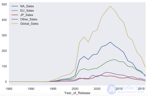
As an example, let's build a chart of video game sales in different countries depending on the year. First, let's filter out only the columns we need, then calculate the total sales by year and call the plot function on the resulting DataFrame without any parameters.
sales_df = df[[x for x in df.columns if 'Sales' in x] + ['Year_of_Release']]
sales_df.groupby('Year_of_Release').sum().plot()
The implementation of the plot function in pandas is based on the matplotlib library.
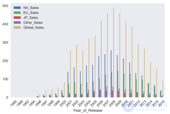
With the kind parameter, you can change the type of chart, for example, to a bar chart. Matplotlib lets you configure charts very flexibly. You can change almost anything about a chart, but you'll need to dig through the documentation to find the parameters you need. For example, the rot parameter controls the tilt angle of the x-axis tick labels.
sales_df.groupby('Year_of_Release').sum().plot(kind='bar', rot=45)
Now let's move on to the seaborn library. Seaborn is essentially a higher-level API built on top of the matplotlib library. Seaborn has more sensible default plot styling. The library also has some fairly complex visualization types that would require a lot of code in matplotlib.
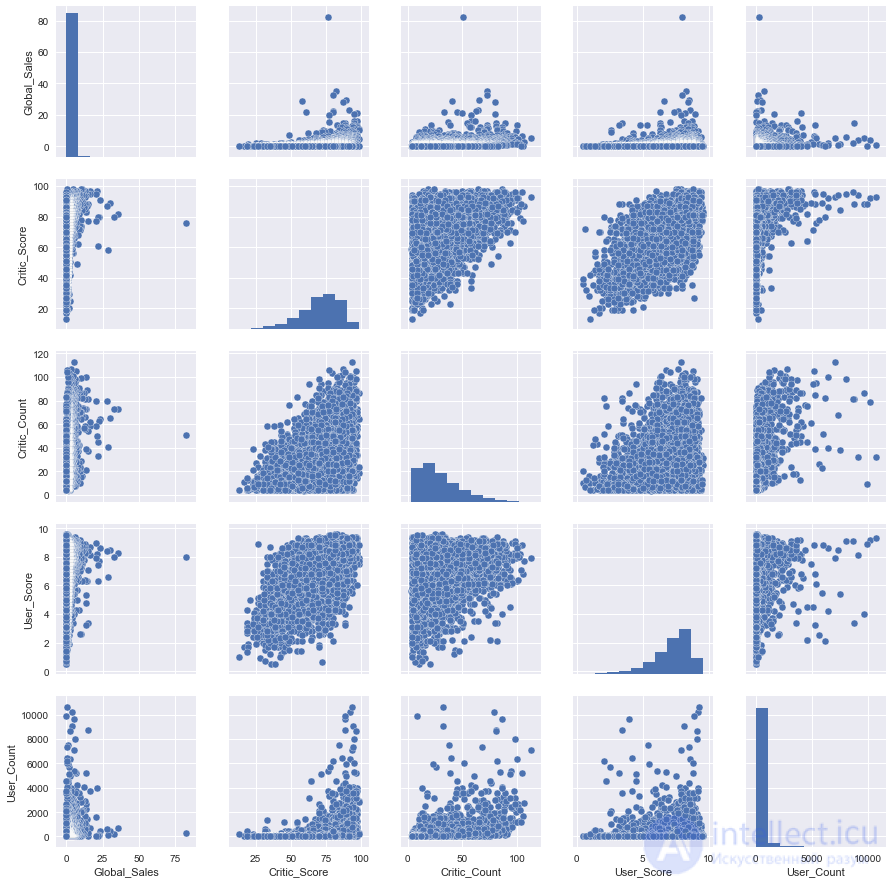
Let's get acquainted with the first such "complex" type of chart, the pair plot (scatter plot matrix). This visualization will help us see, in a single picture, how various features are related to each other.
cols = ['Global_Sales', 'Critic_Score', 'Critic_Count', 'User_Score', 'User_Count']
sns_plot = sns.pairplot(df[cols])
sns_plot.savefig('pairplot.png')
As you can see, the diagonal of the chart matrix contains histograms of the feature distributions. The remaining charts are ordinary scatter plots for the corresponding pairs of features.
To save charts to files, it's worth using the savefig method.
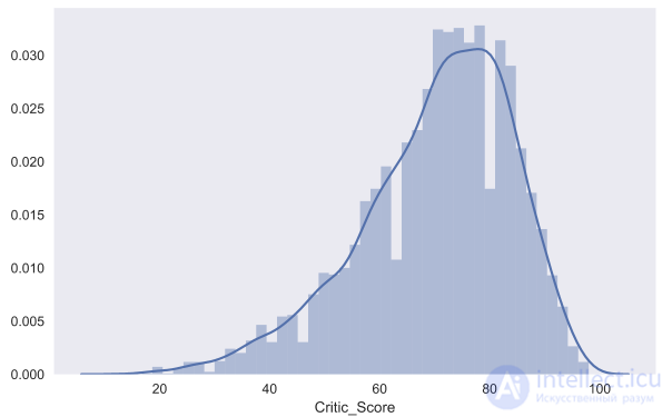
With seaborn, you can also build a distribution plot, the dist plot. As an example, let's look at the distribution of the critics' scores, Critic_Score. By default, the chart shows a histogram and a kernel density estimation.
sns.distplot(df.Critic_Score)
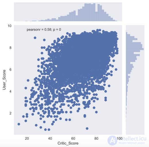
To take a closer look at the relationship between two numeric features, there's also the joint plot — a hybrid of a scatter plot and a histogram. Let's look at how the critics' score Critic_Score and the users' score User_Score are related to each other.
Another useful type of chart is the box plot. Let's compare the critics' scores for the top 5 largest gaming platforms.
top_platforms = df.Platform.value_counts().sort_values(ascending = False).head(5).index.values
sns.boxplot(y="Platform", x="Critic_Score", data=df[df.Platform.isin(top_platforms)], orient="h")
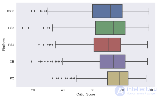
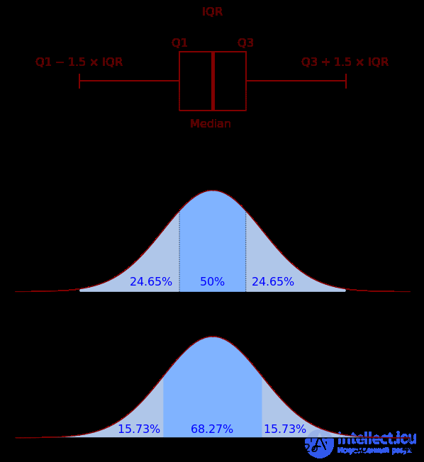
I think it's worth discussing in a bit more detail how to read a box plot. A box plot consists of a box (hence the name box plot), whiskers, and points. The box shows the interquartile range of the distribution, that is, the 25th (Q1) and 75th (Q3) percentiles, respectively. The line inside the box marks the median of the distribution.
Now that we've covered the box, let's move on to the whiskers. The whiskers show the entire spread of points except for the outliers, that is, the minimum and maximum values that fall within the interval (Q1 - 1.5*IQR, Q3 + 1.5*IQR), where IQR = Q3 - Q1 — the interquartile range. The points on the chart mark the outliers — the values that don't fit within the range of values set by the chart's whiskers.
It's easier to understand by seeing it once, so here's a picture from Wikipedia as well:
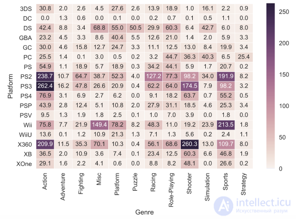
And one more type of chart (the last one we'll look at in this article) is the heat map. A heat map lets you look at the distribution of some numeric feature across two categorical features. Let's visualize the total sales of games by genre and gaming platform.
platform_genre_sales = df.pivot_table(
                        index='Platform',
                        columns='Genre',
                        values='Global_Sales',
                        aggfunc=sum).fillna(0).applymap(float)
sns.heatmap(platform_genre_sales, annot=True, fmt=".1f", linewidths=.5)
We've looked at visualizations based on the matplotlib library. However, that's not the only option for building charts in Python. Let's also get acquainted with the plotly library. Plotly is an open-source library that lets you build interactive charts in Jupyter Notebook without needing to dig into javascript code.
The beauty of interactive charts is that you can see the exact numeric value on mouse hover, hide uninteresting series in the visualization, zoom in on a particular section of the chart, and so on.
Before we start, let's import all the necessary modules and initialize plotly using the init_notebook_mode command.
from plotly.offline import download_plotlyjs, init_notebook_mode, plot, iplot
import plotly
import plotly.graph_objs as go

init_notebook_mode(connected=True)
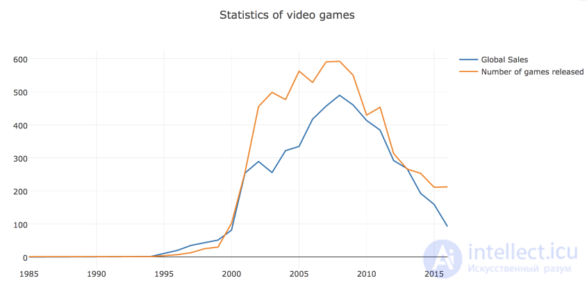
To start, let's build a line plot showing the dynamics of the number of games released and their sales by year.
# calculate the number of games released and copies sold by year
years_df = df.groupby('Year_of_Release')[['Global_Sales']].sum().join(
    df.groupby('Year_of_Release')[['Name']].count()
)
years_df.columns = ['Global_Sales', 'Number_of_Games']

# create a line for the number of copies sold
trace0 = go.Scatter(
    x=years_df.index,
    y=years_df.Global_Sales,
    name='Global Sales'
)

# create a line for the number of games released
trace1 = go.Scatter(
    x=years_df.index,
    y=years_df.Number_of_Games,
    name='Number of games released'
)

# define the data array and set the chart title in the layout
data = [trace0, trace1]
layout = {'title': 'Statistics of video games'}

# create a Figure object and visualize it
fig = go.Figure(data=data, layout=layout)
iplot(fig, show_link=False)
In plotly, the visualization is built from a Figure object, which consists of data (an array of lines, called traces in the library) and formatting/style, which the layout object is responsible for. In simple cases, you can call the iplot function with just the array of traces.
The show_link parameter controls the links to the plot.ly online platform on the charts. Since this functionality usually isn't needed, I prefer to hide it to prevent accidental clicks.
You can also save the chart right away as an html file.
plotly.offline.plot(fig, filename='years_stats.html', show_link=False)
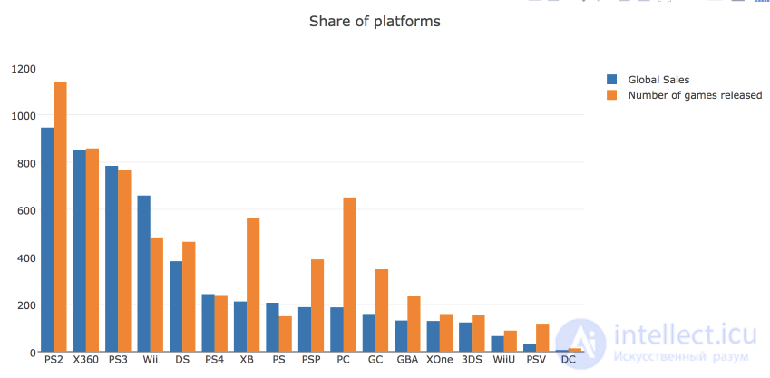
Let's also look at the market share of gaming platforms, calculated by the number of games released and by total revenue. For this, let's build a bar chart.
# count the number of games sold and released by platform
platforms_df = df.groupby('Platform')[['Global_Sales']].sum().join(
    df.groupby('Platform')[['Name']].count()
)
platforms_df.columns = ['Global_Sales', 'Number_of_Games']
platforms_df.sort_values('Global_Sales', ascending=False, inplace=True)

# create traces for visualization
trace0 = go.Bar(
    x=platforms_df.index,
    y=platforms_df.Global_Sales,
    name='Global Sales'
)

trace1 = go.Bar(
    x=platforms_df.index,
    y=platforms_df.Number_of_Games,
    name='Number of games released'
)

# create an array with the data and set the title for the chart and the x axis in layout
data = [trace0, trace1]
layout = {'title': 'Share of platforms', 'xaxis': {'title': 'platform'}}

# create a Figure object and visualize it
fig = go.Figure(data=data, layout=layout)
iplot(fig, show_link=False)
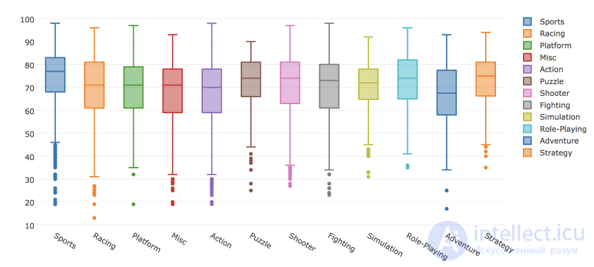
You can also build a box plot in plotly. Let's look at the distributions of critics' scores depending on the game's genre.
# create a Box trace for each genre in our data
data = []
for genre in df.Genre.unique():
    data.append(
        go.Box(y=df[df.Genre==genre].Critic_Score, name=genre)
    )

# visualize the data
iplot(data, show_link = False)
With plotly, you can also build other types of visualizations. The charts come out fairly nice with the default settings. However, the library also lets you flexibly configure various visualization parameters: colors, fonts, labels, annotations, and much more.
Let's read into a DataFrame the telecom operator customer churn data that's already familiar from the first article.
df = pd.read_csv('../../data/telecom_churn.csv')
Let's check that everything was read correctly – let's look at the first 5 rows (the head method).
df.head()

The number of rows (customers) and columns (features):
df.shape
(3333, 20)
Let's look at the features and make sure none of them have missing values – there are 3333 records everywhere.
df.info()
RangeIndex: 3333 entries, 0 to 3332
Data columns (total 20 columns):
State                     3333 non-null object
Account length            3333 non-null int64
Area code                 3333 non-null int64
International plan        3333 non-null object
Voice mail plan           3333 non-null object
Number vmail messages     3333 non-null int64
Total day minutes         3333 non-null float64
Total day calls           3333 non-null int64
Total day charge          3333 non-null float64
Total eve minutes         3333 non-null float64
Total eve calls           3333 non-null int64
Total eve charge          3333 non-null float64
Total night minutes       3333 non-null float64
Total night calls         3333 non-null int64
Total night charge        3333 non-null float64
Total intl minutes        3333 non-null float64
Total intl calls          3333 non-null int64
Total intl charge         3333 non-null float64
Customer service calls    3333 non-null int64
Churn                     3333 non-null bool
dtypes: bool(1), float64(8), int64(8), object(3)
memory usage: 498.1+ KB
Feature description
| Name | Description | Type |
|---|---|---|
| State | State letter code | categorical |
| Account length | How long the customer has been with the company | quantitative |
| Area code | Phone number prefix | quantitative |
| International plan | International roaming (on/off) | binary |
| Voice mail plan | Voicemail (on/off) | binary |
| Number vmail messages | Number of voicemail messages | quantitative |
| Total day minutes | Total call duration during the day | quantitative |
| Total day calls | Total number of calls during the day | quantitative |
| Total day charge | Total charge for services during the day | quantitative |
| Total eve minutes | Total call duration during the evening | quantitative |
| Total eve calls | Total number of calls during the evening | quantitative |
| Total eve charge | Total charge for services during the evening | quantitative |
| Total night minutes | Total call duration at night | quantitative |
| Total night calls | Total number of calls at night | quantitative |
| Total night charge | Total charge for services at night | quantitative |
| Total intl minutes | Total duration of international calls | quantitative |
| Total intl calls | Total number of international calls | quantitative |
| Total intl charge | Total charge for international calls | quantitative |
| Customer service calls | Number of calls to the service center | quantitative |
Target variable: Churn – the churn indicator, binary (1 – the customer was lost, i.e. churned). Later we'll build models that predict this feature from the others, which is why we called it the target.
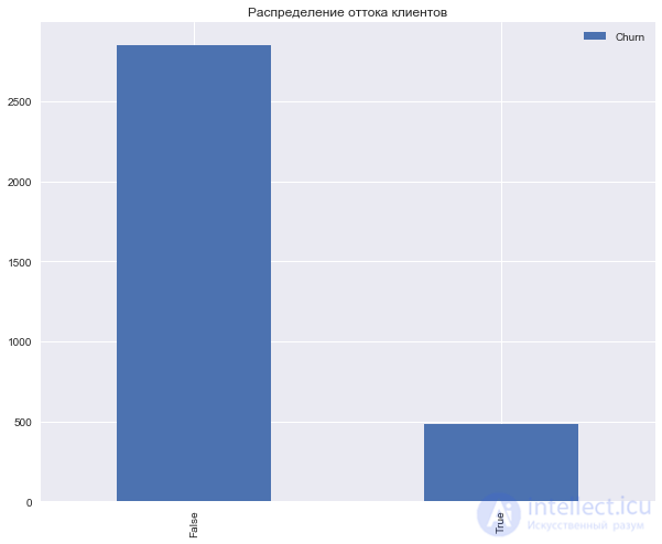
Let's look at the distribution of the target class – customer churn.
df['Churn'].value_counts()
False    2850
True      483
Name: Churn, dtype: int64
df['Churn'].value_counts().plot(kind='bar', label='Churn')
plt.legend()
plt.title('Distribution of customer churn');
Let's identify the following groups of features (among all of them except Churn ):
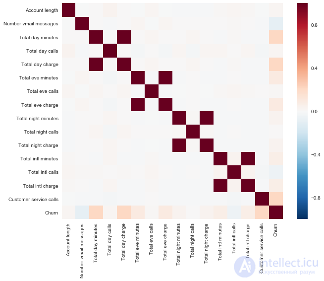
Let's look at the correlations of the quantitative features. From the colored correlation matrix, you can see that features like Total day charge are computed from the minutes talked (Total day minutes). That is, 4 features can be dropped, since they carry no useful information.
corr_matrix = df.drop(['State', 'International plan', 'Voice mail plan',
                      'Area code'], axis=1).corr()
sns.heatmap(corr_matrix);
Now let's look at the distributions of all the quantitative features we're interested in. We'll look at the binary/categorical/ordinal features separately.
features = list(set(df.columns) - set(['State', 'International plan', 'Voice mail plan',  'Area code',
                                      'Total day charge',   'Total eve charge',   'Total night charge',
                                        'Total intl charge', 'Churn']))

df[features].hist(figsize=(20,12));
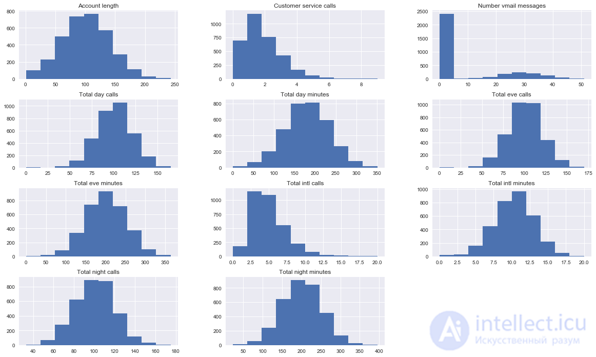
We see that most of the features are normally distributed. The exceptions are the number of calls to the service center (Customer service calls) (a Poisson distribution fits better here) and the number of voicemail messages (Number vmail messages, with a peak at zero, i.e. these are the customers who don't have voicemail enabled). The distribution of the number of international calls is also skewed (Total intl calls).
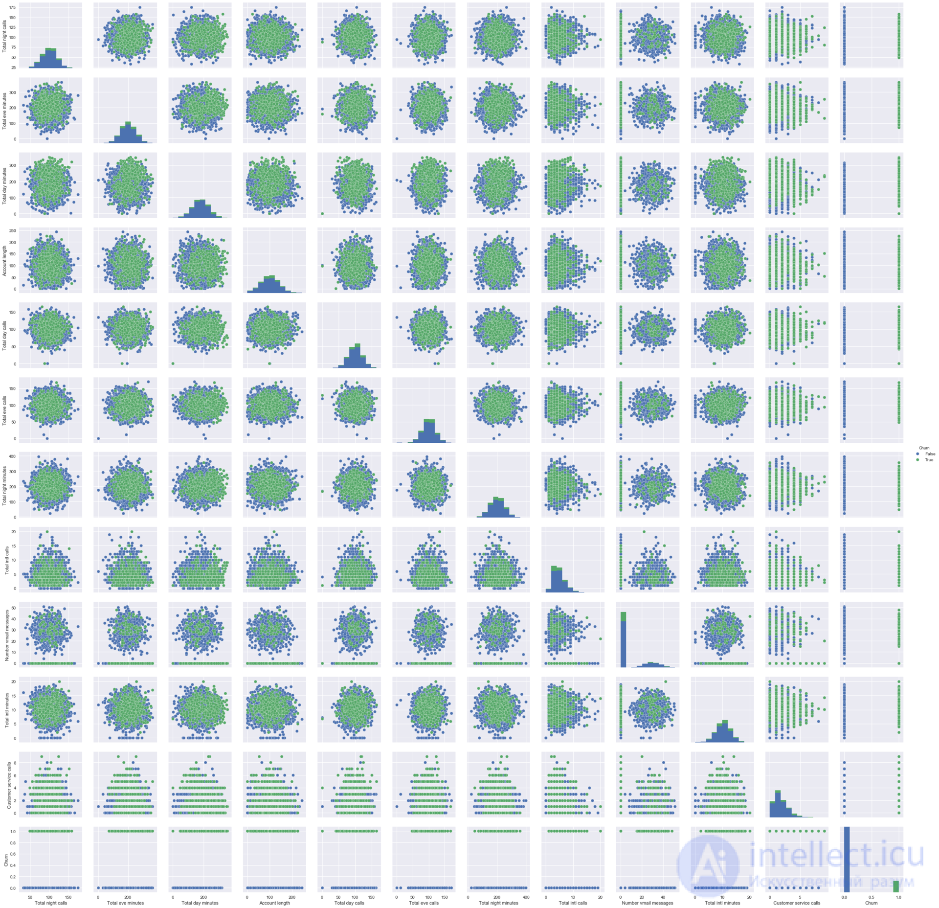
It's also useful to build pictures like this one, where the main diagonal shows the feature distributions, and off the main diagonal are scatter plots for pairs of features. Sometimes this leads to some insight, but in this case everything is pretty much clear, with no surprises.
sns.pairplot(df[features + ['Churn']], hue='Churn');
Next, let's look at how the features relate to the target – to churn.
Let's build boxplots describing the distribution statistics of the quantitative features in two groups: loyal customers and churned customers.
fig, axes = plt.subplots(nrows=3, ncols=4, figsize=(16, 10))

for idx, feat in  enumerate(features):
    sns.boxplot(x='Churn', y=feat, data=df, ax=axes[idx / 4, idx % 4])
    axes[idx / 4, idx % 4].legend()
    axes[idx / 4, idx % 4].set_xlabel('Churn')
    axes[idx / 4, idx % 4].set_ylabel(feat);
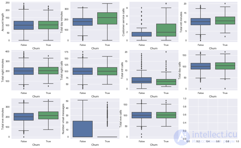
Visually, we see the biggest difference for the features Total day minutes, Customer service calls, and Number vmail messages. Later on, we'll learn to determine feature importance in a classification problem using a random forest (or gradient boosting), and it will turn out that the first two are indeed very important features for predicting churn.
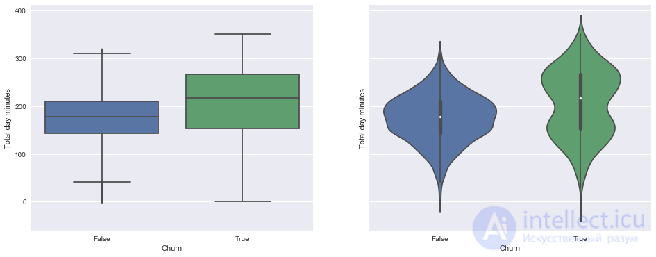
Let's look separately at the pictures showing the distribution of the number of minutes talked during the day among loyal/churned customers. On the left are the boxplots we already know, and on the right are smoothed histograms of the distribution of the numeric feature in the two groups (mostly just a nice-looking picture, since everything is already clear from the boxplot).
An interesting observation: on average, churned customers use the service more. Perhaps they're unhappy with the rate plans, and one of the measures to combat churn would be lowering the rates (the cost of mobile service). But the company would need to carry out additional economic analysis to determine whether such measures would really be justified.
_, axes = plt.subplots(1, 2, sharey=True, figsize=(16,6))

sns.boxplot(x='Churn', y='Total day minutes', data=df, ax=axes[0]);
sns.violinplot(x='Churn', y='Total day minutes', data=df, ax=axes[1]);
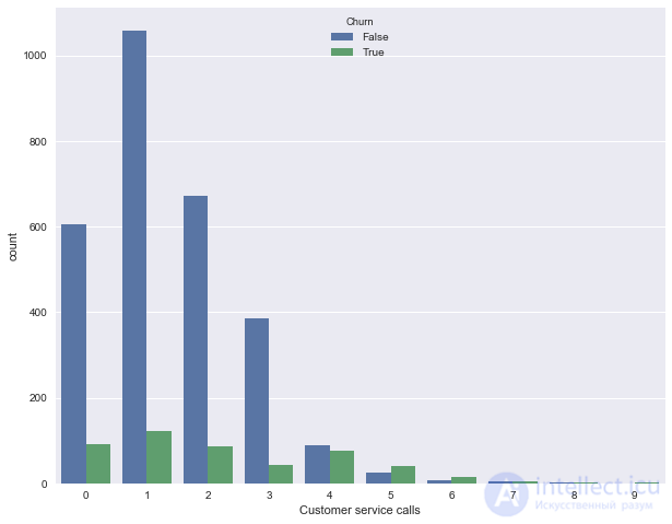
Now let's plot the distribution of the number of calls to the service center (we built a similar picture in the first article). There aren't many unique values of this feature here (it can be treated either as a quantitative integer feature or as an ordinal one), and it's more illustrative to show the distribution using a countplot. Observation: the churn rate rises sharply starting from 4 calls to the service center.
sns.countplot(x='Customer service calls', hue='Churn', data=df);
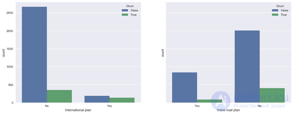
Now let's look at how the binary features International plan and Voice mail plan relate to churn. Observation: when roaming is enabled, the churn rate is much higher, i.e. having international roaming is a strong feature. The same can't be said about voicemail.
_, axes = plt.subplots(1, 2, sharey=True, figsize=(16,6))

sns.countplot(x='International plan', hue='Churn', data=df, ax=axes[0]);
sns.countplot(x='Voice mail plan', hue='Churn', data=df, ax=axes[1]);
Finally, let's look at how the categorical feature State is related to churn. It's already less pleasant to work with, since the number of unique states is quite large – 51. You could start by building a summary table or calculating the churn percentage for each state. But there's too little data for each individual state (there are only 3 to 17 churned customers in each state), so it's possible that the feature State shouldn't be added to the classification models later on, because of the risk of overfitting (but we'll check this with cross-validation, stay tuned!).
Churn rates for each state:
df.groupby(['State'])['Churn'].agg([np.mean]).sort_values(by='mean', ascending=False).T


You can see that in New Jersey and California the churn rate is above 25%, while in Hawaii and Alaska it's below 5%. But these conclusions are based on rather modest statistics, and this may simply be a quirk of the available data (here you could also test hypotheses about Matthews and Cramer correlations, but that's beyond the scope of this article).
Let's build a t-SNE representation of the same churn data. The name of the method is complicated – t-distributed Stochastic Neighbor Embedding, and the math is pretty cool too (we won't dig into it, but for those interested – here's the original paper by G. Hinton and his graduate student in JMLR), but the basic idea is dead simple: find a mapping from the multidimensional feature space onto a plane (or into 3D, but 2D is almost always chosen) such that points that were far from each other also end up far apart on the plane, and points that were close also end up mapped close together. That is, neighbor embedding is a kind of search for a new representation of the data that preserves neighborhood relations.
A few details: we'll drop the states and the churn feature, and convert the binary Yes/No features to numbers (pd.factorize). We also need to scale the sample – subtract the mean from each feature and divide by the standard deviation, which is what StandardScaler does.
from sklearn.manifold import TSNE
from sklearn.preprocessing import StandardScaler
# convert all features to numeric, dropping the states
X = df.drop(['Churn', 'State'], axis=1)
X['International plan'] = pd.factorize(X['International plan'])[0]
X['Voice mail plan'] = pd.factorize(X['Voice mail plan'])[0]

scaler = StandardScaler()
X_scaled = scaler.fit_transform(X)
%%time
tsne = TSNE(random_state=17)
tsne_representation = tsne.fit_transform(X_scaled)
CPU times: user 20 s, sys: 2.41 s, total: 22.4 s
Wall time: 21.9 s
plt.scatter(tsne_representation[:, 0], tsne_representation[:, 1]);
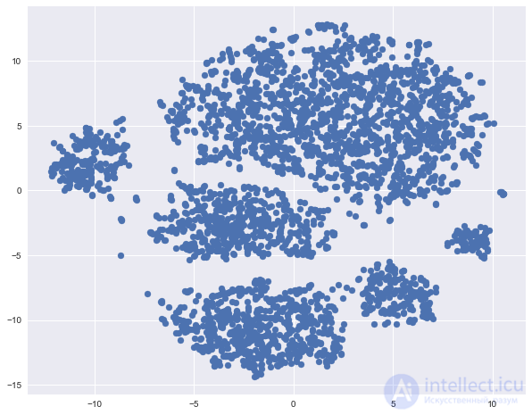
Let's color the resulting t-SNE representation of the churn data (blue – loyal customers, orange – churned customers).
plt.scatter(tsne_representation[:, 0], tsne_representation[:, 1],
            c=df['Churn'].map({0: 'blue', 1: 'orange'}));
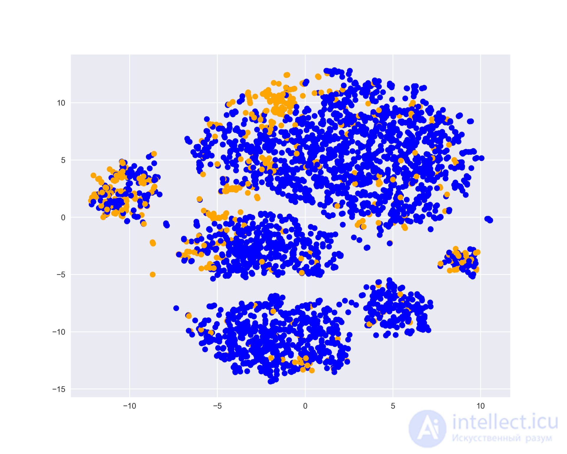
We can see that churned customers mostly "cluster" in certain regions of the feature space.
To better understand the picture, you can also color it by the other binary features – by roaming and voicemail. The blue areas correspond to objects that have that binary feature.
_, axes = plt.subplots(1, 2, sharey=True, figsize=(16,6))

axes[0].scatter(tsne_representation[:, 0], tsne_representation[:, 1],
            c=df['International plan'].map({'Yes': 'blue', 'No': 'orange'}));
axes[1].scatter(tsne_representation[:, 0], tsne_representation[:, 1],
            c=df['Voice mail plan'].map({'Yes': 'blue', 'No': 'orange'}));
axes[0].set_title('International plan');
axes[1].set_title('Voice mail plan');
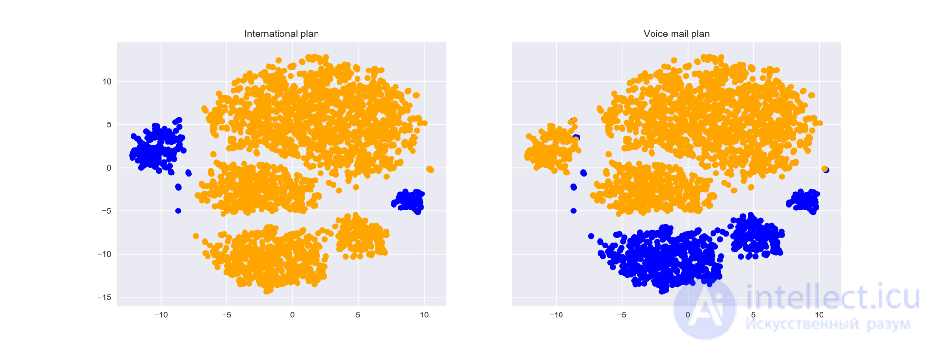
Now it's clear that, for example, a lot of churned customers cluster in the left group of people who have roaming enabled but no voicemail.
Finally, let's note the downsides of t-SNE (yes, it too deserves a separate article):
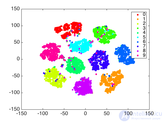
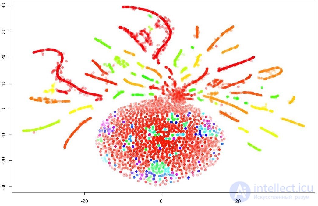
And a couple more pictures. With t-SNE you can really get a good picture of the data (as in the case of handwritten digits, here's a good article), or you can just draw a Christmas tree ornament.
Current homework assignments are announced during the next run of the course; you can follow along in the VK group and in the course repository.
To reinforce the material, we suggest doing this assignment – carry out a visual analysis of data on publications on Habrahabr. You can check yourself by submitting your answers in the web form (you'll also find the solution there).

Comments