Lecture
The wide development of various platforms and devices makes developers make special versions of sites for them, which is quite time-consuming and problematic. At the same time, times and needs change, and website creation for various devices is an inevitable and necessary link in its development. With this in mind, CSS introduced the concept of media type, when the style is applied only to a specific device. In tab. 4.1 lists some types of media.
| Type of | Description |
|---|---|
| all | All types. This value is used by default. |
| aural | Speech synthesizers, as well as programs to play the text out loud. This, for example, include speech browsers. |
| braille | Braille based devices that are designed for blind people. |
| handheld | Handheld computers and similar devices. |
| Printing devices like a printer. | |
| projection | Projector. |
| screen | Monitor screen. |
| tv | Television. |
In CSS, the @import and @media commands are used to specify the type of media, with which you can define a style for elements depending on whether the document is displayed on the screen or on a printer.
The keywords @media and @import refer to these rules. This name comes from the name of the symbol @ - “fl”, from which these keywords begin. In runet, the well-established term "dog" is used to denote the symbol @. Only now use the expression "dog's rule" language does not rotate.
When importing a style via the @import command, the media type is indicated after the file address. In this case, it is allowed to specify several types at once, mentioning them separated by commas, as shown in Example 4.1.
Example 4.1. Import Style File
<!DOCTYPE HTML> <html> <head> <meta charset="utf-8"> <title>Импорт стиля</title> <style> @import "/style/main.css" screen; /* Стиль для вывода результата на монитор */ @import "/style/smart.css" print, handheld; /* Стиль для печати и смартфона */ </style> </head> <body> <p>...</p> </body> </html> In this example, two files are imported - main.css is intended to change the type of document when it is viewed on the monitor screen, and smart.css - when printing a page and displayed on a smartphone.
Internet Explorer browser up to version 7 inclusively does not support media types when importing a style file.
The @media command allows you to specify the media type for global or related styles and in general has the following syntax.
@media тип носителя 1 { Описание стиля для типа носителя 1 } @media тип носителя 2 { Описание стиля для типа носителя 2 } After the keyword @media there is one or more types of media listed in Table. 4.1, if there are more than one, they are separated by a comma. Then follow the obligatory curly brackets, inside which comes the usual description of style rules. Example 4.2 shows how to set a different style for printing and display on the monitor.
Example 4.2. Styles for different types of media
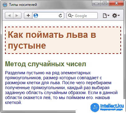
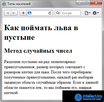
<!DOCTYPE HTML> <html> <head> <meta charset="utf-8"> <title>Типы носителей</title> <style> @media screen { /* Стиль для отображения в браузере */ BODY { font-family: Arial, Verdana, sans-serif; /* Рубленый шрифт */ font-size: 90%; /* Размер шрифта */ color: #000080; /* Цвет текста */ } H1 { background: #faf0e6; /* Цвет фона */ border: 2px dashed maroon; /* Рамка вокруг заголовка */ color: #a0522d; /* Цвет текста */ padding: 7px; /* Поля вокруг текста */ } H2 { color: #556b2f; /* Цвет текста */ margin: 0; /* Убираем отступы */ } P { margin-top: 0.5em; /* Отступ сверху */ } } @media print { /* Стиль для печати */ BODY { font-family: Times, 'Times New Roman', serif; /* Шрифт с засечками */ } H1, H2, P { color: black; /* Чёрный цвет текста */ } } </style> </head> <body> <h1>Как поймать льва в пустыне</h1> <h2>Метод случайных чисел</h2> <p>Разделим пустыню на ряд элементарных прямоугольников, размер которых совпадает с размером клетки для льва. После чего перебираем полученные прямоугольники, каждый раз выбирая заданную область случайным образом. Если в данной области окажется лев, то мы поймаем его, накрыв клеткой.</p> </body> </html> In this example, two styles are introduced — one to change the appearance of the elements when they are displayed normally in the browser, and the other when the page is printed. At the same time, the appearance of the document for different media can vary greatly among themselves, for example, as shown in Fig. 4.1 and fig. 4.2.

Fig. 4.1. Page to display in a browser window

Fig. 4.2. Page to print
You can view a document whose CSS is set as the print type by printing a specific page or using a preview in the browser (File> Preview). Or go for a trick and temporarily replace print with a screen to display the total in the browser. This is how rice was obtained. 4.2.
The @media command is mainly used to form a single style file, which is divided into blocks according to the type of devices. Sometimes it makes sense to create several different CSS files — one for printing, the other for displaying in the browser — and connecting them to the document as needed. In this case, you should use the <link> tag with the media attribute, the value of which is the same types listed in Table. 4.1.
Example 4.3 shows how to create links to CSS files that are designed for different types of media.
Example 4.3. Connecting styles for different media
<!DOCTYPE HTML> <html> <head> <meta charset="utf-8"> <title>Разные носители</title> <link media="print, handheld" rel="stylesheet" href="print.css"> <link media="screen" rel="stylesheet" href="main.css"> </head> <body> <p>...</p> </body> </html> In this example, two tables of related styles are used, one for display in the browser, and the second for printing the document and viewing it on a smartphone. Although two different styles are loaded onto the page at the same time, they apply only to certain devices.
Similarly, you can use global styles by adding the media attribute to the <style> tag (Example 4.4).
Example 4.4. Smartphone style
<!DOCTYPE HTML> <html> <head> <meta charset="utf-8"> <title>Разные носители</title> <style media="handheld"> BODY { width: 320px; /* Ширина страницы */ } </style> </head> <body> <p>Lorem ipsum dolor sit amet, consectetuer adipiscing elit, sed diem nonummy nibh euismod tincidunt ut lacreet dolore magna aliguam erat volutpat. </p> </body> </html> In this example, the width for handheld devices is limited to 320 pixels.
1. Pasha decided to make a print version for his site. What line should it use in the code?
2. At what point does the style for the printer connect?
3. Which line of code contains an error?
  @media hanheld {
 BODY {
 color: # 080;
 background: #ffe;
} 1. @import "palm.css" print;
2. While printing a document.
3.}
Comments
To leave a comment
Cascading CSS / CSS3 Style Sheets
Terms: Cascading CSS / CSS3 Style Sheets