Flexbox can rightly be called a successful attempt to solve a huge range of problems when building layouts in css. But before proceeding to its description, let's find out what is wrong with the layout methods that we use now?
Any typesetter knows several ways to align something vertically or make a 3-column layout with a rubber center column. But let's admit that all these methods are rather strange, similar to a hack, are not suitable in all cases, are difficult for perception and do not work if certain magic conditions that have developed historically are not observed.
It happened so because html and css evolved. At the beginning of the web page, they were similar to single-text text documents, a little later the page splitting into blocks was done with tables, then it became fashionable to type out floats, and after the official death, ie6 they added methods with inline-block. As a result, we inherited an explosive mixture of all these techniques, used to build layouts 99.9% of all existing web pages.
Specification CSS Flexible Box Layout Module (popularly Flexbox) is designed to radically change the situation for the better when solving a huge number of tasks. Flexbox allows you to control the size, order and alignment of elements along several axes, the distribution of free space between elements and much more.
The main advantages of flexbox
- All blocks are very easily made “rubber”, which already follows from the name “flex”. Elements can be compressed and stretched according to specified rules, occupying the necessary space.
- Aligning vertically and horizontally, the baseline of the text works great.
- The location of elements in html is not critical. It can be changed in CSS. This is especially important for some aspects of responsive layout.
- Elements can be automatically lined up in several rows / columns, taking up all the space provided.
- Many languages in the world use right-to-left spelling rtl (right-to-left), in contrast to the usual ltr (left-to-right). Flexbox is adapted for this. It has a concept of beginning and end, not right and left. Those. in browsers with the rtl locale, all elements will be automatically arranged in reverse order.
- The syntax of CSS rules is very simple and is learned quite quickly.
Browser Support
Browser support is incomplete (2014). The main reason for this is Internet Explorer, which supports the 2011 specification only starting from version 10,. In spite of this, I would recommend to pay attention to the extensive support of all other mobile and desktop browsers! Everything is beautiful here. If you need a mobile version of the site or a web-based application, then you can (and perhaps you should) do it using all the advantages of flexbox!
A bit of history
- 2008 - CSS Working Group discusses the “Flexible Box Model” proposal based on XUL (XML User Interface Language is a markup language in Mozilla applications) and XAML (Extensible Application Markup Language is a markup language in Microsoft applications).
- 2009 - published draft of “Flexible Box Layout Module”. Chrome and Safari adds partial support, while Mozilla begins to support XUL-like syntax, known as “Flexbox 2009 ″.
- 2011 - Tab Atkins takes on the development of Flexbox and publishes 2 drafts. In these drafts, the syntax has been changed significantly. Chrome, Opera, and IE 10 support this syntax. It is known by the name “flexbox 2011”
- 2012 - The syntax is slightly modified and refined. The specification becomes Candidate Recommendation and is known as “flexbox 2012”. Opera introduces unprefixed support, Chrome supports the current specification with prefixes, Mozilla without them, IE10 adds support for an outdated “flexbox 2011” syntax.
- 2014 - all new browsers support the latest specification (including IE 11)
We will consider all the examples based on the new specification. If you need support for old Сhrome, FF and IE10, it is better to use autoprefixer, which will automatically add css rules and vendor prefixes for outdated specifications.
We start the dive
Flexbox defines a set of CSS properties for a container (flex-container) and its child elements (flex-blocks). The first thing to do is to specify the display: flex or display: inline-flex container.
HTML
CSS
 .my-flex-container {
 display: flex;
 }
The main properties of the flex-container. Main and transverse axis.
One of the basic concepts in flexbox are axes.
- The main axis of the flex container is the direction in which all its children are located.
- The transverse axis is the direction perpendicular to the main axis.
The main axis in the ltr locale by default is located from left to right. Transverse - from top to bottom. The direction of the main axis of the flex container can be set using the basic css property of the flex-direction.
flex-direction - the direction of the main axis
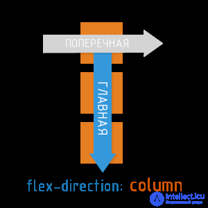
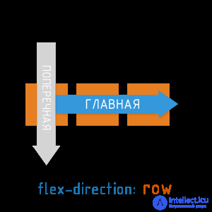
Available flex-direction values:
- row (default) : from left to right (in rtl from right to left)
- row-reverse: from right to left (in rtl from left to right)
- column: top to bottom
- column-reverse: bottom to top
justify-content - alignment along the main axis.
The css property justify-content determines how elements are aligned along the main axis.
Available values justify-content:
- flex-start (default value) : blocks are pressed to the beginning of the main axis
- flex-end: blocks are pressed to the end of the main axis
- center: the blocks are located in the center of the main axis
- space-between: the first block is located at the beginning of the main axis, the last block is at the end, all other blocks are evenly distributed in the remaining space.
- space-around: all blocks are evenly distributed along the main axis, dividing all free space equally.
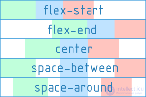
align-items - alignment along the transverse axis.
The Css align-items property determines how items align along the transverse axis.
Available align-items values:
- flex-start: blocks are pressed to the beginning of the transverse axis
- flex-end: blocks are pressed to the end of the transverse axis
- center: the blocks are located in the center of the transverse axis
- baseline: blocks aligned on their baseline
- stretch (default value) : blocks are stretched, taking up all available space along the transverse axis, while min-width / max-width, if any, is still taken into account.
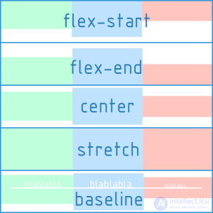
The CSS properties of flex-direction, justify-content, align-items should be applied directly to the flex container, and not to its children.
A demo of the basic properties of a flex container
The axes and alignments are the basics of flex. Relax, click on the demo and use it if you need to refresh your memory.
Multi-line organization of blocks inside a flex container.
flex-wrap
All the examples that we cited above were constructed taking into account the single-line (single-column) arrangement of blocks. I must say that by default the flex-container will always place the blocks inside itself in one line. However, the specification also supports multi-line mode. For the multi-line inside the flex-container, the CSS property flex-wrap is responsible.
Available flex-wrap values:
- nowrap (default value) : blocks are located in one line from left to right (in rtl from right to left)
- wrap: blocks are arranged in several horizontal rows (if they do not fit in one row). They follow each other from left to right (in rtl from right to left)
- wrap-reverse: the same as wrap, but the blocks are arranged in reverse order.
flex-flow is a convenient shortcut for flex-direction + flex-wrap
In fact, flex-flow provides the ability to describe the direction of the main and multi-lines of the transverse axis in one property. The default is flex-flow: row nowrap.
flex-flow: <'flex-direction'> || <'flex-wrap'>
CSS
 / * i.e.  ... * /
 .my-flex-block {
 flex-direcrion: column;
 flex-wrap: wrap;
 }
 / * this is the same as ... * /
 .my-flex-block {
 flex-flow: column wrap;
 }
align-content
There is also the align-content property, which determines how the resulting rows of blocks will be aligned vertically and how they will divide the entire space of the flex container among themselves.
Important: align-content works only in multi-line mode (i.e. in the case of flex-wrap: wrap; or flex-wrap: wrap-reverse;)
Available values are align-content:
- flex-start: rows of blocks are pressed to the top of the flex container.
- flex-end: rows of blocks pressed to the end of the flex container
- center: rows of blocks are in the center of the flex container
- space-between: the first row of blocks is located at the beginning of the flex-container, the last row of blocks is a block at the end, all other rows are evenly distributed in the remaining space.
- space-around: the rows of blocks are evenly distributed in from the beginning to the end of the flex-container, dividing all the free space equally.
- stretch (default value) : Rows of blocks are stretched to take up all the available space.
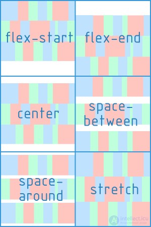
CSS, the flex-wrap and align-content properties should be applied directly to the flex container, not to its child elements.
CSS rules for flex-container child elements (flex-blocks)
flex-basis - the base size of a single flex-block
Sets the initial size along the main axis for a flex block before transformations based on other flex factors are applied to it. It can be set in any units of length (px, em,%, ...) or auto (by default). If set as auto, the block dimensions (width, height) are taken as a basis, which, in turn, may depend on the size of the content, if not specified explicitly.
flex-grow - “greed” of an individual flex-block
Determines how much a separate flex block can be larger than neighboring elements, if necessary. flex-grow takes a dimensionless value (default is 0)
Example 1:
- If all the flex blocks inside a flex container have flex-grow: 1, then they will be the same size.
- If one of them has flex-grow: 2, then it will be 2 times more than all the others.
Example 2:
- If all the flex blocks within a flex container have flex-grow: 3, then they will be the same size.
- If one of them has flex-grow: 12, then it will be 4 times more than all the others.
That is, the absolute value of flex-grow does not determine the exact width. It determines its degree of “greed” in relation to other flex-blocks of the same level.
flex-shrink - compressibility factor of a single flex block
Determines how much the flex block will decrease relative to neighboring elements inside the flex container in case of insufficient free space. The default is 1.
flex - short entry for flex-grow, flex-shrink and flex-basis properties
flex: none | [<'flex-grow'> <'flex-shrink'>? || <'flex-basis'>]
CSS
 / * i.e.  ... * /
 .my-flex-block {
 flex-grow: 12;
 flex-shrink: 3;
 flex basis: 30em;
 }
 / * this is the same as ... * /
 .my-flex-block {
 flex: 12 3 30em;
 }
align-self - alignment of a single flex-block along the transverse axis.
Makes it possible to redefine the align-items flex-container property for an individual flex-block.
Available align-self values (same 5 options as for align-items)
- flex-start: flex-block is pressed to the beginning of the transverse axis
- flex-end: flex-block is pressed to the end of the transverse axis
- center: flex-block located in the center of the transverse axis
- baseline: flex-block aligned to baseline
- stretch (default value) : the flex-block is stretched to take all the available space along the transverse axis, while min-width / max-width, if any, are taken into account.
order - the order of the individual flex-block inside the flex-container.
By default, all blocks will follow each other in the order specified in html. However, this order can be changed using the order property. It is an integer and defaults to 0.
The order value does not specify the absolute position of the element in the sequence. It determines the weight of the position of the element.
HTML
In this case, the blocks will follow one after another along the main axis in the following order: item5, item1, item3, item4, item2
margin: auto vertically. Dreams Come True!
Flexbox can be loved at least for the fact that the horizontal alignment familiar to everyone through the margin: auto here also works for the vertical!
 .my-flex-container {
 display: flex;
 height: 300px;  / * Or whatever * /
 }
 .my-flex-block {
 width: 100px;  / * Or whatever * /
 height: 100px;  / * Or whatever * /
 margin: auto;  / * Magic!  The unit is centered vertically and horizontally!  * /
 }
Things to remember
- Do not use flexbox where there is no need.
- Determining regions and changing the order of the content is in many cases still useful to make it dependent on the page structure. Think it over.
- Understand flexbox and know its basics. So much easier to achieve the expected result.
- Do not forget about the margin. They are taken into account when setting axial alignment. It is also important to remember that margins in flexbox do not “collapse”, as it happens in a regular stream.
- The float value of flex blocks is not taken into account and does not matter. This can probably somehow be used for graceful degradation when switching to flexbox.
- flexbox is very well suited for layout of web components and individual parts of web pages, but it didn’t show its best when making basic layouts (layout of article, header, footer, navbar, etc.). This is still a controversial point, but this article rather convincingly shows the flaws of xanthir.com/blog/b4580


Comments
To leave a comment
Cascading CSS / CSS3 Style Sheets
Terms: Cascading CSS / CSS3 Style Sheets