Lecture
Pseudo-classes define the dynamic state of elements, which is changed by user actions, as well as the position in the document tree. An example of such a state is a text link that changes color when you hover the mouse over it. When using pseudo-classes, the browser does not overload the current document, so using pseudo-classes you can get different dynamic effects on the page.
The syntax for using pseudo-classes is as follows.
Selector: Pseudo Class {Description of Style Rules}
First select the selector to which the pseudo-class is added, followed by a colon, followed by the name of the pseudo-class. It is allowed to apply pseudo-classes to the names of identifiers or classes (A.menu:hover {color: green}), as well as to context selectors (.menu A: hover {background: # fc0}). If a pseudo-class is specified without a selector in front (: hover), then it will be applied to all elements of the document.
Conventionally, all pseudo-classes are divided into three groups:
This group includes pseudo-classes that recognize the current state of the element and apply style only for this state.
Occurs when the user activates an item. For example, the link becomes active if you hover the cursor on it and click the mouse. Despite the fact that almost any element of a web page can become active, the pseudo-class: active is used primarily for links.
Applies to unvisited links, i.e., links that the user has not yet clicked on. The browser for some time saves the history of visits, so the link may be marked as visited, if only because it was followed by a transition earlier.
Writing A {...} and A: link {...} is equivalent in its result, since it gives the same effect in the browser, so the pseudo-class: link can be omitted. The exceptions are anchors, they are: the link does not apply.
Applies to an element when it receives focus. For example, for a text field in a form, getting focus means that the cursor is positioned in the field, and you can type text into it using the keyboard (Example 15.1).
Example 15.1. Pseudo class: focus
HTML5CSS 2.1IECrOpSaFx
<!DOCTYPE HTML> <html> <head> <meta charset="utf-8"> <title>Псевдоклассы</title> <style> INPUT:focus { color: red; /* Красный цвет текста */ } </style> </head> <body> <form action=""> <p><input type="text" value="Черный текст"></p> <p><input type="text" value="Черный текст"></p> </form> </body> </html> The result of the example is shown below (fig. 15.1). The second line contains the cursor, so the text field received focus.
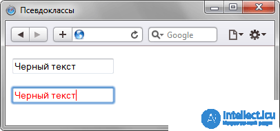
Fig. 15.1. Changing text style when getting focus
In this example, the text field contains a preliminary text, it is determined by the value of the value attribute of the tag <input>. When clicking on a form element, the field receives focus, and the text color changes to red. It is enough to click anywhere on the page (except for the text box, of course), as the loss of focus will occur and the text will return to its original black color.
The result will be visible only for those elements that can receive focus. In particular, these are <a>, <input>, <select> and <textarea> tags.
The: hover pseudo-class is activated when the mouse cursor is within an element, but not clicked.
This pseudo-class applies to visited links. Usually such a link changes its default color to purple, but with the help of styles, color and other parameters can be set independently (Example 15.2).
Example 15.2. Change the color of links
HTML5CSS 2.1IECrOpSaFx
<!DOCTYPE HTML> <html> <head> <meta charset="utf-8"> <title>Псевдоклассы</title> <style> A:link { color: #036; /* Цвет непосещенных ссылок */ } A:visited { color: #606; /* Цвет посещенных ссылок */ } A:hover { color: #f00; /* Цвет ссылок при наведении на них курсора мыши */ } A:active { color: #ff0; /* Цвет активных ссылок */ } </style> </head> <body> <p> <a href="1.html">Ссылка 1</a> | <a href="2.html">Ссылка 2</a> | <a href="3.html">Ссылка 3</a></p> </body> </html> The result of the example is shown in Fig. 15.2.
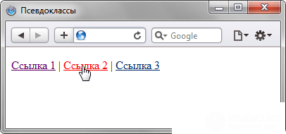
Fig. 15.2. View of the link when you hover your mouse over it
This example shows the use of pseudo-classes with links. In this case, the order of the pseudo-classes matters. Initially indicated: visited, and then goes: hover, otherwise the visited links will not change their color when you hover over them.
Selectors can contain more than one pseudo-class, which are listed in a row through the colon, but only if their actions do not contradict each other. So, the A: visited: hover entry is correct, and the A: link: visited entry is not. However, formally, the CSS validator considers any combination of pseudo-classes correct.
Internet Explorer 6 and below allows the use of the: active and: hover pseudo-classes for links only. Starting from version 7.0, pseudo-classes in this browser also work for other elements.
The pseudo-class: hover does not have to be applied to links, it can be added to other elements of the document. So, in example 15.3 a table is shown, the rows of which change their color when you hover the mouse over them. This is achieved by adding a: hover pseudo-class to the TR selector.
Example 15.3. Highlighting table rows
HTML5CSS 2.1IECrOpSaFx
<!DOCTYPE HTML> <html> <head> <meta charset="utf-8"> <title>Псевдоклассы</title> <style> table { border-spacing: 0; } td { padding: 4px; } tr:hover { background: #fc0; /* Меняем цвет фона строки таблицы */ } </style> </head> <body> <table width="400" border="1"> <tr> <th></th> <th>Пики</th> <th>Трефы</th> <th>Бубны</th> <th>Червы</th> </tr> <tr> <td>Чебурашка</td> <td>5</td><td>2</td><td>4</td><td>2</td> </tr> <tr> <td>Крокодил Гена</td> <td>2</td><td>7</td><td>1</td><td>3</td> </tr> <tr> <td>Шапокляк</td> <td>5</td><td>4</td><td>3</td><td>1</td> </tr> <tr> <td>Крыса Лариса</td> <td>1</td><td>0</td><td>5</td><td>7</td> </tr> </table> </body> </html> The result of the example is shown below (fig. 15.3).
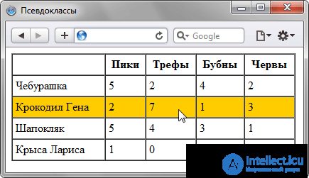
Fig. 15.3. Highlighting the rows of the table when you hover over them
This group includes pseudo-classes that determine the position of an element in the document tree and apply a style to it depending on its status.
Applies to the first child element of the selector, which is located in the document element tree. To make it clear what this is about, let's analyze a small code (Example 15.4).
Example 15.4. Use of pseudo-class: first-child
HTML5CSS 2.1IECrOpSaFx
<!DOCTYPE HTML> <html> <head> <meta charset="utf-8"> <title>Псевдоклассы</title> <style type="text/css"> B:first-child { color: red; /* Красный цвет текста */ } </style> </head> <body> <p><b>Lorem ipsum</b> dolor sit amet, <b>consectetuer</b> adipiscing <b>elit</b>, sed diem nonummy nibh euismod tincidunt ut lacreet dolore magna aliguam erat volutpat.</p> <p><b>Ut wisis enim</b> ad minim veniam, <b>quis nostrud</b> exerci tution ullamcorper suscipit lobortis nisl ut aliquip ex ea <b>commodo consequat</b>.</p> </body> </html> The result of the example is shown below (fig. 15.4).
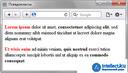
Fig. 15.4. Using the pseudo-class: first-child
In this example, the: first-child pseudo-class is added to the B selector and sets the text color to red. Although the container <b> is found in the first paragraph three times, only the first mention will be highlighted in red, that is, the text “Lorem ipsum”. In other cases, the contents of the <b> container are displayed in black. With the next paragraph, everything starts again, because the parent element has changed. Therefore, the phrase “Ut wisis enim” will also be highlighted in red.
Internet Explorer supports the: first-child pseudo-class since version 7.0.
The pseudo-class: first-child is most convenient to use when you need to set a different style for the first and other elements of the same type. For example, in some cases, the red line for the first paragraph of the text is not set, and for the remaining paragraphs add the indent of the first line. For this purpose, apply the text-indent property with the desired indent value. But to change the style of the first paragraph and remove the indent for it, you will need to use the pseudo-class: first-child (example 15.5).
Example 15.5. Paragraph indents
HTML5CSS 2.1IECrOpSaFx
<!DOCTYPE HTML> <html> <head> <meta charset="utf-8"> <title>Псевдоклассы</title> <style> P { text-indent: 1em; /* Отступ первой строки */ } P:first-child { text-indent: 0; /* Для первого абзаца отступ убираем */ } </style> </head> <body> <p>Историю эту уже начали забывать, хотя находились горожане, которые время от времени рассказывали ее вновь прибывшим в город посетителям.</p> <p>Легенда обрастала подробностями и уже совсем не напоминала произошедшее в действительности событие. И, тем не менее, ни один человек не решался заикнуться о ней с наступлением темноты.</p> <p>Но однажды в город вновь вошел незнакомец. Он хромал на левую ногу.</p> </body> </html> The result of the example is shown below (fig. 15.5).
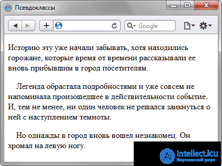
Fig. 15.5. Change the style of the first paragraph
In this example, the first paragraph of text does not contain the indent of the first line, and for the rest it is set.
For documents that simultaneously contain texts in several languages, the observance of syntax rules characteristic of a particular language is important. With the help of pseudo-classes, you can change the style of design of foreign texts, as well as some settings.
Specifies the language that is used in the document or its fragment. In HTML code, the language is set through the lang attribute, it is usually added to the <html> tag. With the help of the pseudo-class: lang, you can make certain settings specific to different languages, for example, the type of quotes in quotations. The syntax is as follows.
Element: lang (language) {...}
The following values can be used as a language: ru - Russian; en - English; de - German; fr - French; it is italian.
Example 15.6. Type of quotes depending on the language
HTML5CSS 2.1IECrOpSaFx
<!DOCTYPE HTML> <html> <head> <meta charset="utf-8"> <title>lang</title> <style> P { font-size: 150%; /* Размер текста */ } q:lang(de) { quotes: "\201E" "\201C"; /* Вид кавычек для немецкого языка */ } q:lang(en) { quotes: "\201C" "\201D"; /* Вид кавычек для английского языка */ } q:lang(fr), q:lang(ru) { /* Вид кавычек для русского и французского языка */ quotes: "\00AB" "\00BB"; } </style> </head> <body> <p>Цитата на французском языке: <q lang="fr">Ce que femme veut, Dieu le veut</q>.</p> <p>Цитата на немецком: <q lang="de">Der Mensch, versuche die Gotter nicht</q>.</p> <p>Цитата на английском: <q lang="en">То be or not to be</q>.</p> </body> </html> The result of this example is shown in Fig. 15.6. To display typical quotes in the example, the style property quotes is used, and the switching of the language and the corresponding type of quotes takes place via the lang attribute added to the <q> tag.
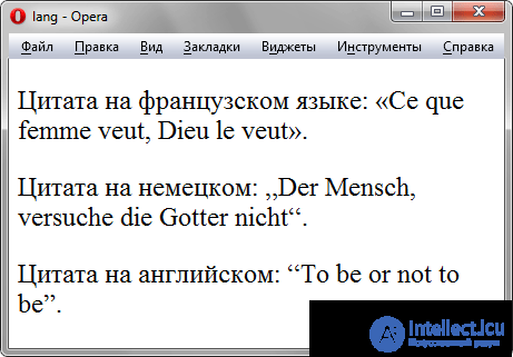
Fig. 15.6. Different quotes for different languages
1. Oleg made links that change the background color when you hover the mouse over them. For this he used the following style.
A {color: blue; background: orange; }
A: hover {background: yellow; color: black; }
A: visited {color: white; }
A: active {color: red; }
However, some links when you hover over them did not change their color to black. Why?
2. It is required to select the first row of the table with background color. Which pseudo class is suitable for this purpose?
3. To which elements does the following construct add a style - A: link: visited: hover?
1. Pseudo-class: visited after: hover.
2.: first-child
3. To one element.
Comments
To leave a comment
Cascading CSS / CSS3 Style Sheets
Terms: Cascading CSS / CSS3 Style Sheets