
Lecture
Color schemes (or color harmonies) are specific combinations of colors based on the color wheel that create visually pleasing and balanced combinations. From the standpoint of design and color theory, they help you correctly choose colors for artistic, interior, graphic, and video projects.
Color schemes in film and games play a key role in creating atmosphere, emotional tone, and visual storytelling. The proper use of color can strengthen the plot, reveal characters, set the pace, and even direct the viewer's attention.
The color wheel consists of:
Primary colors: red, blue, yellow.
Secondary colors: green, orange, violet.
Tertiary colors: intermediate shades (for example, yellow-green, blue-violet, and so on).
In color theory, a color scheme is a selection of colors used in a design for various media. For example, using a white background with black text is an example of a common default color scheme in web design.
Color schemes are logical combinations of colors on the color wheel. Color schemes are used to create style and visual appeal. Colors that together create an aesthetic feeling usually appear together in color schemes. A basic color scheme uses two colors that look appealing together. More complex color schemes include several colors combined, usually based on a single color — for example, text in colors such as red, yellow, orange, and light blue placed together on a black background in a magazine article. Color schemes can also contain different shades of a single color; for example, a color scheme that blends different shades of green, ranging from very light (almost white) to very dark.
Complementary colors are two colors located directly opposite each other; for example, red and green are complementary colors. Tetradic color palettes use four colors, a pair of complementary color pairs. For example, you could use yellow, violet, red, and green. Tetradic colors can be found by placing a square or rectangle on the color wheel. An analogous color scheme consists of colors located next to each other on the wheel. For example, red, orange, and yellow are analogous colors. Monochromatic colors are different shades of the same color. For example, light blue, indigo, and blue. Complementary colors are colors located opposite each other on the color wheel. For example, blue and orange. Triadic colors are colors that are evenly spaced from each other in a triangle over the color wheel. For example, the primary colors red, yellow, and blue are triadic colors.
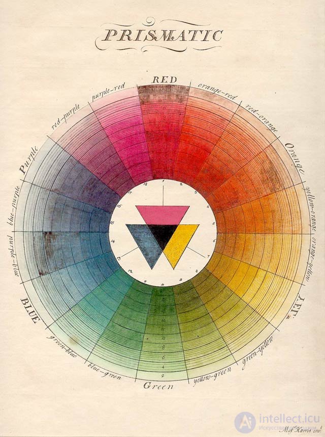
Moses Harris presented this color palette in his book "The Natural System of Colours" (1776).
Here are the main aspects and types of color schemes in film and games:
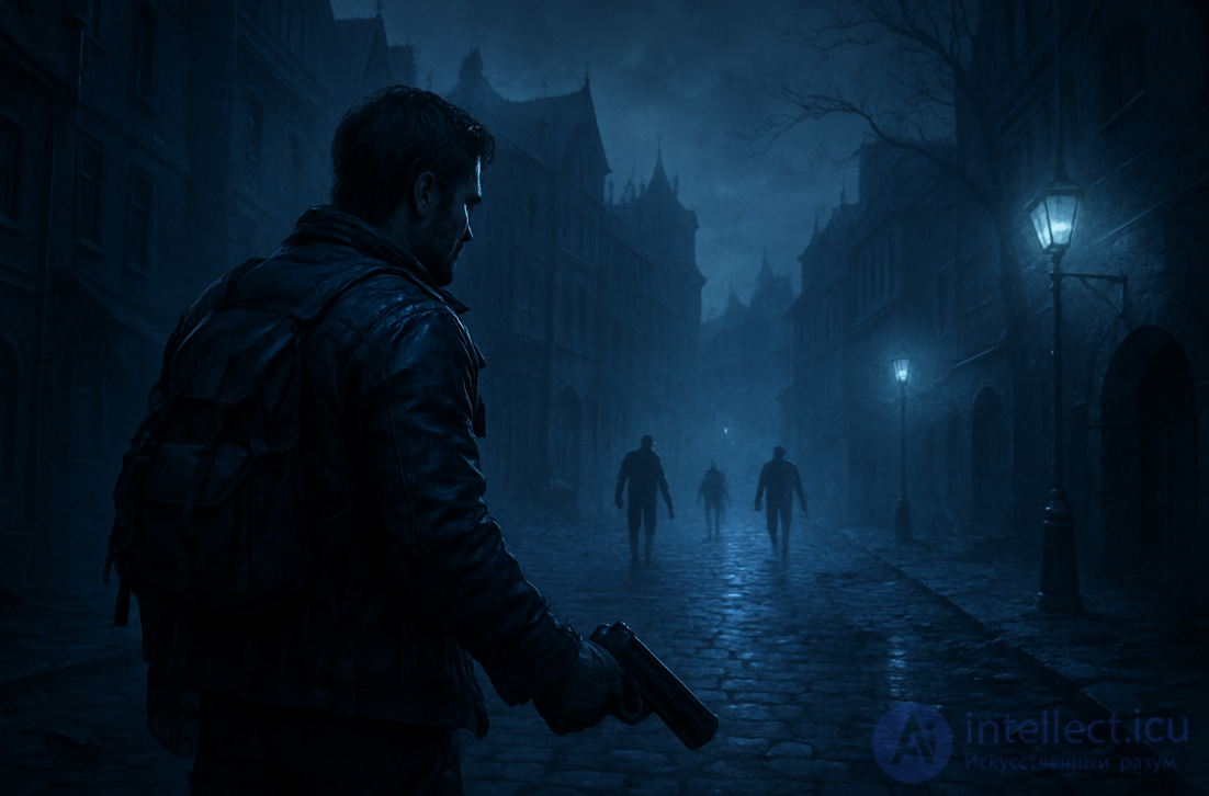
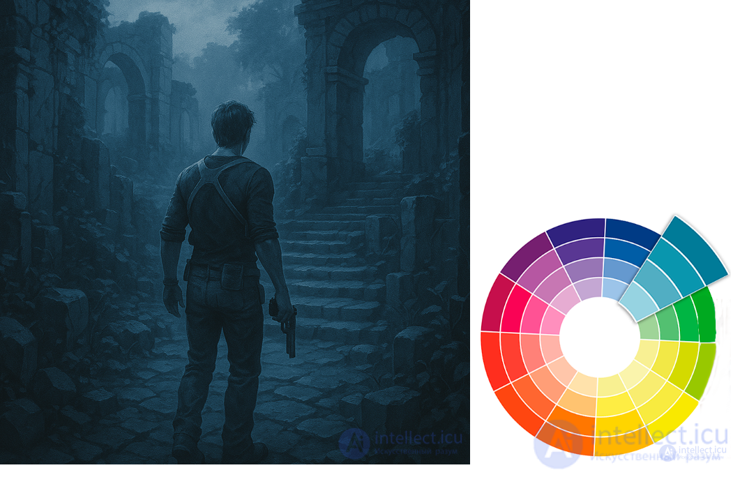
A single color is used in different shades, tones, and saturations.
Example: light blue, blue, dark blue.
Effect: calmness, restraint, elegance.
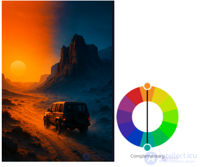
Colors located opposite each other on the color wheel (for example, blue and orange).
Often used in films: "Mad Max: Fury Road", "Transformers", where blue shadows and an orange sun create a powerful visual contrast.
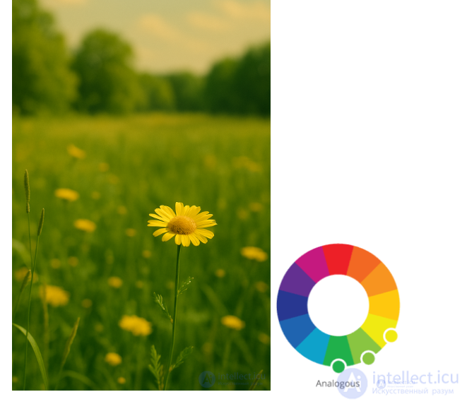
Colors located next to each other on the wheel (for example, green, yellow-green, yellow).
Produces a soft, natural, and harmonious effect. Suitable for scenes of calm or nature.
Adjacent colors on the color wheel are used.
Example: blue – blue-green – green.
Effect: soft transitions, natural combinations, good for backgrounds and gentle moods.
Difficult to balance, but produces bright and lively compositions.
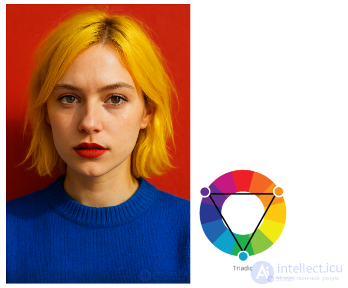
Three colors evenly spaced on the wheel.
Example: red – yellow – blue.
Effect: bright yet balanced contrast, often used in logos and brand design.
A more complex and rich palette. Often used in fantasy or sci-fi.
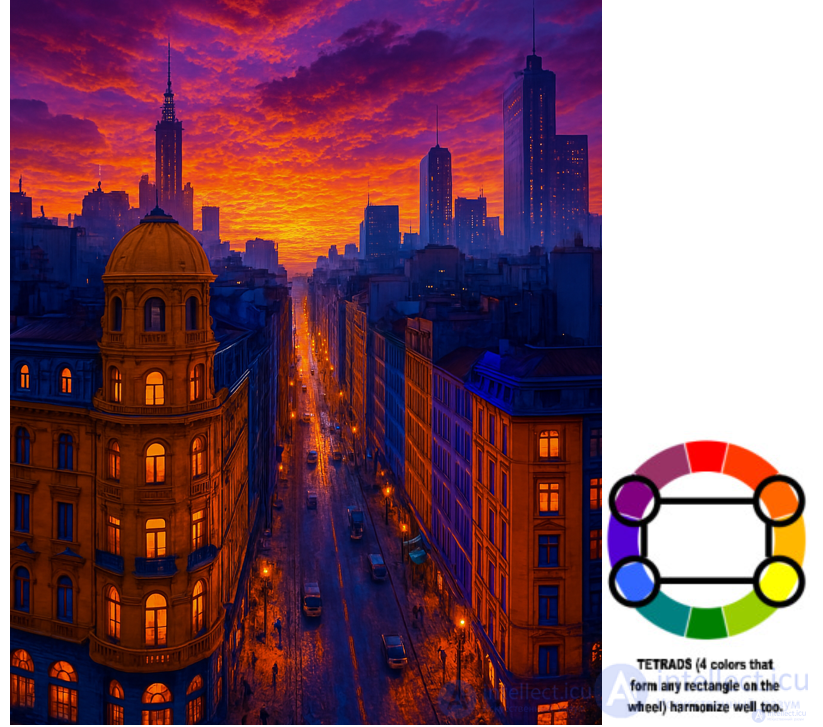
Four colors: two complementary pairs.
Example: red and green + blue and orange.
Effect: a complex but powerful scheme that requires good control of the dominant color.
Emotional context
🔴 Red — aggression, passion, anxiety
🔵 Blue — calmness, loneliness, cold
🟢 Green — nature, sickness, toxicity (depending on the shade)
Symbolism
In Wong Kar-wai's films, red and green often symbolize love and separation.
In «The Matrix», a green filter represents the virtual world, while blue represents reality.
Gameplay and navigation
In games, color helps players orient themselves, notice interactive objects, and signal danger.
Example: Dead Space — health indicators are built into the suit.
Example: Portal — the use of orange and blue portals.
The Last of Us — a muted, post-apocalyptic palette that sets a tone of realism and grimness.
Bioshock Infinite — vivid retro colors that emphasize the utopian illusion.
Journey — the game plays with warm and cool palettes to mark the stages of the journey.
Adobe Color
Coolors.co
Color Hunt
Itten's color wheel / Ostwald's color wheel — for a basic theoretical understanding.
Light and color accents are among the main tools of visual storytelling.
Light and color accents are powerful tools that help direct the player's attention, create atmosphere, and highlight important elements of a scene.
Light accents use the intensity, direction, and color of light to highlight important areas. For example:
Backlighting (a silhouette effect) adds drama.
Light rays through windows create a cozy or mysterious mood.
A bright spot draws attention to an object or character.
Color accents make a scene more expressive. They are based on color contrast or saturation. For example:
Warm colors (orange, yellow) draw attention and create a sense of coziness.
Cool colors (blue, purple) make a scene mysterious and deep.
A bright object among muted tones instantly becomes the focus of the scene.
With their help, artists, cinematographers, and game designers direct the viewer's attention, highlight important objects, and create mood and rhythm.
Using a color that differs from the surrounding palette.
Example: a bright red jacket against a gray crowd.
In games: glowing blue objects against dark dungeons.
A classic example: «Schindler's List» — the girl in red against a black-and-white world.
A single color stands out against a monotonous environment.
Example: an entire scene in gray and brown tones, and suddenly — a green plant.
Works especially well in post-apocalyptic worlds (The Last of Us, Inside).
Increasing color saturation in a specific area of the frame.
The eye is automatically drawn to more saturated areas.
Works well in platformers, where the player's path is highlighted with color.
Example: a character's warm-toned face against a blue night.
Typical of cinema and trailers (the orange-and-blue trend in blockbusters).
An accent spotlight highlights a character or object.
Used in cinematic scenes, quests, and horror games.
Example: a flashlight's beam illuminates only the intended object.
A technique from painting, widely used in film noir and thrillers.
Example: a face half in shadow — creates drama and mystery.
Backlighting creates a glow along the contour of a character or object.
It separates it from the background.
Often used in character select menus (Dark Souls, Destiny).
Light passes through cracks, windows, and stained glass, forming patches of light.
Example: sunbeams in a temple, breaking through windows — emphasizing the center of the scene.
Patches of light, lines, or spotlights form a path or guide the gaze.
Used in games: God of War, Control, Uncharted — illuminated edges show the player the way.

Comments