
Lecture
In this article, we'll learn about the concept of responsive images — images that work well on devices with widely differing screen sizes, resolutions, and other such features — and see what tools HTML provides for implementing them. This helps improve performance across different devices. Responsive images are just one part of responsive design, a future CSS topic that you should study.
| Prerequisites: | You should already know the basics of HTML and know how to add static images to a web page. |
|---|---|
| Objective: | Learn how to use features such as srcsetand the <picture>element to implement responsive image solutions on websites. |
Let's look at a typical scenario. A typical website might have a header image and some content images below the header. The header image will probably take up the full width of the header, while the content image will fit somewhere inside the content column. Here's a simple example:
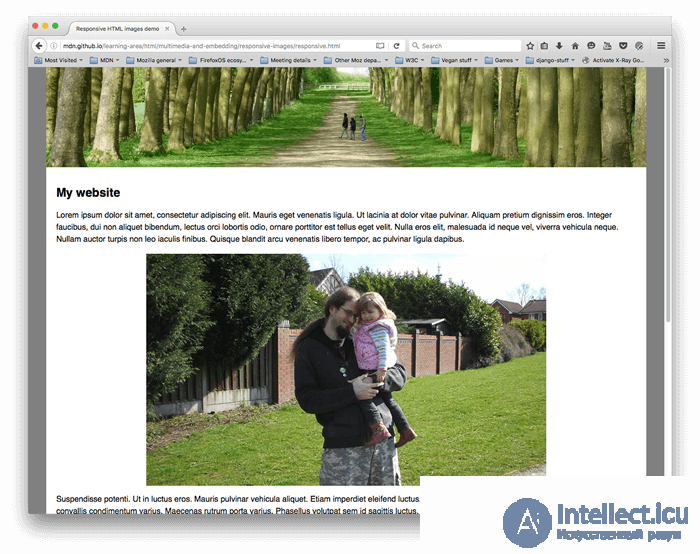
This works well on a wide-screen device such as a laptop or desktop computer (you can see a live example and find the source code on Github). We won't discuss CSS in detail in this lesson, but we'll say the following:
However, problems arise once you start viewing the site on a device with a narrow screen. The header below looks fine, but on a mobile device it starts to take up a large portion of the screen's height. And at that size it's hard to see the people in the first content image.
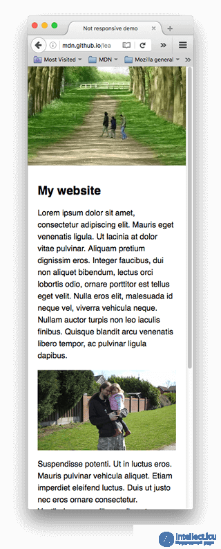
An improvement could be to display a cropped version of the image that shows the important details of the image when the site is viewed on a narrow screen. A second, cropped image could be displayed for a device with a medium-width screen, such as a tablet. This is widely known as the art direction problem .
In addition, there's no need to embed such large images on the page if it's being viewed on a mobile phone screen. Conversely, a small raster image starts to look grainy when displayed larger than its original size (a raster image is a fixed number of pixels wide and a fixed number of pixels tall, as we saw when we looked at vector graphics ). This is called the resolution switching problem .
Conversely, there's no need to display a large image on a screen significantly smaller than intended. This can lead to wasted bandwidth; in particular, mobile users don't want to waste bandwidth downloading a large image intended for the desktop when a small image would suit their device. Ideally, you should have several resolutions available and serve the appropriate size depending on the device accessing the data on the website.
To complicate matters further, some devices have high-resolution screens, which require larger images than you might expect for them to display well. Essentially, this is the same problem but in a slightly different context.
You might think that vector images would solve these problems, and they do to a certain extent — they have a small file size and scale well, and you should use them wherever possible. However, they aren't suitable for every type of image. Vector images are great for simple graphics, patterns, interface elements, and so on, but it becomes very difficult to create a vector image with the kind of detail you'd find, say, in a photograph. Raster image formats such as JPEG are better suited to the images we see in the example above.
This kind of problem didn't exist when the web was still new, in the early-to-mid 90s - back then the only devices around for viewing web pages were desktop and laptop computers, so browser engineers and spec writers didn't even think about implementing a solution. Responsive image technologies have recently been implemented to solve the problems outlined above, letting you offer the browser several image files that either show the same thing but contain different numbers of pixels ( resolution switching ), or different images suited to different amounts of space ( art direction ).
Note . The new features discussed in this article - srcset/ sizes/ <picture>- are all supported in released versions of modern desktop and mobile browsers (including Microsoft Edge, but not Internet Explorer).
In this section we'll look at the two problems illustrated above, and show how to solve them using HTML's responsive image features. Note that we'll focus on HTML <img>for this section, as seen in the content area of the example above - the image in the site header is purely decorative and is therefore implemented using CSS background images. CSS may well have better tools for responsive design than HTML does, and we'll talk about them in a future CSS module.
So, what problem are we trying to solve with resolution switching? We want to display identical image content, just larger or smaller depending on the device - this is the situation we have with the second content image in our example. The standard <img>element traditionally lets you point the browser to only one source file:
<img src="elva-fairy-800w.jpg" alt="Elva dressed as a fairy">
However, we can use two new attributes - srcsetand sizes-, to provide several additional source images along with hints to help the browser pick the right one. You can see an example of this in our responsive.html example on Github (see also the source code):
<img srcset="elva-fairy-480w.jpg 480w,
             elva-fairy-800w.jpg 800w"
     sizes="(max-width: 600px) 480px,
            800px"
     src="elva-fairy-800w.jpg"
     alt="Elva dressed as a fairy">
The srcsetand sizesattributes look complicated, but they aren't too hard to understand if you format them as shown above, with each attribute value on its own line. Each value contains a comma-separated list, and each item in those lists is made up of three parts. Let's now run through the content of each:
srcsetdefines the set of images between which the browser can choose, and the size of each image. Each set of image information is separated from the previous one by a comma. For each one we write:
elva-fairy-480w.jpg)480w) - note that this uses the wunit, not pxas you might expect. This is the image's real size, which can be worked out by looking at the image file on your computer (for example, on a Mac you can select the image in Finder and press Cmd+, Ito bring up the information screen).sizesdefines a set of media conditions (e.g. screen widths) and indicates what image size would be best to choose when certain media conditions are true - these are the hints we mentioned earlier. In this case, before each comma we write:
(max-width:600px)) - you'll learn more about these in the CSS topic, but for now let's just say that a media condition describes a possible state that the screen can be in. In this case we're saying « when the viewport width is 600 pixels or less ».480px)Note . For the slot width you can specify an absolute length ( px, em) or a length relative to the viewport ( vw), but not a percentage. You may have noticed that the last slot width has no media condition (this is the default value, chosen when none of the media conditions are true). The browser ignores everything that comes after the first matching condition, so be careful when ordering your media conditions.
So, with these attributes the browser will:
sizeslist is the first one to be true.srcsetlist that has the same size as the slot, or, if there isn't one, the first image that is bigger than the chosen slot size.And that's it! At this point, if a supporting browser with a viewport width of 480 pixels loads the page, the (max-width: 600px)media condition will be true, and the browser chooses the 480pxslot. The elva-fairy-480w.jpgimage will be loaded, since its intrinsic width ( 480w) is the closest to the slot size. The 800px image takes up 128KB on disk, whereas the 480px resolution version is only 63KB - a saving of 65KB. Now imagine if this page had lots of images on it. Using this technique could save mobile users a lot of bandwidth.
Note : when testing this with a desktop browser, if the browser fails to load the narrower images when you've set its window to the narrowest width, look at what the viewport is (you can zoom in on it by going into the browser JavaScript console and typing ). Different browsers have minimum sizes down to which they'll let you shrink the window width, and they might be wider than you think. When testing in a mobile browser, you can use tools such as the Firefox page inspector to check a page loaded on a mobile phone using desktop developer tools. To see which images were loaded, you can use the « Network Monitor» tab in Firefox DevTools .document.querySelector('html').clientWidthabout:debugging
Older browsers that don't support these features will simply ignore them. Instead, those browsers will just load the image specified in the srcattribute, as normal.
Note . In the <head>of the example above you'll find the line <meta name="viewport" content="width=device-width">: this forces mobile browsers to adopt their real viewport width for loading web pages (some mobile browsers lie about their viewport width and instead load pages using a wider viewport width, then shrink the loaded page down, which isn't very helpful for responsive images or design).
If you're supporting several screen resolutions, but everyone sees your image at the same real-world size on the screen, you can let the browser choose an image with the right resolution by using srcsetwith x-descriptors and without sizes- a slightly simpler syntax! You can find an example of what this looks like in srcset-resolutions.html (see also the source code):
<img srcset="elva-fairy-320w.jpg,
             elva-fairy-480w.jpg 1.5x,
             elva-fairy-640w.jpg 2x"
     src="elva-fairy-640w.jpg"
     alt="Elva dressed as a fairy">
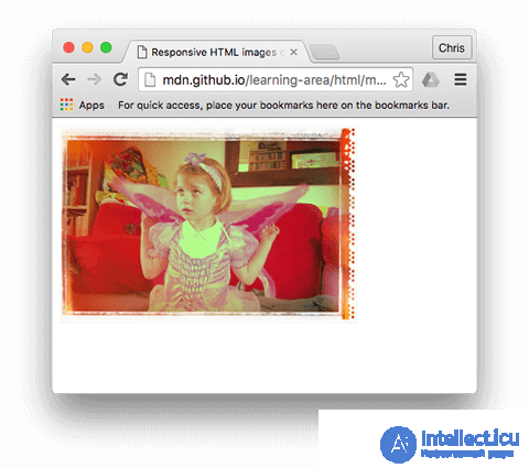 In this example, the following CSS is applied to the image so that its width on the screen is 320 pixels (also known as CSS pixels):
img {
  width: 320px;
}
In this case there's no need for sizes- the browser simply works out what resolution the display is showing, and displays the most suitable image referenced in srcset. So, if the device accessing the page has a standard/low resolution display, with one device pixel representing each CSS pixel, the elva-fairy-320w.jpgimage will be loaded (the 1x is implied, so you don't need to include it). At a high resolution of two device pixels per CSS pixel or more, the elva-fairy-640w.jpgimage will be loaded. The 640px image is 93KB in size, while the 320px image is only 39KB.
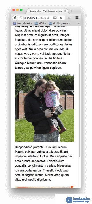
To recap, the art direction problem is about wanting to change the displayed image so that it suits different display sizes. For example, a web page includes a large landscape shot with a person in the middle when viewed in a desktop browser. When viewed in a mobile browser, that same image is shrunk down, making the image of the person very small and hard to see. It would probably be better to show a smaller, portrait image on the mobile phone, one that zooms in on the person. The <picture>element allows exactly this kind of solution to be implemented.
Going back to our original not-responsive.html example, we have an image that is in dire need of art direction:
<img src="elva-800w.jpg" alt="Chris standing up holding his daughter Elva">
Let's fix this using <picture>! Just like <video>and<audio> , this <picture>element is a wrapper containing several <source>elements that offer the browser a choice of different sources, followed by the all-important <img>element. The code in responseive.html looks like this:
<picture>
  <source media="(max-width: 799px)" srcset="elva-480w-close-portrait.jpg">
  <source media="(min-width: 800px)" srcset="elva-800w.jpg">
  <img src="elva-800w.jpg" alt="Chris standing up holding his daughter Elva">
</picture>
<source> elements include a media attribute, which holds a media condition — as with the first srcset example, these conditions test which image should be shown, and the first one that returns TRUE gets displayed. In this case, if the viewport width is 799 pixels or less, the first <source> element's image will be shown. If the viewport width is 800 pixels or more, it will be the second one.srcset attributes contain the path to the image on screen. As we saw with <img> above, <source> can take a srcset attribute with several image references, as well as a sizes attribute. So you can offer several images via the <picture> element, but also offer several resolutions of each of them. In practice, you probably won't want to do that very often.<img> element with src and alt right before the closing </picture>, otherwise the images won't appear. This provides a default case, which applies when none of the media conditions return true (you can in fact remove the second <source> element in this example), and a fallback for browsers that don't support the <picture> element.This code makes it possible to display a suitable image on both wide and narrow screens, as shown below:
Note. The media attribute should only be used in art direction scenarios; when you do use media, don't also offer media conditions in the sizes attribute.
When the browser starts loading a page, it starts loading (preloading) any images before the main parser starts loading and interpreting the page's CSS and JavaScript. This mechanism is generally useful for reducing page load time, but it's unhelpful for responsive images — hence the need to implement solutions such as srcset. For example, you couldn't load an <img> element, then determine the viewport width with JavaScript, and then dynamically change the source image to a smaller one if desired. By that time the original image would already have been loaded, and you would also have loaded the small image, which is even worse from a responsive-image standpoint.
There are several interesting new image formats (such as WebP, AVIF, and JPEG-2000) that can achieve both a small file size and high quality at the same time. However, browser support is still inconsistent.
<picture> lets us keep serving older browsers. You can specify MIME types inside type attributes so the browser can immediately reject unsupported file types:
<picture>
  <source type="image/svg+xml" srcset="pyramid.svg">
  <source type="image/webp" srcset="pyramid.webp">
  <img src="pyramid.png" alt="regular pyramid built from four equilateral triangles">
</picture>
media attribute if you don't also need art direction.<source> element you can only reference images of the type declared in type.srcset and sizes.We expect that in this active learning section you'll show some courage and go it alone ... mostly. We want you to implement your own art-directed narrow/wide-screen shot using <picture>, and a resolution-switching example that uses srcset.
not-responsive.html as a starting point if you like).<picture> element to implement an art-direction image switcher!srcset/size to create a resolution-switching example that displays the same-size image at different resolutions, or images of different sizes at different viewport widths.You have reached the end of this article, but can you remember the most important information? You can find a detailed assessment that tests these skills at the end of the module; see the Mozilla splash page.
That's a wrap on responsive images — we hope you enjoyed playing with these new techniques. To recap, we've been discussing two different problems here:
<picture> element.srcset attribute with sizes.This also brings the whole multimedia and embedding module close to completion! The only thing left to do before moving on is to try our multimedia assessment and see how you get on. Have fun!

Comments