
Lecture
The Aldine Press — a publishing house with its own printing house, founded by Aldus Manutius in 1494 in Venice. It existed until the end of the 16th century. Books printed by the Aldine Press are customarily called Aldines. Thanks to their elegance, well-balanced proportions, simplicity of typesetting and beauty of type, the Aldines are considered masterpieces of the printing of the Renaissance .
The House of Aldus published the famous Aldine editions of the classics (Latin and Greek masterpieces plus several more modern works). The first book, dated and printed under his name, appeared in 1495 .
The Aldine Press is known in the history of typography, among other things, for the introduction of italic type. The press was the first to issue small-format octavo printed books, similar to modern paperbacks, and also intended for portability and ease of reading. According to Curt F. Bühler, the press published 132 books over twenty years of Aldus Manutius's activity. After Aldus's death in 1515, printing was carried on by his wife Maria and her father Andrea Torresani (Andrea Torresano ), until his son Paulus Manutius (1512–1574) took possession of it. His grandson Aldus Manutius the Younger then ran the firm until his death in 1597. Today, antique books printed by the Aldine Press in Venice are called Aldines .
The press held a monopoly on works printed in Greek within the Republic of Venice, which in effect gave it copyright protection. However, protection outside the republic was more problematic. The firm had an agency in Paris, but its commercial success was affected by a great many counterfeit editions issued in Lyon and elsewhere.
Aldus Manutius , founder of the Aldine Press, was originally a humanist scholar and teacher. Manutius became acquainted with Andrea Torresani, who had acquired printing equipment from the widow of Nicolas Jenson . Initially the Aldine Press belonged to Pierfrancesco Barbarigo, nephew of the then reigning doge, Agostino Barbarigo , with the other half belonging to Andrea Torresani. Manutius himself held a fifth of Torresani's shares. Manutius was mainly responsible for scholarship and editing, leaving financial and operational matters to Barbarigo and Torresani. In 1496 Aldus settled in a building called Thermae in the Sestiere di San Polo on the Campo Sant'Agostin, today numero civico (house number) 2343 San Polo on the Calle della Chiesa (church lane), where the restaurant Due Colonne now stands. Although the building at numero civico 2311 Rio Terà Secondo bears two commemorative plaques , historians believe they were placed there in error, based on letters of the period addressed to Manutius; ” the first erroneous plaque was put up by the abbot Don Vincenzo Zenier in 1828. Manutius lived and worked in the Thermae, in order to produce the published books of the Aldine Press. Here too was housed the “New Academy”, where a group of Manutius's friends, associates and editors gathered together to translate Greek and Latin texts. [18] : 1–5 In 1505 Manutius married Maria, daughter of Andrea Torresani of Asola. Torresani and Manutius had already been business partners, but the marriage united the two partners' shares in the publishing business. [20] After the wedding Manutius lived in Torresani's house. Losing popularity, in 1506 the Aldine Press was moved to Torresani's house in the parish of San Paternian. It was demolished in 1873 and now stands beneath a bank building on the Venetian square Campo Manin.
The press was founded by Manutius out of his love of the classics and the need to preserve Hellenistic scholarship. At first the press printed new copies of the works of Plato, Aristotle and other Greek and Latin classics. Manutius also printed dictionaries and grammars to help people interpret books, which were used by scholars wishing to learn Greek, in order to hire Greek scholars for direct instruction. The historian Elizabeth Eisenstein argued that the fall of Constantinople in 1453 threatened the importance and survival of Greek scholarship, but publications such as those of the Aldine Press confirmed it. Erasmus was one of the scholars studying Greek with whom the Aldine Press collaborated in order to ensure an accurate translation of the text. The Aldine Press also expanded into modern languages, mainly Italian and French.
Aldus Manutius hired Francesco Griffo to create a typeface reproducing humanist handwriting . This led to the creation of the first roman face , adapted and known today as italic type . It was first used to print De Aetna by Cardinal Pietro Bembo in 1495. Until this time, printed books had used typeset letters; the appearance of handwriting in print was a novel development, and, however hard he tried to prevent it, Manutius's typeface was illegally copied and spread throughout Europe.
In 1505 Manutius produced simple texts in a convenient form, using the term enchiridion , meaning a handbook or small hand-weapon. [18] Octavo was the first appearance of the editio minor ] , in a plain text, one that could be both produced and controlled by an editor. Although these new portable books were not cheap, Aldine Press books did not force their buyers into the substantial investment that large volumes of text and commentary demanded at the time. By contrast, the editio minor brought financial and logistical benefits to those interested in the classics. One no longer needed to go to the book; rather, the book now came with the reader.
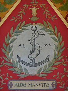
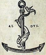
In 1501 Aldus used as his publisher's device an image of a dolphin wrapped around an anchor . “The dolphin-and-anchor device owes its origin most directly to Pietro Bembo. Six years later Aldus was to tell Erasmus that Bembo had given him a silver coin, minted under the emperor Vespasian and bearing an image of this device.” The image of the dolphin and anchor on the coin came with the motto “Festina lente”, meaning “Make haste slowly”. This became the motto of the Aldine Press.
The Aldine Press was one of the first publishing houses of its kind. In the early period of printing (the second half of the 15th century) the printer was often at once the owner of the press (the print shop), the publisher, the editor, the proofreader, and sometimes even the author. He was assisted by a few apprentices. Aldus Manutius was one of the first to create a true publishing house with a staff of proofreaders and editors.
The first thing Manutius decided to do was to print books in Greek, a language that “seemed threatened with ruin and oblivion” . Manutius himself was a great connoisseur of Greek and spoke it fluently. There was a Greek colony in Venice, to which Greeks fleeing Turkish rule had escaped. Here Manutius found the manuscripts and staff he needed. The money to set up the printing house was provided by Prince Alberto Pio of Carpi, whom Manutius had once taught languages.
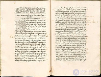
Aldus's first books, following the tradition of early printing, were large-format folios. The type for them was cut by Francesco Griffo, already a well-known punchcutter by that time. For these books he created Latin and Greek typefaces. The latter was based on the manuscripts of Greek calligraphers.
The most famous of these Greek editions is the collected works of Aristotle in 5 volumes (1495—1498). Like many other books of the incunabula period (1452—1500), the “Aristotle” is decorated with ornament. Chapters begin with woodcut “plaited” headpieces and large initials. Aldus Manutius would later abandon ornament altogether. Chapter endings are set in the shape of a “kerchief”, and paragraph indents are rarely used. Above the text block there is a running head that changes from page to page.
As V. Lazursky notes, Manutius's first folios are most interesting from the standpoint of typesetting and layout . Manutius and his printers at first experimented with the form before arriving at its final version, which remained almost unchanged in later books.
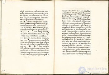
In 1496 Manutius published a small quarto booklet, De Aetna. It was a dialogue written by Aldus's friend Pietro Bembo. From this time on, the publisher began to print works in Latin and Italian.
The typeface for it was cut by Francesco Griffo. Identical letters in it vary slightly, which lends liveliness to a typesetting otherwise free of any additional decoration. The book's plain, austere design sets it sharply apart from books of the incunabula period. It has neither ornaments nor headpieces. The text begins with a small initial set out in the margin. Nor does the book have a title page.
The proportions of the margins in the book are 3:4, and the proportions of the text block are 2:3. Because of the narrow type area, the outer margins of the book are enlarged, perhaps to make it easier to leave notes. The text is set in a large type size. The ratio of type size to leading is 5:8 (the golden ratio). The book has no paragraph indents.
In 1499 Aldus issued a lavish illustrated folio — the Hypnerotomachia Poliphili. Griffo made a new typeface for the book (an improved version of the De Aetna typeface). In addition, the book contains around 170 full-bleed woodcuts by an unknown artist (the so-called Master of the Hypnerotomachia).
The book's layout is highly remarkable. Together with the illustrations it creates complex compositions that vary on almost every spread. One of the texts in the book (the epitaph of Polia) is set in a deliberately careless manner, as though trying to convey the character's agitated feelings. This device anticipates the typographic experiments of the 20th century begun by Apollinaire and Marinetti.
Tailpieces are set in the shape of “kerchiefs”, ships and goblets. The text of the book calls for images of objects with inscriptions in various languages. All of these are rendered as woodcuts, and the text of the inscriptions is sometimes printed separately over the illustration.
M. I. Shchelkunov wrote of this most famous book of Aldus, which appeared in December 1499:
“…with this edition Aldus seems to sum up all the achievements of the typographic art by the end of the 15th century” .
Having taken up the printing of the Latin classics, Manutius was the first to conceive of publishing a series of pocket-sized books. These octavo-format “small Aldines” were, in fact, what made the Aldine Press famous . Francesco Griffo produced an easy-to-read but small and closely-set typeface of a new design, now known as italic. At first it was called “Aldine”, and was not used for emphasis within the text but was used to set the entire book. The historian Renouard wrote of Griffo's italic:
…the new typeface had a great advantage — it resembled a beautiful calligraphic hand, which “must have been pleasing at a time when most books still remained handwritten” .
Small-format books were far more convenient for the secular Renaissance reader, who led an active life, read a great deal and travelled, than the bulky medieval folios. Moreover, the small Aldines were cheaper. They were produced with the same care and precision as all of Manutius's other books. All this made them extraordinarily popular. The first such book was the works of Virgil, which appeared in 1501.
Soon the “small Aldines” began to be copied by other printers. At first only the typeface and format were copied, but later unscrupulous publishers began to reprint the books in their entirety, complete with Aldus's prefaces. Manutius dismissed several workers who had apparently stolen the typeface, and began printing his famous publisher's device — a dolphin wound around an anchor — in every book. It was sometimes accompanied by the motto: “festina lente”, that is, “make haste slowly”. In his “Address to the Reader” Manutius described in detail how to tell a genuine Aldine from a counterfeit one.
“…At present, as far as I know, they are printing in Lyon, in typefaces very similar to ours, the following works: Virgil, Horace, Juvenal, Persius, Martial, Lucan, Catullus, Tibullus and Propertius, Terence — all these works without the printer's name, without any indication of place or year, and without saying when they were finished. On our own copies, by contrast, one will find the following: ‘At Venice. The House of Aldus’, and the year of publication. Moreover, theirs bear no special mark at all; ours carry a dolphin wound around an anchor (as can be seen below). Furthermore, their paper is inferior and, I do not know why, has a foul smell; and the letters have… something of a Gallic character. The capital letters are altogether ugly. Moreover, the consonants are not joined to the vowels, but kept separate. In our editions, on the contrary, almost all are joined and imitate handwriting, if one takes the trouble to look…”
Manutius's boldest step was to petition the Senate for a privilege on printing in italic type. The privilege, granted for a term of 10 years, was issued to him by Pope Alexander VI in 1502, and was later renewed several times. This, in turn, became the cause of a rift between Manutius and Francesco Griffo, who was, in fact, the creator of the italic type. Griffo was forced to move to Fano, where the privilege did not apply, and there he cut several more typefaces, in particular an italic for the printer Soncino. Later (in 1530) this italic was copied by Claude Garamond, as was the roman type of the Hypnerotomachia Poliphili.
By that time Manutius had enough different typefaces and no longer needed any more. All his subsequent books were set in Griffo's old typefaces.
In design, the “small Aldines” are similar to Aldus's folio editions, which share the same proportions. On the whole, the books are designed elegantly and very simply. Among the innovations: italic type, the publisher's device. In place of initials, blank spaces were left for hand-drawn letters.
ALDINES, editions of the Venetian printers of the 15th–16th centuries: Aldus Manutius, his son Paulus, his grandson Aldus the Younger, and his father-in-law Andrea Torresani. The Aldines are characterised by a small format (octavo), bindings of gold-tooled leather, and a publisher's device (a dolphin wound around an anchor). Italic type was used for the first time. Works of classical antiquity and of Renaissance humanists were published predominantly. In all, more than 1,100 Aldines were issued.
Aldus Manutius the Elder died on 6 February 1515. After his death the firm was run by Andrea Torresani and his daughter Maria, the widow of Aldus Manutius. In 1508 the Aldine Press was named “In the House of Aldus and Andrea Torresano”, a name it retained until 1529. In 1533 Paulus Manutius took over the firm, re-founding it and changing its name to “The Heirs of Aldus and Andrea Torresano”. In 1539 the imprint changed to “The Sons of Aldo Manuzio”. In 1567 Aldus Manutius the Younger carried on the business until his death.
Outstanding figures of the Renaissance collaborated with Aldus: Maximus the Greek, Pietro Bembo, Erasmus of Rotterdam. The typefaces for Aldus were cut by one of the best punchcutters of the time — Francesco Griffo. Although Manutius himself was an editor and proofreader rather than a printer, he constantly strove to improve the quality and craft of printing. He introduced a number of innovations that are still in use today. Among them: ragged-right (flag) setting, an em-space indent, “typographic games” (in the Hypnerotomachia), page numbering, and so on. The beauty of the Aldines is well known, and the books themselves are considered a model of “classical typography” . All this suggests that under the leadership of Aldus Manutius, outstanding printers — though unknown to us today — worked at his press.
Claude Garamond copied Griffo's typefaces for the Estiennes (the “French Aldi”) as early as the first third of the 16th century. Subsequently, the typefaces of Garamond and Griffo were repeatedly copied, and exist today in several digital versions.

Comments