
Lecture
Bootstrap (also known as Twitter Bootstrap) — a free toolkit for building sites and web applications. It includes HTML and CSS design templates for typography, web forms, buttons, labels, navigation blocks and other web interface components, including JavaScript extensions.
Bootstrap uses modern developments in the field of CSS and HTML, so you need to be careful when supporting old browsers .
Almost any web page contains many similar components that also appear on other sites. These are menus, navigation, form elements, headings and so on. Not to mention multi-column layout, without which it is quite difficult to turn a design mockup into a finished web page. To write less code and make the most of ready-made solutions, specialized libraries are used, often called frameworks. Bootstrap is one such framework for page building.
Bootstrap was created by Mark Otto and Jacob Thornton, Twitter employees, which is exactly why the company's name appears in it. Their goal is clear to any developer — to create a single standard toolkit for the company's employees that speeds up their work.
Today Bootstrap has long outgrown the scope of a single company; it is an open product used by web developers for site layout all over the world.
What advantages does using the library bring.
High development speed
In fact, Bootstrap is a construction kit whose pieces you include in your project as needed. This reduces development time, because there is no need to think up and write them yourself.
Responsive design
Bootstrap is aimed at creating a layout for different devices — laptops, tablets, smartphones. The code is written once, and scaling depending on the device's width is handled by the framework.
Open program
You are free to study the library's source code, modify it and extend it for your own needs.
Browser compatibility
The library's components are written and tested with the work of different browsers in mind. This guarantees that the layout will look the same regardless of the browser chosen.
Low entry threshold
To use the library in your work, you need only minimal knowledge of HTML, CSS and JavaScript. This lets even beginning developers create impressive sites.
Unified operation of components
Bootstrap does not just insert some elements onto the page, but immediately sets up their appearance and interaction with the user through JavaScript. You get a fully working set of components that you just need to add and customize to your needs.
Of course, there are drawbacks too, and they mainly stem from the system's versatility.
First, the library files, even compressed, take up quite a lot of space and increase the load on the server. As experience grows, you should download and install only the required Bootstrap components, thereby reducing the file size.
Second, the styles offered by the library may not fit the design of the site being developed, and you will have to redo a lot. In such cases, as is well known, it is easier to write everything yourself from scratch.
In general, Bootstrap is suitable for typical sites whose design is oriented toward the library. And quite a lot of sites offering themes and templates, including free ones, have appeared recently. Just search for the keywords «Bootstrap Theme».
This framework began as an internal library of the Twitter company called Twitter Blueprint. After several months of development it was made public under the name Bootstrap on August 19, 2011 .
The main innovations of the second version, which appeared on January 31, 2012, were the 12-column grid and responsiveness support .
The third version was released on August 19, 2013. In it, responsiveness was developed further, a transition was made to the mobile first concept, optimizing above all for mobile devices. The default design became flat .
Work on the fourth version began on October 29, 2014 . The alpha version came out on August 19, 2015[10].
Among the disadvantages one can note the poor color range of the standard icon set.[11]. Among the advantages — a good implementation of the grid for scaling the web page and creating a responsive design.[12]
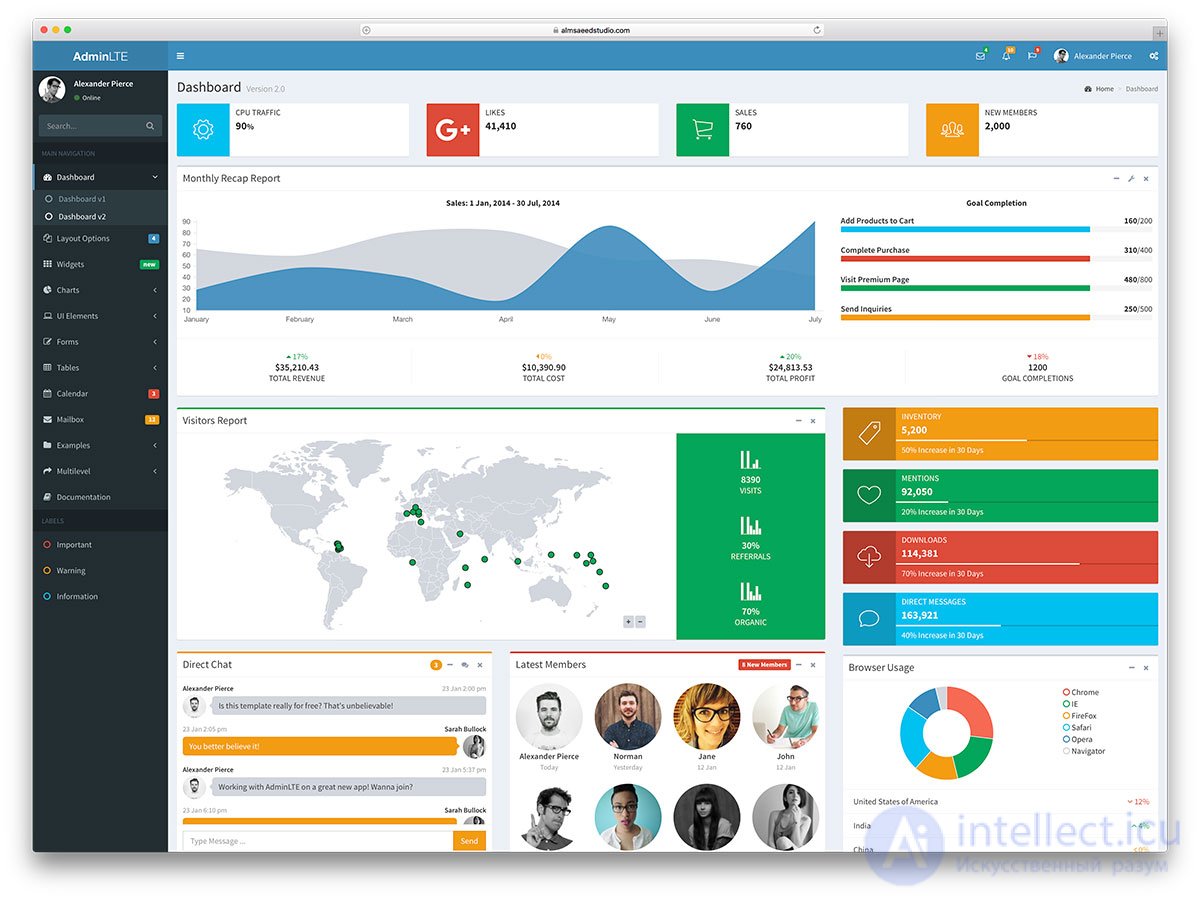
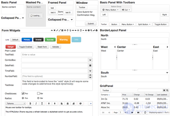
The main tools of Bootstrap:
 \
\
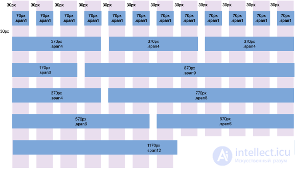
Figure 1. Aaron K. White's Bootstrap grid system template
To get started, you need to download Bootstrap from the developer's website at the following address:
http://getbootstrap.com/getting-started/#download
This is the full version, containing all the necessary scripts and styles. Inside there are three folders: css, fonts and js.
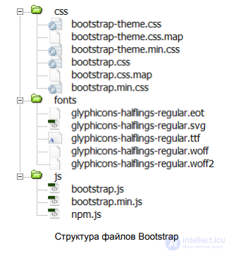
Bootstrap file structure
The style and script folders include two versions of the files — the source and the minified one (the name contains min). The minified version differs only in file size and reduced code readability. It is best to add exactly this version to a live site, since it will speed up the loading of web pages a little.
We copy all the folders into our project and create index.html in the root. As a result, the structure of our project will look as follows.
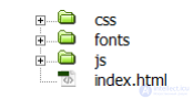
Files and folders of our project
The contents of index.html include a link to the bootstrap.css style file, and at the bottom of the page we call bootstrap.js. Nothing more is needed for now.
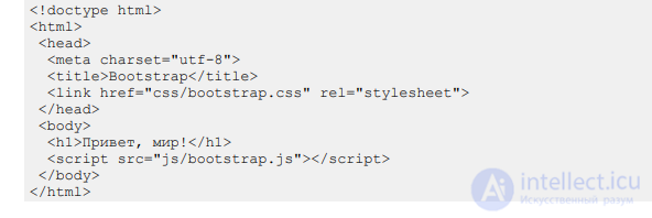
If, in the course of work, you need to override the styles of some elements, you can attach one more custom style file and set the necessary properties in it. Bootstrap also lets you configure the desired parameters right on their website, mark the required components and download a personalized version of the working files. This is done via the following link:
http://getbootstrap.com/customize/
Also, we will need the jQuery library further on; it needs to be downloaded, with its call added before bootstrap.js.
Bootstrap is known for its well-thought-out and flexible grid system, based on a 12-column layout.
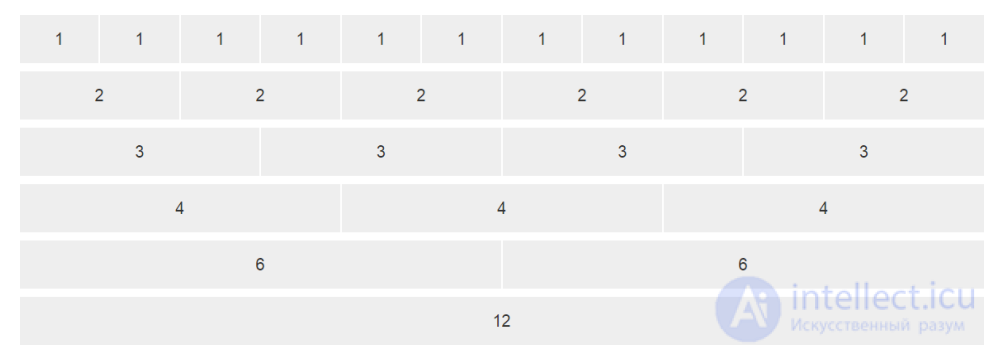
Columns of equal width
The columns themselves do not have to be the same width; you can combine any number of columns, as long as they add up to 12.
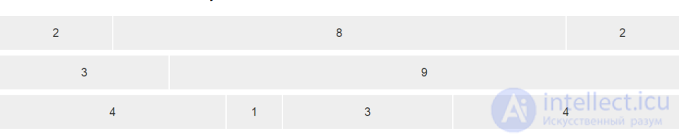
Columns of different widths
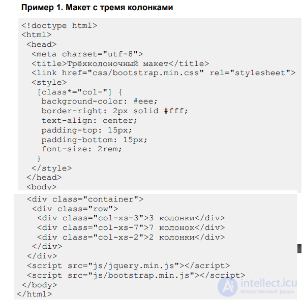
So, to create a layout of three columns we use
Example 1. Layout with three columns
The style is added only to visually highlight the columns.
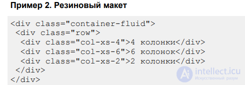
The container class creates a fixed-width layout, whose value depends on the device size. For monitors the maximum width is 1170 pixels; for smartphones the layout will take up the full available width. If you don't need to limit the layout width, use container-fluid instead of the container class (example 2).
Example 2. Fluid layout
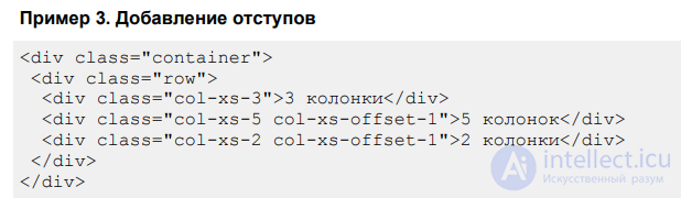
Columns initially sit tightly against each other, which is not always useful for a layout. To add empty space between columns, the col-xs-offset-N class is used, where N ranges from 0 to 12. The offset is added to the left of the current column (example 3).
Example 3. Adding offsets
The result of this example in the browser is shown in fig. 3.
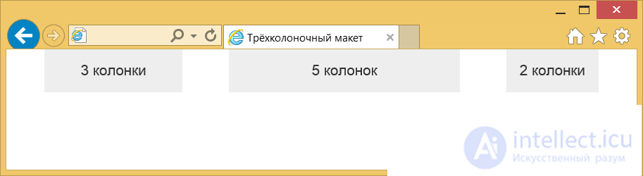
Fig. 3. Columns with offsets between them
Remember that offsets are added to the total number of columns, and their sum must not exceed 12, otherwise the columns will start moving to another line.
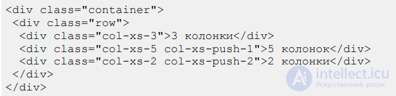
Each column can be shifted left or right by a specified number of columns. Again, this is done using classes. col-xs-pull-N — shifts the column to the left by the given number, and col-xs-push-N shifts it to the right (example 4). Here N can range from 0 to 12.
Example 4. Shifting columns to the right
Notice that a shift is not an extra column, as with offset, so there is no need to sum all the values. You also need to make sure that the columns do not overlap each other.
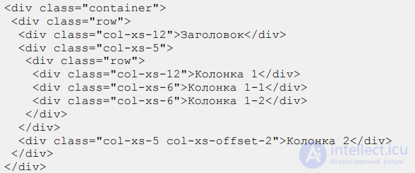
When building complex layouts, twelve columns may not be enough, and moreover a single column may contain additional ones. So we will need to nest some columns inside others. This is done in a similar way (example 5).
Example 5. Nested columns
To create nested columns we again add
with the row class, which contains the desired structure of nested columns. This way you can build layouts of any complexity.
Notice that the heading fills the entire width of the layout, because it takes up all 12 columns. It is not necessary to introduce an additional row container for such things; the remaining columns will wrap onto another line automatically (fig. 4).
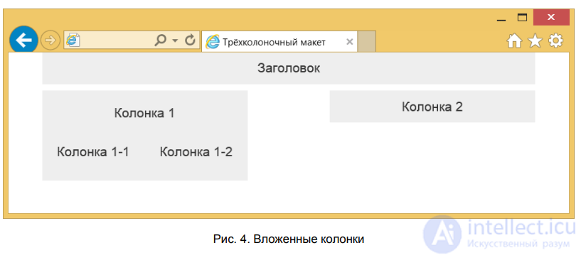
Fig. 4. Nested columns
Responsive design is a layout method where the width of the web page layout adapts to the width of the device. The simplest option is a proportional change of scale, but in practice it is better to change both the placement of elements and their sizes. This way we get the most optimal look for smartphones, tablets and monitors.
Bootstrap already has responsive design capabilities built in. If you make a simple multi-column layout and then start reducing the width of the browser window, you will notice that the layout itself changes too. But that's not all — it is much more interesting to slightly change the layout itself so that it best matches the device. For this, keywords have been introduced that appear in class names; they are presented in table 1.
| Device | Name | Layout width |
|---|---|---|
| Smartphone | xs | Less than 768px |
| Tablet | sm | 768px and more |
| Monitor | md | 992px and more |
| High-resolution monitor | lg | 1200px and more |
To set the column width for smartphones, it is enough to include the col-xs-N class in the code; for monitors it will already be called col-md-N. Any classes can be combined with each other; if a class for the selected device is not specified, it is inherited from the bottom up. This means the layout for a smartphone will look the same as the layout for a monitor. But not the other way around. That's exactly why layout building always starts with the smartphone layout, then comes the tablet and the monitor.
Since we are now focusing on mobile devices, inside
we need to add the following line.
Now our design will scale to the device width and look optimal, especially on devices with small screens.
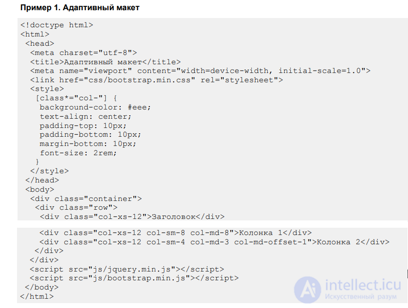
With this line and the new classes in mind, let's make a simple layout with two columns (example 1).
Example 1. Responsive layout
To test the layout, there is no need to look at it on some specific device; it is enough to reduce the width of the browser window and we will immediately see the changes. Fig. 1-3 show the result of this example at different window widths.
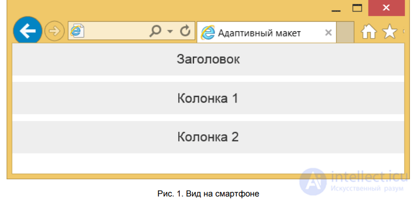
Fig. 1. View on a smartphone
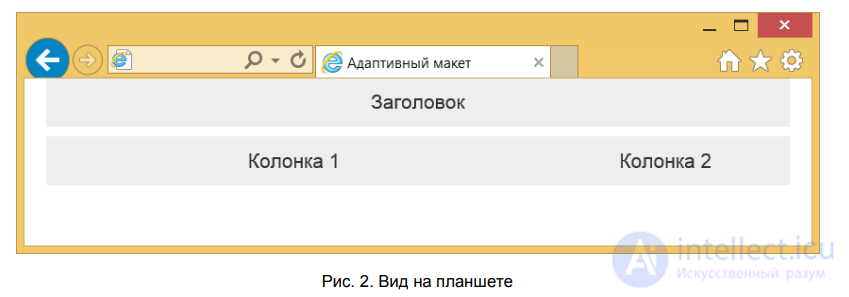
Fig. 2. View on a tablet
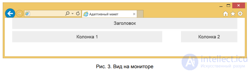
Fig. 3. View on a monitor
We have looked at the simplest case, where the placement of elements barely changes relative to each other. What if you need to swap elements around or remove something for small screens? This can't be done directly, so let's use a small trick — add two identical elements in different places and hide one while showing the other. Bootstrap offers two sets of classes for hiding and showing elements depending on the window width — hidden-xs and visible-xs-block. The principle is the same as when working with columns; instead of xs, substitute the needed keyword. Example 2 shows how to «move» the heading this way.
Example 2. Changing the position of the heading
The result of this example is shown in fig. 4.
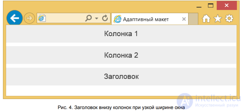
Fig. 4. Heading below the columns at a narrow window width
In this example, the hidden-xs class means that the column should be hidden for smartphones, while visible-xs-block— on the contrary, shown. When viewed on a wide screen, the heading will always be at the top, and at the bottom on a narrow one.
Bootstrap contains many ready-made styles for styling elements. They are quite simple to apply — all you need to do is add a class defined in the styles to the element. This saves time on developing the project, since there's no need to think about the design of individual elements. The style of some elements, such as headings,
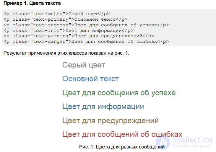
The web page is set with a white background color, a font set of Helvetica Neue, Helvetica, Arial, and a text color of #333. You can also use a predefined set of colors to draw attention to text and create informational messages (example 1).
Example 1. Text colors
Fig. 1. Colors for different messages
In a similar way you can change the background color of text or another element, such as buttons. The class names change slightly, but the principle stays the same (example 2).
Example 2. Element backgrounds
The result of applying these classes is shown in fig. 2.
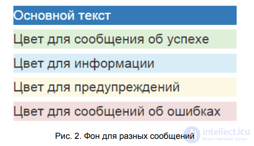
Fig. 2. Backgrounds for different messages
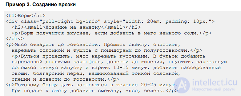
The classes pull-left and pull-right are used for creating callouts, which align the element to the left and right edges respectively. A callout is a block with images and text that is embedded into the main text. A callout is usually placed along the left or right edge of a text block, with the main text wrapping around it on the other sides (example 3).
Example 3. Creating a callout
The result of this example is shown in fig. 3.
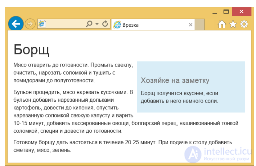
Fig. 3. Appearance of a callout in text
To make our callout more noticeable, the
By default, the font size of the main text is set to 14px, and the line spacing (the value of the line-height property) is — 1.428. Between paragraphs of text (the element
) an additional spacing of 10 pixels is introduced.
For headings, the familiar HTML elements are used, with 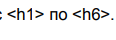 . Their style differs slightly from the original (fig. 1).
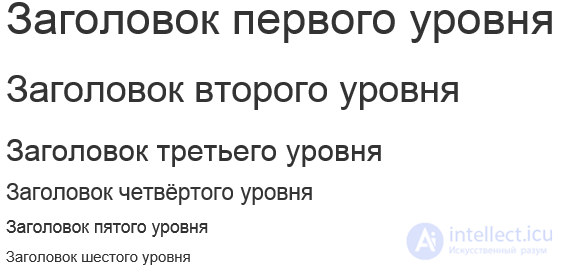
Fig. 1. Appearance of text headings
Headings can be made slightly smaller yourself, if you insert the element inside, resulting in the following combination.
Headings of this type look somewhat different and are intended for other sections of the site, such as a sidebar (fig. 2).
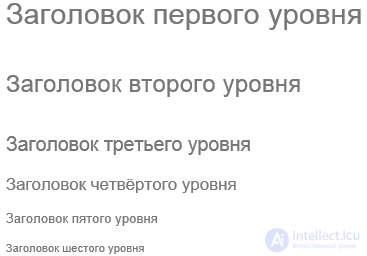
Fig. 2. Reduced headings
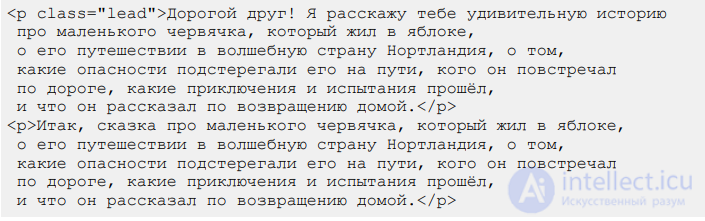
In journalism, the lead is the first paragraph of an article that grabs attention and gives a brief idea of the article's content. It usually looks slightly different from the main text. To mark a paragraph or column as the lead, simply add the class lead to it, as shown in example 1.
Example 1. Creating a lead
Dear friend! I will tell you an amazing story about a little worm who lived in an apple, about his journey to the magical land of Northland, about the dangers that lay in wait for him along the way, who he met on his travels, what adventures and trials he went through, and what he told everyone when he returned home.
So, here is a tale about a little worm who lived in an apple, about his journey to the magical land of Northland, about the dangers that lay in wait for him along the way, who he met on his travels, what adventures and trials he went through, and what he told everyone when he returned home.
The result of this example is shown in fig. 3.
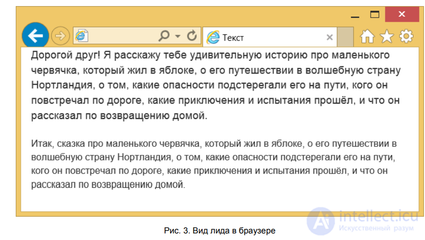
Fig. 3. Appearance of the lead in the browser
An abbreviation is a compound shortened word (kolkhoz) or a word formed from the first letters of the words in a phrase (KGB). To mark abbreviations in text, the element is used, and its expansion is added inside it via the title attribute (example 2).
Example 2. Abbreviation
CSS — a set of formatting parameters that is applied to the elements of a document to change their appearance.
An abbreviation is marked with a dotted underline; when you hover the mouse pointer over the word, it changes to a help cursor and a tooltip appears, if one is set.
When the initialism class is added to the element, the font-size property is set to 90% for it, so the abbreviation is displayed at a reduced size.
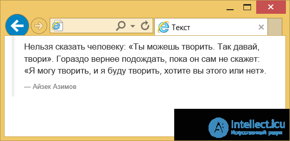
For formatting large quotes, HTML uses the element
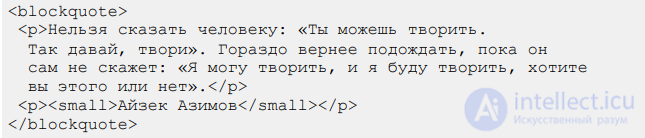

The quote can be inverted, so that the line is on the right and the text is also aligned to the right edge (fig. 5).
Fig. 4. Appearance of a quote in the browser
If the quote itself is styled quite traditionally, the caption for it is added using the element or
, as shown in example 3.
Example 3. Adding a quote
The quote can be inverted, so that the line is on the right and the text is also aligned to the right edge (fig. 5).
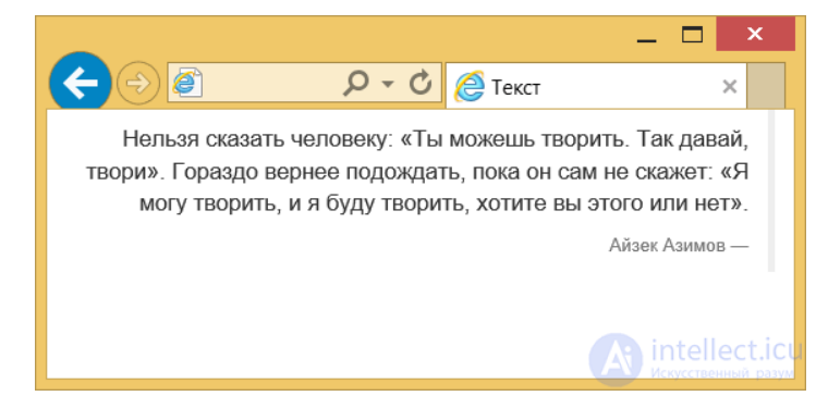
Fig. 5. Quote aligned to the right edge
Simply add the class pull-right
We often need to publish program listings and denote variables. HTML has several ready-made elements for this — denotes individual variables, — an inline fragment of code, and
is used for multi-line code (example 4).
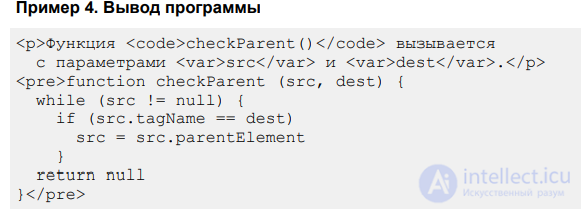
Example 4. Program output
The result of this example is shown in fig. 6.
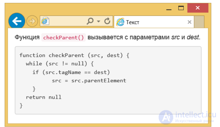
Fig. 6. Appearance of program code in the browser
The element 
takes up a height equal to its content, which can be inconvenient for large listings. To limit the height, simply add the class pre-scrollable, then the height will be equal to 350 pixels and a vertical scroll bar will appear.
There are several classes for styling images — img-rounded, img-circle and img-thumbnail. To change the display style of images, simply add one of these classes to the element. Fig. 1 shows the results of applying each class.

a. Original image
 |
 |
 |
| b. img-rounded | c. img-circle | d. img-thumbnail |
Fig. 1. Changing the image style
The img-rounded class rounds the corners of the image, img-circle makes it round, and img-thumbnail adds a border around the image.
Example 1 shows how to display a photo and set its style.
Example 1. Round image
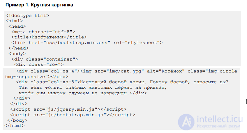
Any displayed images have their original dimensions, but for responsive design it is better when the image width adjusts to the width of the column. For this, simply add the class img-responsive to the element, as shown in the example above. Note that the classes for responsive sizing and image style combine perfectly well with each other. As a result, when the window is resized smaller, we will also see the image itself shrink (fig. 2).
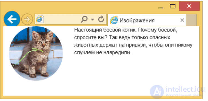
Fig. 2. Appearance of the photo when the window is resized smaller
On websites, lists are used both for their direct purpose — displaying actual lists, and for creating various kinds of navigation. This is because list elements themselves have a strict hierarchy and allow for nested structures, and the appearance of lists is also easy to control through styles.
This kind of list is usually used to create a menu; to the element
for this you only need to add the class list-inline (example 1).
Example 1. Horizontal menu
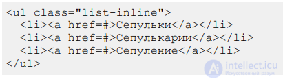
Here is what such a menu looks like (fig. 1). The style of the middle link changes when you hover the pointer over it.
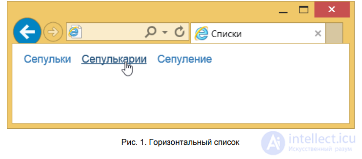
Fig. 1. Horizontal list
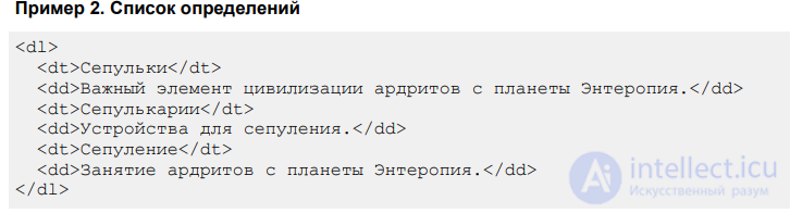
A definition list consists of two elements — the term and its definition.
The list itself is created using the DL container, the term — with the DT element, and its definition — with DD (example 2).
Example 2. Definition list
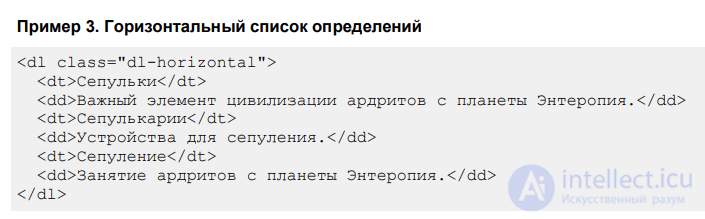
Bootstrap offers to make such a list clearer by arranging the term and definition horizontally. To the element
it is enough to add the class dl-horizontal (example 3).
Example 3. Horizontal definition list
The result of this example is shown in fig. 2.
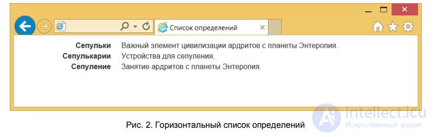
Fig. 2. Horizontal definition list
If the term is too long, it will be truncated and an ellipsis added to it. Also, when the window is resized smaller, the appearance of the list changes back to the traditional one (fig. 3).
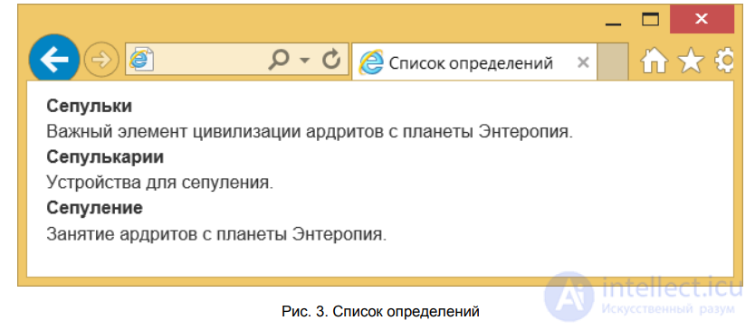
Fig. 3. Definition list
For basic table styling, it is enough to include the class table in the element. The appearance of a table styled this way is shown in fig. 1.
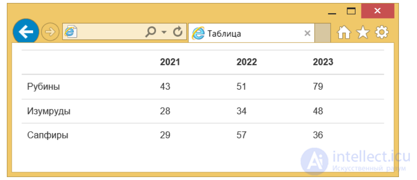
Fig. 1. Table
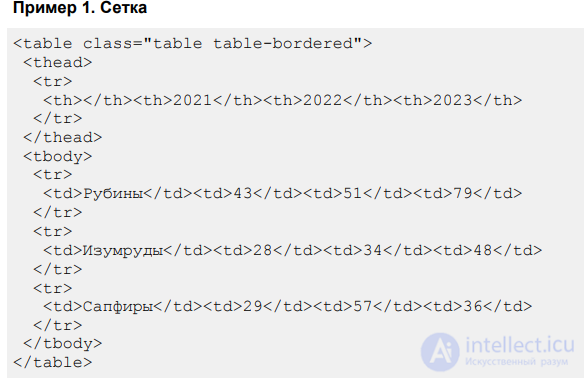
There is no border around the table; the table rows are separated from each other by lines. To make the table look like a grid, add the class table-bordered (example 1).
Example 1. Grid
Note that we keep the class table and add new classes to it. The result of this example is shown in fig. 2.
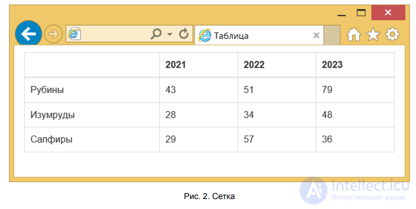
Fig. 2. Grid
You can add one more class, table-hover, to our set, and then when you hover the pointer over a table row, it will be highlighted in gray (fig. 3).
Rows inside THEAD are not highlighted this way.
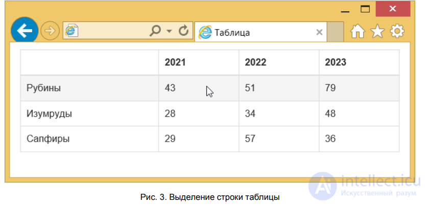
Fig. 3. Highlighting a table row
For a convenient presentation of tabular data, it makes sense to make the table rows alternate, so that the background color of even and odd rows differs (fig. 4). This type of table is often called a «zebra».
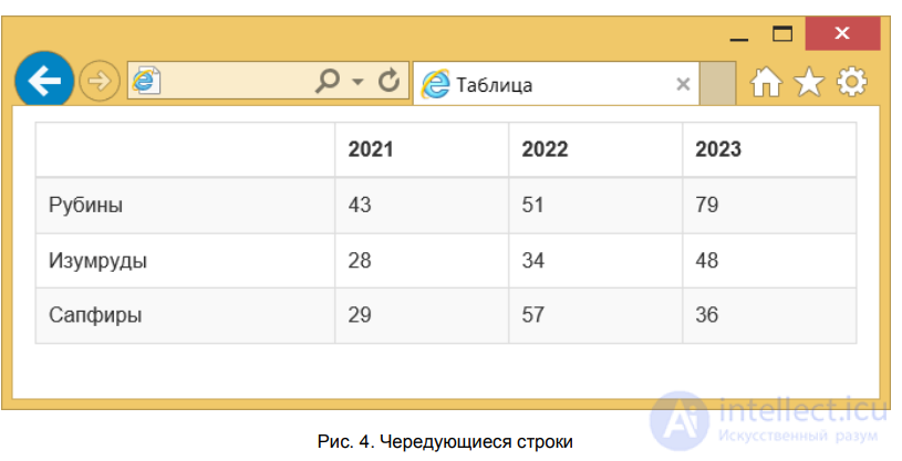
Fig. 4. Alternating rows
This format is again achieved by adding the class table-striped to the element. All of the above can be combined in a single table.
Buttons are used not only as form elements, since a link can also be turned into a button by giving it a rectangular appearance. It will still remain a link with all its available functionality, but in appearance it will resemble that same button. The reverse is also possible — a button can be given the appearance of a link.
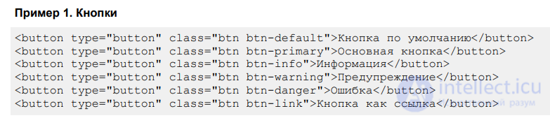
To create buttons, add to the element, A INPUT BUTTON, or the class btn. The second class is needed to change the button's style.
Example 1 shows the possible button variants and what purposes they are intended for.
Example 1. Buttons
The result of this example is shown in fig. 1.
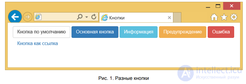
Fig. 1. Different buttons
When you hover the pointer over a button, it becomes slightly darker.
If you need to make a button bigger or smaller, three additional classes are used for this. The class btn-lg sets a large-size button, btn-sm — a small one, and btn-xs — a very small one (example 2).
Example 2. Buttons of different sizes
The result of this example is shown in fig. 2.
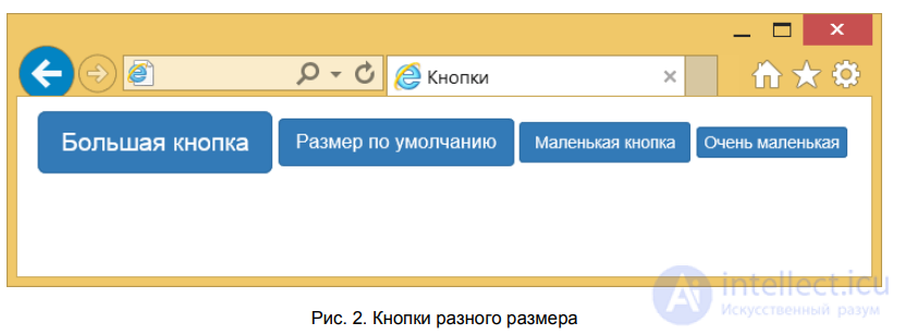
Fig. 2. Buttons of different sizes
A button can also be made block-level, taking up all the width available to it. Just add the class btn-block to it, and the result will be the following button (fig. 3).
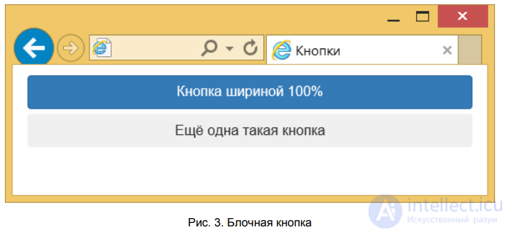
Fig. 3. Block-level button
The code for creating such buttons is shown in example 3.
Example 3. Block-level buttons
To make a button stop working, for the elements INPUT BUTTON and it is enough to add the attribute disabled. Bootstrap will itself change the style of such buttons, clearly showing that clicking them is pointless. For links styled as buttons, you need to include the class disabled, as shown in example 4.
Example 4. Disabled buttons
The result of this example is shown in fig. 4.
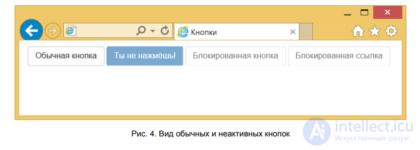
Fig. 4. Appearance of regular and inactive buttons
Bootstrap includes several dozen icons that can be used in text, for buttons, in forms, in navigation, and in other places. The icons are made as font characters, so they can be scaled over a wide range without any loss of quality, while taking up very little space. To add the desired icon, an empty element is usually used, inside which we write the icon's class. Here, for example, is how to add a magnifying glass symbol to a button, it usually represents search.
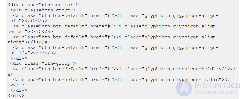
Example 1 shows the creation of a toolbar with buttons and icons on them.
Example 1. Toolbar
The result of this example is shown in fig. 1.
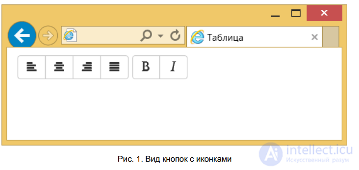
Fig. 1. Appearance of buttons with icons
Form markup — this is one of Bootstrap's strong points. The framework not only helps arrange form elements in the right order, but also provides for changing the appearance of elements and their interaction with the user.
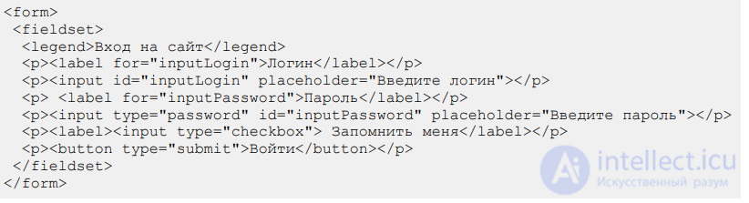
Let's look at a typical sign-in form for a site and use it as an example to see how Bootstrap works for forms. Example 1 shows the creation of a basic form, without adding any additional classes yet.
Example 1. Sign-in form for a site
The form looks dull (fig. 1), since no styling has been included yet.
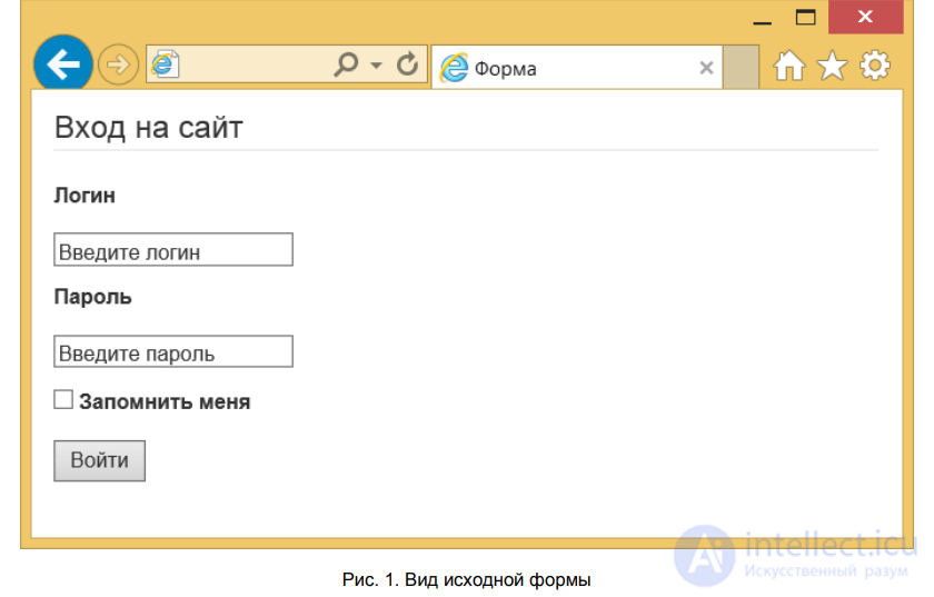
Fig. 1. Appearance of the original form
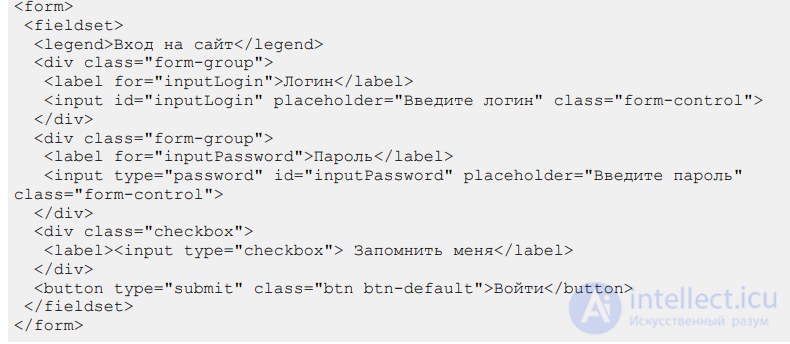
First, let's add the class form-control to the text field and the password field — this will change the style of the text fields. Next we need to group the label and the field after it, so the spacing between them is smaller than usual. Add LABEL and INPUT inside an element
with the class form-group. Also, let's change the checkbox with its text by wrapping them inside an element with the class checkbox, and set a different button style. Example 2 shows the changes to the form.
Example 2. Applying classes
As a result the form looks different (fig. 2).
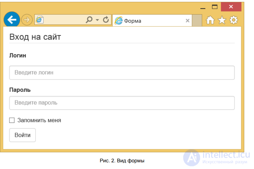
Fig. 2. Form appearance
To make the form more compact, to the FORM element
it's enough to add the class form-inline. The form elements will then line up in a single row (fig. 3). You should also remove FIELDSET and LEGEND from the code.
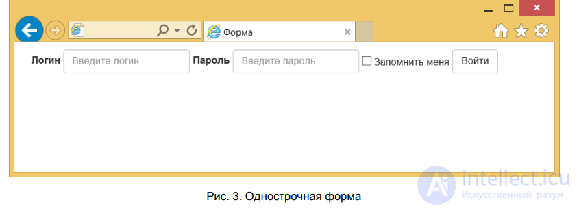
Fig. 3. Inline form
Example 3 shows how to create such a form.
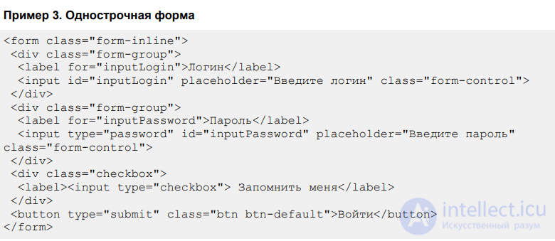
When the window is made smaller, the form stops being inline and reverts to its original appearance shown in fig. 2.
This type of form is often found on websites, where the field and its label are placed on the same line (fig. 4).
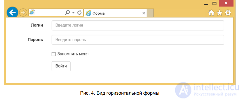
Fig. 4. Appearance of a horizontal form
To create a form of this type you need to perform several steps:
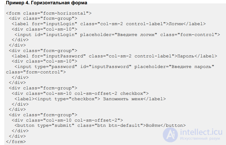
We've already dealt with the 12-column grid, let's apply those skills to control the form's design. The label will occupy two columns, and the width of the field itself — the remaining ten columns. Instead of adding an extra
let's add the class col-sm-2 directly to , which will slightly reduce the number of code elements. As for the checkbox and the button, let's add the class col-sm-offset-2 to them, it will shift the fields right under the text field (example 4).
Example 4. Horizontal form
In the classes we used the prefix sm, so that on smartphones the form looks traditional (fig. 2), while on large screens — horizontal.
Bootstrap components — this is a collection of tools used in website design. Each component, as a rule, includes a set of several HTML elements, styles for them, and, when needed, scripts that provide interaction with the user. Below are described some popular Bootstrap components.
Combines several buttons into a single group, which is displayed as a single whole, with no gaps between the buttons.

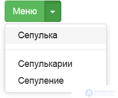
Contains a button that, when clicked, displays a list of links.
On websites, tabs are used where information needs to be arranged into blocks compactly and clearly.

On websites, navigation in the form of breadcrumbs is used to show the path to the current document and its position in the site's hierarchy.

For blogs, the total number of posts is split into separate pages to reduce traffic load and make the information easier to perceive. Navigation between pages is done using a special pager with numbers for all pages, or links to the previous and next page.

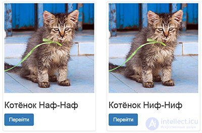
A thumbnail — is a reduced-size image that simultaneously serves as a link to a page, or to the same image enlarged.
To let the user know about the results of their actions, informational messages are used — different colors are used for different purposes.

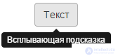
Displays explanatory text when the cursor hovers over an element.
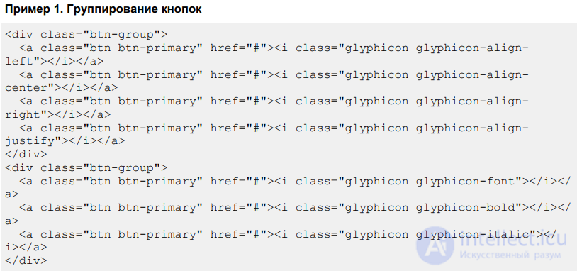
Combining buttons into groups is used to create a set of buttons united by some common principle. For example, for editing buttons you could create a group for text alignment and a group for controlling formatting. Visually, such buttons are arranged in a single row with no gaps between them.
To group buttons, place them inside
with the class btn-group, as shown in example 1.
Example 1. Grouping buttons
The result of this example is shown in fig. 1.
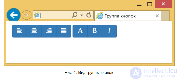
Fig. 1. Appearance of a button group
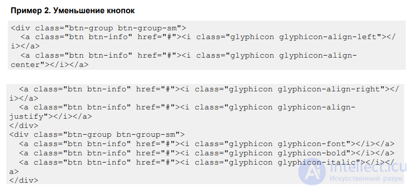
It's convenient to set the size of a button group right away, using the prefixes xs, sm, md, lg in the classes. So, to shrink the buttons it's enough to add the class btn-group-sm (example 2).
Example 2. Shrinking buttons
The result of this example is shown in fig. 2.
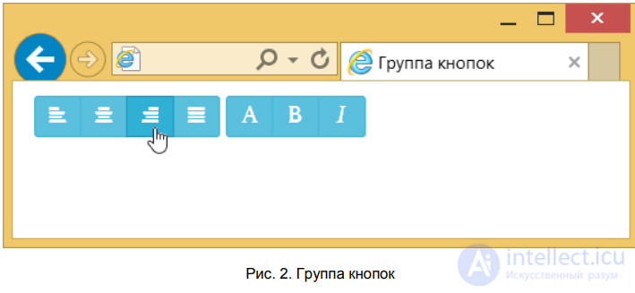
Fig. 2. Button group
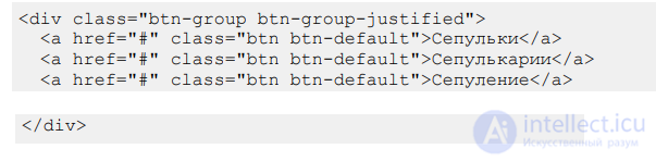
A button group can be aligned by width, so that the buttons adjust to the available width and take up all of it (fig. 3). This is often used to create a fluid menu.
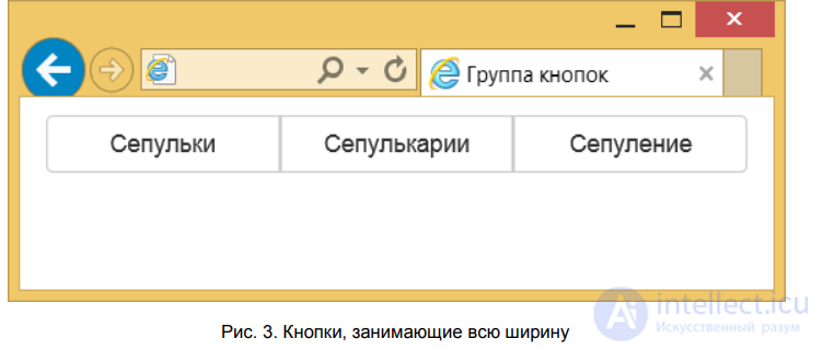
Fig. 3. Buttons taking up the full width
To align by width, add to
the class btn-group-justified as shown in example 3.
Example 3. Aligning buttons by width
This type of menu has firmly taken its place in operating systems and programs. It's also used quite often on websites because of its compactness and hierarchical structure — each menu item can contain a submenu, and that submenu another one in turn. However, because of this there are some usability issues. Looking at the menu, you can't immediately tell how many items it contains, and nested submenus make navigation harder. For these reasons Microsoft, in some of its programs, abandoned the dropdown menu in favor of a ribbon interface, as in Word. But the main thing is, there's a tool, and how you use it is up to you, based on your own tasks.
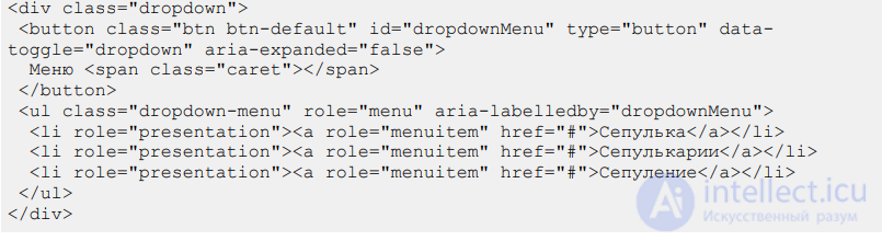
In Bootstrap, the menu itself and the button that opens it — are two different elements combined into one block with the class dropdown. Inside it we add a button with the data-toggle attribute and the value dropdown.
Traditionally, a small downward arrow is shown next to the text — it indicates that the user is dealing specifically with a dropdown menu, and not an ordinary button or text. To create it, simply insert it after the label on the button (example 1).
Example 1. Dropdown menu
Below the button we add a list with the menu items and write the class dropdown-menu. Bootstrap takes care of everything else, so no additional actions are required from us. As a result we get the following menu (fig. 1).
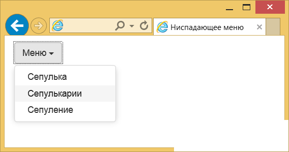
Fig. 1. Appearance of the menu
To visually separate one or several menu items from the others, a horizontal divider is used. Instead of a regular link, insert an empty element
with the class divider, as shown in example 2.
Example 2. Divider
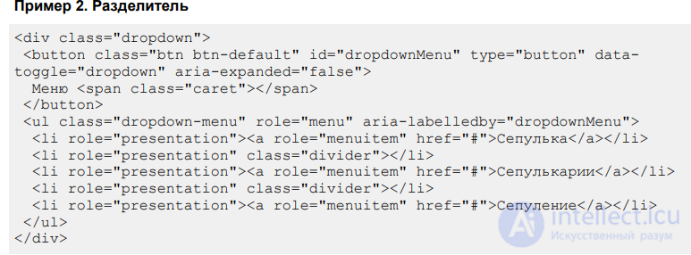
The result of this example is shown in fig. 2.
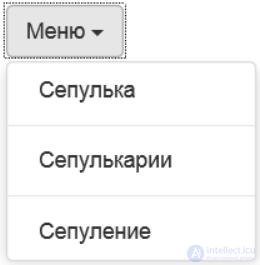
Fig. 2. Using a divider in a menu
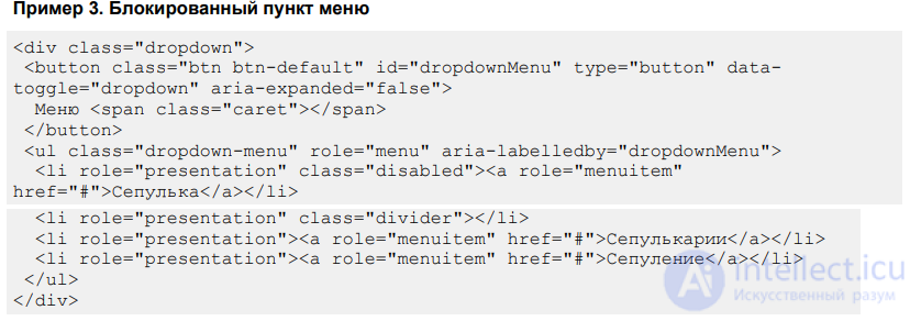
If some menu items need to be made inactive, add the class disabled to the LI element (example 3).
Example 3. Disabled menu item
Such a menu item will be visible, but it is displayed in a different color, cannot be clicked, and when the mouse cursor hovers over the item, the pointer changes (fig. 3).
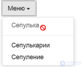
Fig. 3. Disabled menu item

You can show the user an already open menu right away, so they won't need to click it just to see what's hidden inside. Simply add the class open to the parent
.
In addition to adding traditional buttons, you can insert a button in which the arrow is visually separated from the text (fig. 4).
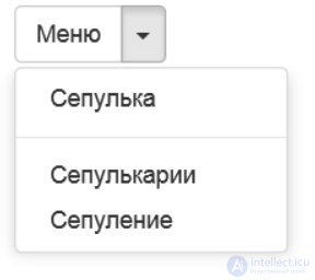
Fig. 4. Appearance of a button with an arrow
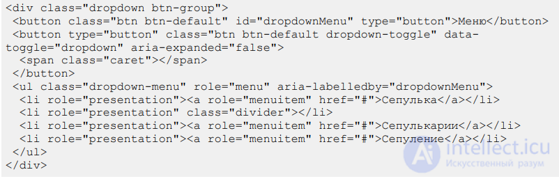
To create such an element, let's make two buttons — one with text, the other with an arrow, and combine them into a group by adding the class btn-group (example 4).
Example 4. Button with an arrow
Since we now have two buttons, various experiments are possible. For example, you can set a different color for the text button and the arrow, or swap them around.
In this case a white arrow on a green background will be to the left of the text «Menu».
Tabs as an interface element come from paperwork. Small pieces of cardboard with labels are inserted into ordinary business folders, letting you quickly orient yourself in the contents and jump to the section you need. On websites, tabs are used where information needs to be arranged into blocks compactly and clearly. Switching between tabs happens without reloading the page, which speeds up the work and makes life easier for the user.
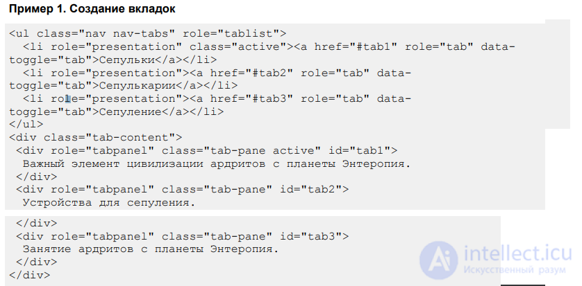
The tab code consists of two parts — the display of the tabs themselves, and the content associated with them.
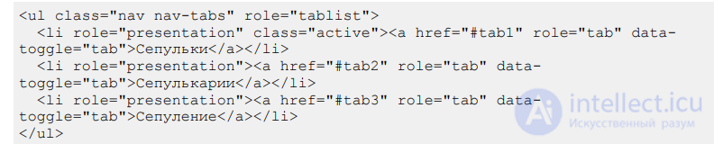
First we create a list
, for the currently open tab you need to add the class active. The text on the tabs is done using links, and for each of them you should add the data-toggle attribute with the value tab. The link itself points to an element with an identifier, which should be displayed when the tab is opened. Here's what we end up with.
Even with this bare-bones code, the tabs should already work and switch visually.
Let's move on to the displayed text. We wrap everything in an element
with the class tab-content, and inside, for each tab, we make a separate one with the class tab-pane. Plus we add a unique identifier linking the text to the tab itself. The final touch — for the current tab we specify the class active.
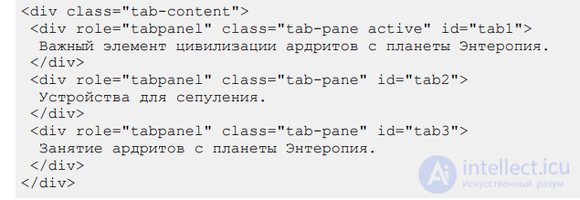
We combine the two fragments together and get the final code for creating tabs.
Example 1. Creating tabs
The result of this example is shown in fig. 1.
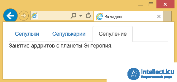
Fig. 1. Appearance of the tabs
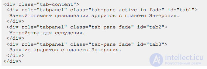
Switching between tabs happens instantly, but you can add a small effect by adding the class fade to the block with the text. Then the text will smoothly fade out and appear. For the active tab you must also enable one more class, in, otherwise errors will occur.
The size of a tab depends on the length of the text inside it, but you can force their width so that the tabs take up all of the available width. Just add the class nav-justified to the UL element

Here is what such tabs look like (fig. 2).
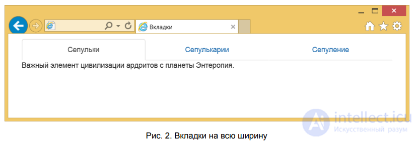
Fig. 2. Full-width tabs
When the window size is reduced, such tabs change their appearance and are arranged not horizontally, but one below another (fig. 3).
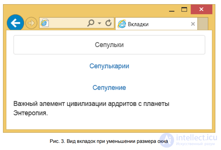
Fig. 3. Appearance of tabs when the window size is reduced
Traditionally, tabs have an appearance inherited from real life — pieces of cardboard sticking out of a folder with a label on them. By replacing the class nav-tabs with nav-pills, we get tabs in the form of pills (fig. 4).
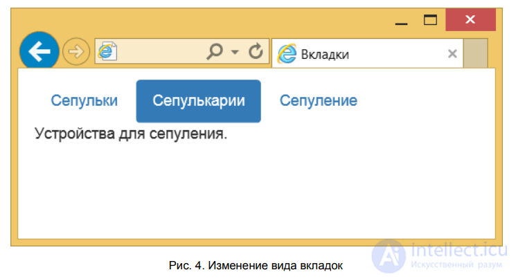
Fig. 4. Changing the appearance of tabs
The code will look like this.

Tabs can also be arranged vertically; the class nav-stacked is intended for this.

The appearance of such tabs is demonstrated in fig. 5.
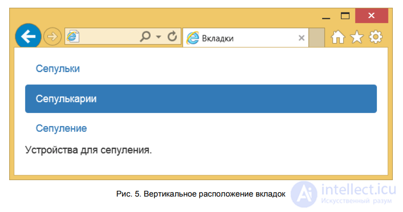
Fig. 5. Vertical arrangement of tabs
The name «breadcrumbs» comes from children's fairy tales. Remember the story of the boy who scattered breadcrumbs along the way and used them to find his way back home. However, in one version of the story the crumbs were pecked up by birds, which set off new adventures for the hero. On websites, breadcrumb navigation is used to show the path to the current document and its position in the site hierarchy (fig. 1).
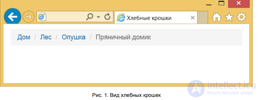
Fig. 1. Appearance of breadcrumbs
The gray text shows the name of the current document, while the links lead to previous documents, with the first link, as a rule, always pointing to the site's home page.
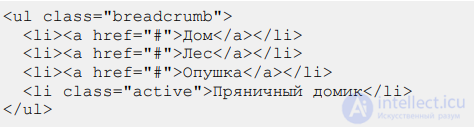
To create breadcrumbs, a list is used
with the class breadcrumb, elements
form the «crumbs» themselves. The current item is not a link, and the class active is added to it (example 1).
Example 1. Breadcrumbs
For blogs, the total number of posts is split into separate pages to reduce traffic load and make the information easier to take in. Navigation between pages happens in one of two ways:
1. the numbers of all pages are shown, with arrows leading to the previous and next page (fig. 1);
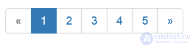
Fig. 1. Numbering of all pages
2. only links to the previous and next page are shown (fig. 2).
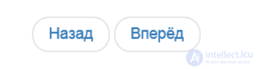
Fig. 2. Links to the previous and next page
Pagination is done using the UL element with the class pagination. Numbers are added via LI elements, and we set their number ourselves. For example, if we need links to jump to the first and last page, or links leading to the previous and next page (example 1).
Example 1. Pagination
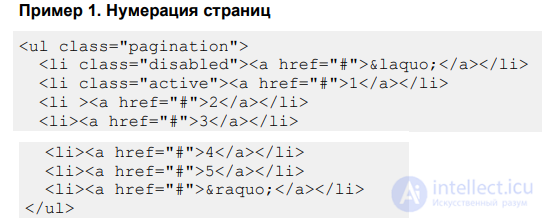
The current navigation item is highlighted with the class active added to LI. If you need to block some item, add the class disabled to it. Blocking is needed so as not to mislead the user. So, if they are on the first page, going to the previous page is impossible, because at the moment it simply doesn't exist. When the mouse pointer hovers over such an item, the cursor changes its appearance.
To decrease or increase the size of the links, use the classes pagination-sm and pagination-lg respectively, adding them to
. The class pagination itself doesn't go anywhere in this case. Here is what the code for the larger size will look like.

The second type of page navigation contains only links to the previous and next page. Accordingly, the code and the appearance of the pagination are simplified, since the list will have only two items. In this case, for
we use the class pager, as shown in example 2.
Example 2. Navigating between pages
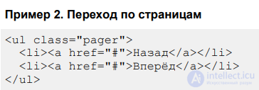
The links are displayed rather close to each other, and to space them out and align them to the left and right edges, add the classes previous and next to them (example 3).
Example 3. Aligning links
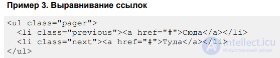
The result of this example is shown in fig. 3.
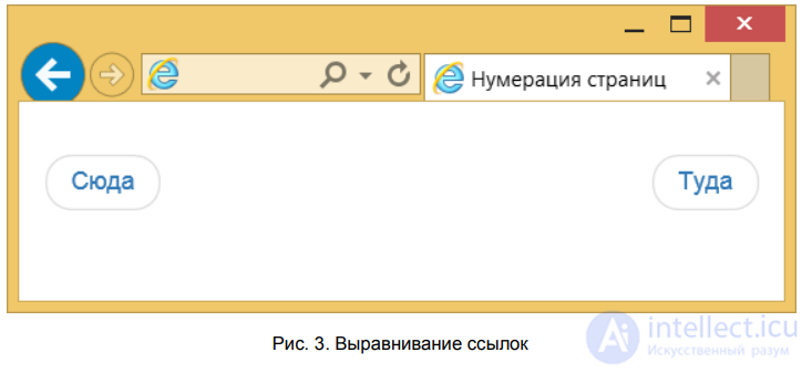
Fig. 3. Aligning links
A thumbnail — is a reduced-size image that also serves as a link to the page, or to the same image at full size. A common synonym is «nailies» (from the English thumbnail — nail) or the transliterated «thumbs».
Unlike regular images, thumbnails fit into the grid, and the size of the images adjusts to the width of the layout. So first we need to build the grid, and only then insert links with photos into the columns. Let's say there will be four columns for medium screens and two columns for small screens. In each column we add an element with the class thumbnail and an element (example 1).
Example 1. Creating thumbnails
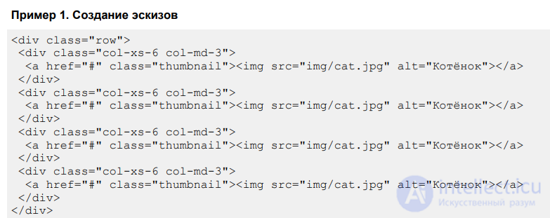
The result of this example is shown in fig. 1.
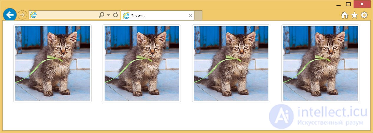
Fig. 1. Appearance of thumbnails for a medium screen
When the browser window width is reduced, the layout's appearance changes slightly (fig. 2).
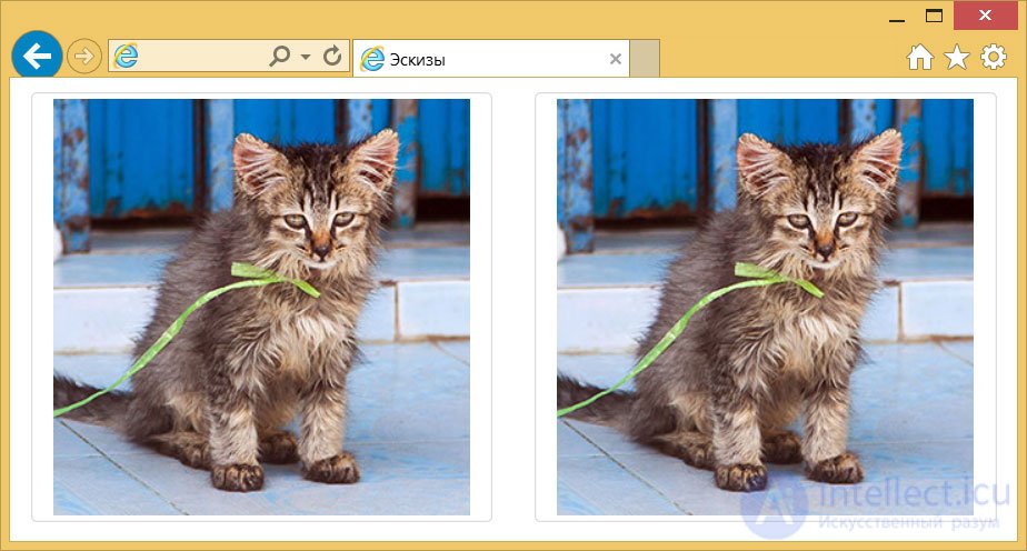
Fig. 2. Appearance of thumbnails for a small screen
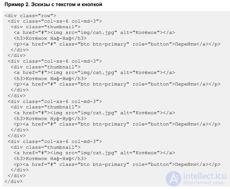
Inside an element with the class thumbnail, you are allowed to add not only images but also explanatory text for it. This lets you flexibly adjust the appearance to match your own design (example 2).
Example 2. Thumbnails with text and a button
In this example, a heading and a button for navigation are added under each image (fig. 3). The photo still acts as the link.
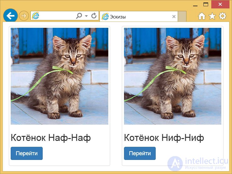
Fig. 3. Thumbnails with headings
To let the user know about the results of their actions, informational alerts are used — different colors are used for different purposes. To the element
add the class alert and one of the classes shown in example 1.
Example 1. Types of alerts
The result of this example is shown in fig. 1.
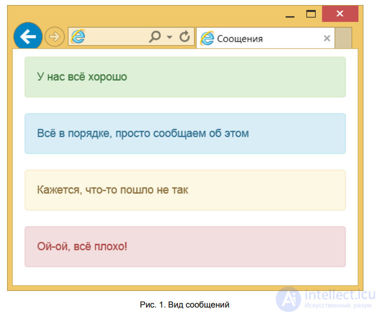
Fig. 1. Appearance of alerts
For links in alerts on a colored background to look harmonious, you need to add the class alert-link to the element, as shown in example 2.
Example 2. Links
Fig. 2. Appearance of links in alerts
By default, the user cannot remove alerts from the screen; to add this capability, insert into the
with the message the class alert-dismissible and make a close button, as shown in example 3.
Example 3. Closing an alert
The result of this example is shown in fig. 3.
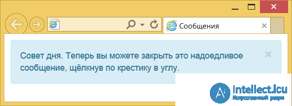
Fig. 3. Alert with a close button
After closing an alert, you can only bring it back by refreshing the page.
A tooltip can be added to any HTML element using the universal title attribute. Then, when the pointer hovers over the element, the text set inside title will appear. The styling of such text is left to the browser and cannot be changed via styles in any way. That is why custom tooltips made with JavaScript are often used instead. They can be flexibly adjusted to your taste, adding capabilities that the built-in tooltip lacks. For example, you can set the position of the tooltip relative to the element.
Bootstrap overrides the title attribute, so we write the text in this attribute, but we also add the data-toggle attribute with the value tooltip. It will tell the script that the appearance of the tooltip should be changed. You can also add other attributes controlling the appearance, for example data-placement indicates the position of the tooltip: left — on the left; right — on the right; top — on top; bottom — at the bottom (example 1). Keep in mind that if there isn't enough space to display the tooltip, it will end up beyond the edge of the browser window.
Example 1. Creating a tooltip
The popularity of the JavaScript language stems from its broad capabilities for interacting with elements of a web page through the DOM.
Before the closing tag, you should also add the script code, as shown below. Without this, our tooltip will not work.
The appearance of the tooltip is shown in fig. 1.
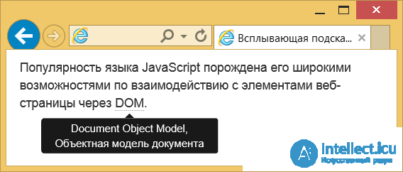
Fig. 1. Tooltip below the text
By default, the tooltip appears and disappears smoothly. You can adjust the animation speed or disable it entirely. Two approaches are used for this. In the first case, we add the attributes data-animation (true — enables the animation; false — disables it) and data-delay to the element, as shown in example 2.
Example 2. Configuring animation
The popularity of the JavaScript language stems from its broad capabilities for interacting with elements of a web page through the DOM.
The data-delay attribute sets the delay time before showing and hiding the text, in milliseconds. If there is a single value, the delay will be the same for both. But you can write a structure as shown in this example and control the delay time for showing and hiding separately.
In the second approach, the animation parameters are added directly into the script.
$(function () {
 $('[data-toggle="tooltip"]').tooltip({
   animation: false,
   delay: {"show": 100, "hide": 1000}
 })
})














Comments